screenprint, print
#
negative space
#
screenprint
#
minimalism
# print
#
pop art
#
colour-field-painting
#
rectangle
#
geometric-abstraction
#
abstraction
#
hard-edge-painting
Copyright: Adja Yunkers,Fair Use
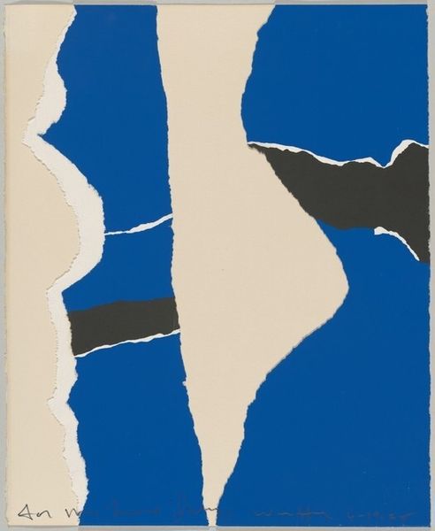
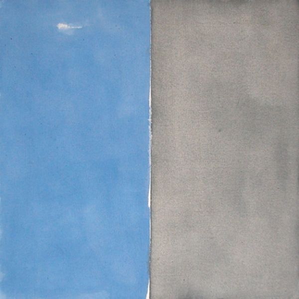
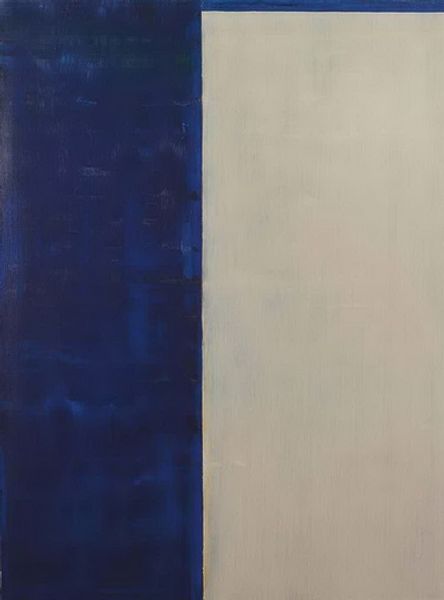
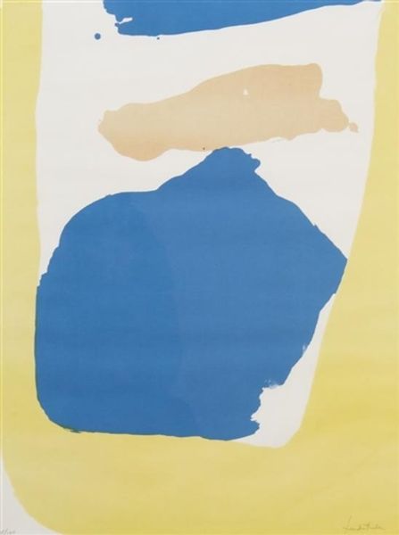
Curator: This is "White On Blue II," a screenprint made in 1969 by Adja Yunkers. What’s your immediate response? Editor: It feels...clean. Deceptively simple, almost aggressively so. That blue just *is*. The stark white almost bisecting it adds this jolt of, I don't know, a clean break? Curator: That sensation of cleanliness really resonates with the minimalist movement Yunkers was associated with. You have this unmodulated field of blue broken only by the negative space created by that meandering white form. The effect comes from the precision inherent to screenprinting. Editor: It's more complex than I first gave it credit for. It reminds me a bit of those Matisse cut-outs but reduced to a really basic design, even to the hard-edge painting of that era— where forms are pared back to pure shape and color. There's something cooly industrial, even pop-art-ish about it. It’s also intriguing how he titles it “White on Blue,” so focusing our attention to the figure-ground dynamic right off the bat. Curator: Right, and I think it reveals the paradox within movements like minimalism or color-field-painting. On the surface, it's a reductive gesture; Yunkers strips away all these traditional representational elements of painting. But look closer! Here is the artist exploring these relationships and forcing us to focus on what we see, while removing so-called extra noise. Yunkers, having fled war-torn Europe, always seemed preoccupied with light, even within abstraction. The high-key contrast surely creates an effect of illumination in the piece. Editor: You can almost read that meandering white slash as a streak of sunlight, I see that. So maybe simplicity isn't about stripping things *away,* but refining what is essential—that emotional hit of pure colour. Looking at this, you also can understand it in the socio-political moment—color, line, and form as things divorced from the weight of art history. What a breath of fresh air in 1969, right? Curator: Absolutely. What begins as a minimal statement becomes an opening for something expansive, in how we engage with art, with seeing. Editor: Indeed, even its deceptive bareness contains whole worlds within the tension between its blue expanse and singular stroke.
Comments
No comments
Be the first to comment and join the conversation on the ultimate creative platform.
More like this