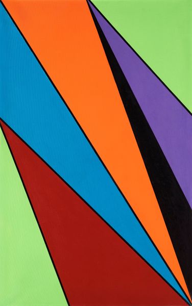
painting, acrylic-paint
#
pop art-esque
#
painting
#
pop art
#
colour-field-painting
#
acrylic-paint
#
form
#
geometric
#
pop art-influence
#
abstraction
#
pop-art
#
line
Copyright: Ray Parker,Fair Use
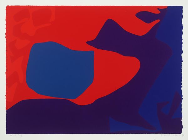
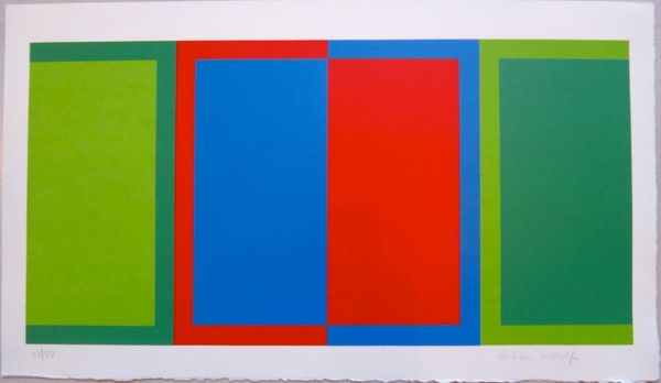
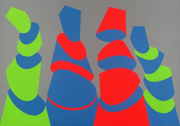
Editor: This untitled acrylic painting by Ray Parker from 1967 is so striking. I'm immediately drawn to the boldness of the simple forms and the use of colour. How do you interpret this work? Curator: For me, this piece is exciting, especially when we consider the cultural context of 1967. Think about the rise of Pop Art, and how artists were engaging with mass culture and simplified forms. The tension between the organic shapes and hard lines is so interesting. How do you think these colour choices contribute to the painting’s overall message or impact, particularly regarding ideas of abstraction and form? Editor: I guess I hadn't really thought about that tension as a commentary. I see them as simply co-existing; but considering the pop art influences, that hard/soft dynamic could be challenging some established norms. Curator: Exactly! And consider Parker’s work within broader conversations around identity. These bold colours and shapes, seemingly simple, push against rigid definitions and celebrate fluid forms. What does that suggest to you in terms of individual expression, set against the socio-political landscape? Editor: Now I see how the minimalist composition and vibrant colors could be a radical statement, advocating for the breaking down of boundaries, especially when we view it through a contemporary lens focused on intersectionality and diverse narratives. It makes the piece so much more relevant! Curator: Precisely! Thinking about historical movements and broader theory brings us to a better, more nuanced appreciation. Editor: Thanks! It really shifts my understanding. I definitely have a different view on it now.
Comments
No comments
Be the first to comment and join the conversation on the ultimate creative platform.
More like this