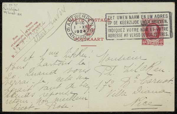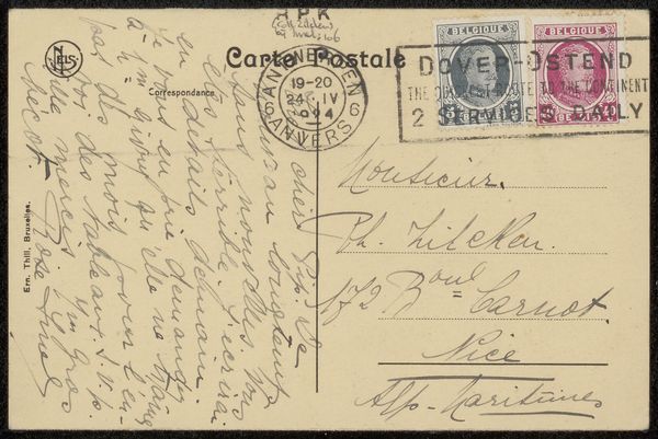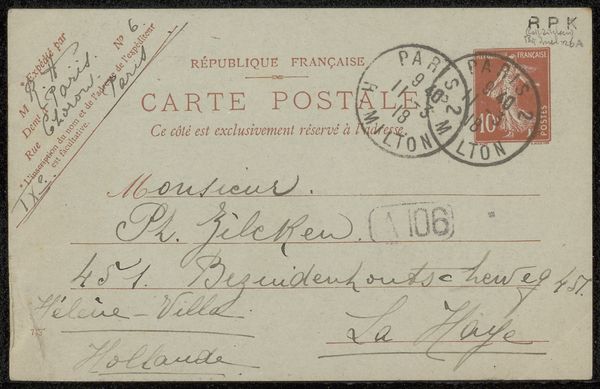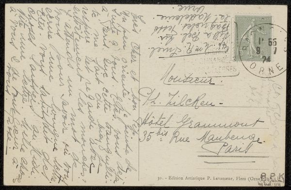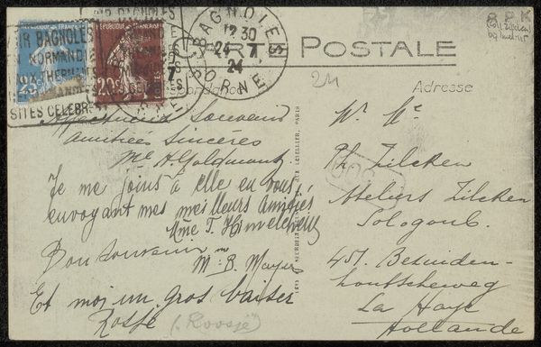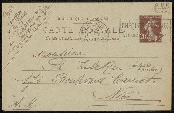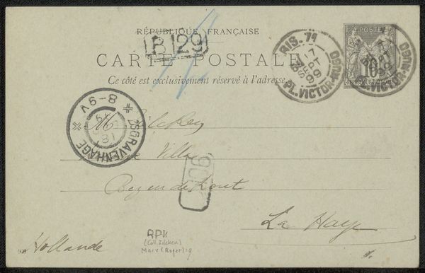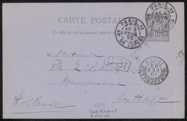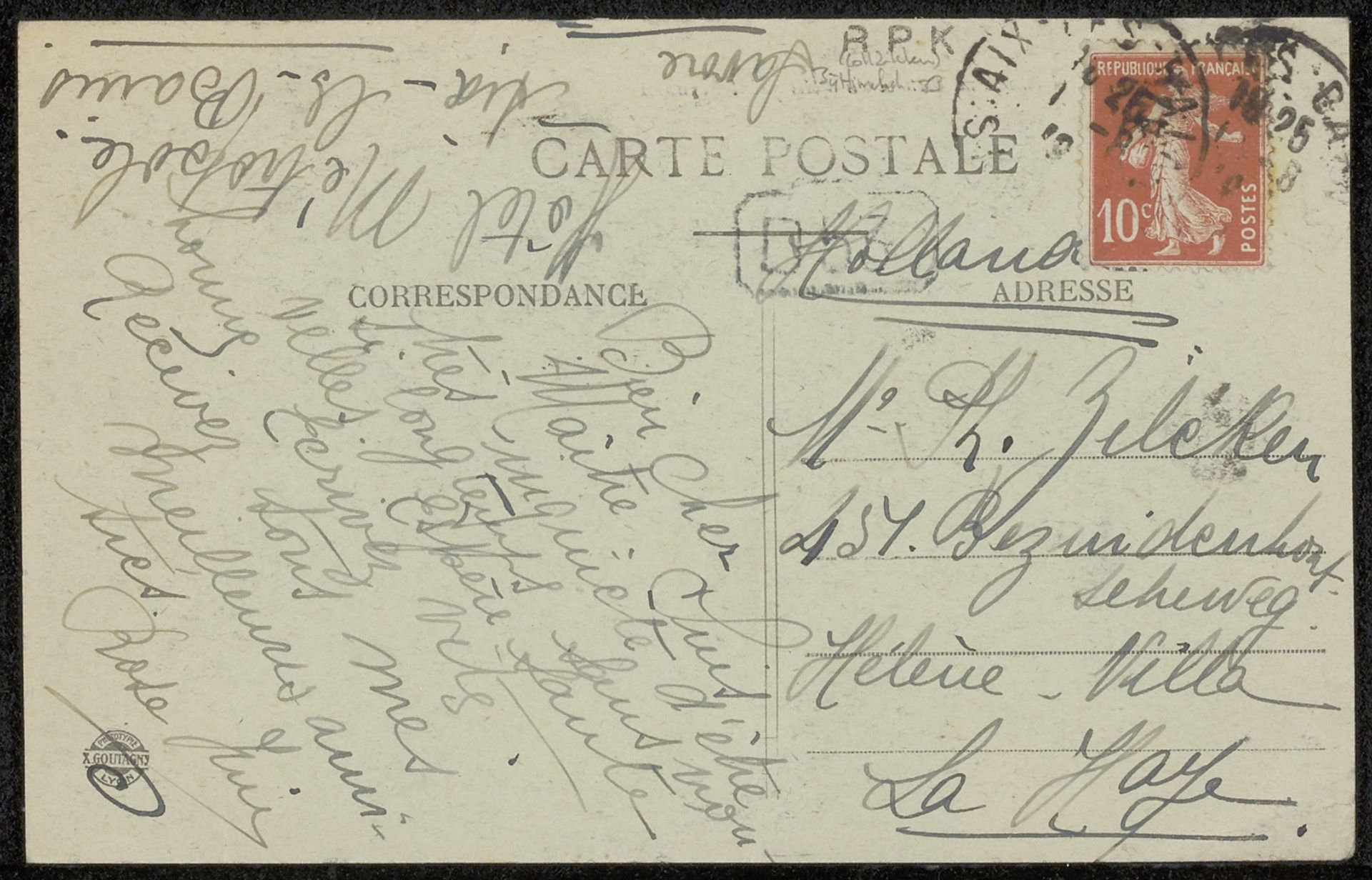
before 1919
Prentbriefkaart aan Philip Zilcken
Listen to curator's interpretation
Curatorial notes
Curator: Here we have a pen and paper drawing titled "Prentbriefkaart aan Philip Zilcken," which translates to postcard to Philip Zilcken. It was created before 1919. What's your immediate impression? Editor: It appears to be a handwritten postcard. I'm drawn to the cursive script and the way the fading ink creates this feeling of fragility. There's an intimacy conveyed through the varying pressure of the pen strokes on the paper. Curator: Absolutely, and considering it was crafted before 1919, its creation falls during the turbulent era of the first World War. Postcards like this one were instrumental forms of communication and maintaining social connections amidst great global change and social unrest. It becomes a fascinating artifact reflecting social interactions during a pivotal moment in history. Editor: I'm focusing on the formal arrangement of the text; it almost takes on an abstract quality when viewed apart from its textual purpose. Note how the script typography and small lettering complement each other, forming dynamic lines across the surface. Also notice the stamp! The deliberate placement of each textual element contributes to an interesting overall composition. Curator: Good point! You’ve touched on the aesthetic considerations involved, of course. Also consider the implications for global communication—even as conflict raged and empires collapsed. I’d even argue these delicate handwritten elements were small acts of resistance against the anonymity and brutalization of warfare, reaffirming individuality. Editor: Resistance, certainly. Looking at the hand-drawn typeface I imagine the slow, deliberate artistry to counteract this turmoil. The details of this particular kind of letter forming may give the viewer insight into popular typeface references of the period and could become clues for our understanding of typography in modern culture. Curator: In conclusion, we see how seemingly mundane objects like postcards served critical roles as communication and expressions of socio-political realities. Editor: And how careful visual study can open avenues into understanding the aesthetics and meaning of an individual artwork and maybe even art history in general.