drawing, paper, ink, pen
#
drawing
#
hand-lettering
#
ink paper printed
#
hand drawn type
#
hand lettering
#
paper
#
personal sketchbook
#
ink
#
hand-drawn typeface
#
fading type
#
pen work
#
sketchbook drawing
#
pen
#
sketchbook art
Copyright: Rijks Museum: Open Domain
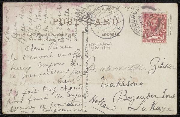
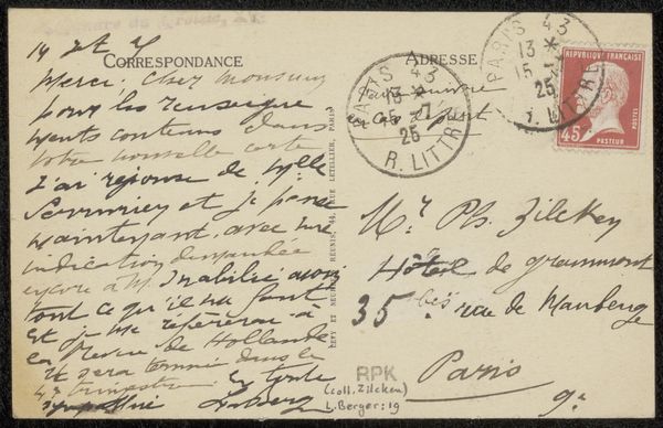
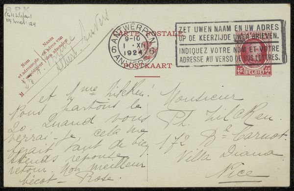
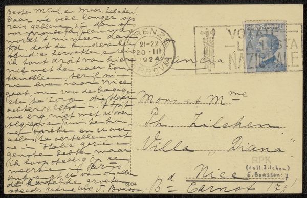
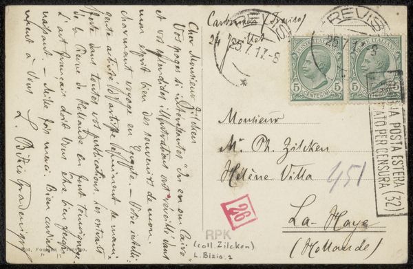
Editor: Here we have "Prentbriefkaart aan Philip Zilcken," a postcard to Philip Zilcken by H. Goldmuntz, created before 1927 using pen, ink, and paper. It feels very immediate and personal because of the handwritten text. What jumps out at you when you look at it? Curator: I’m struck by the contrasting textures created by the graphic elements on the left with the more calligraphic elements on the right. Notice how the stamps, with their standardized forms and regimented placement, create a sort of visual anchor. Editor: Yes, and then your eye travels to the handwriting that seems to flow freely, even carelessly, across the surface. Curator: Precisely. The juxtaposition between the mechanically reproduced postage and the artist's hand creates a fascinating tension. Consider the relationship of positive and negative space created through this. Observe how the density of ink varies, building different compositional weights. Do you perceive any structural divisions in the distribution of these markings? Editor: I see how the text almost creates a grid, broken by the stamps and circular postmark. Curator: Good. See how the handwriting weight shifts across the surface, becoming a sort of landscape in itself. The fading of the type adds another layer to consider, obscuring readability and shifting our focus toward form over semantic content. Editor: That’s a different way of looking at handwriting - as shape and form rather than just words. Thanks for pointing that out. Curator: Of course. It's a wonderful study in contrasts and subtle formal relationships, reminding us that even the most functional objects can reveal deeper aesthetic considerations when we focus on their intrinsic qualities.
Comments
No comments
Be the first to comment and join the conversation on the ultimate creative platform.
More like this