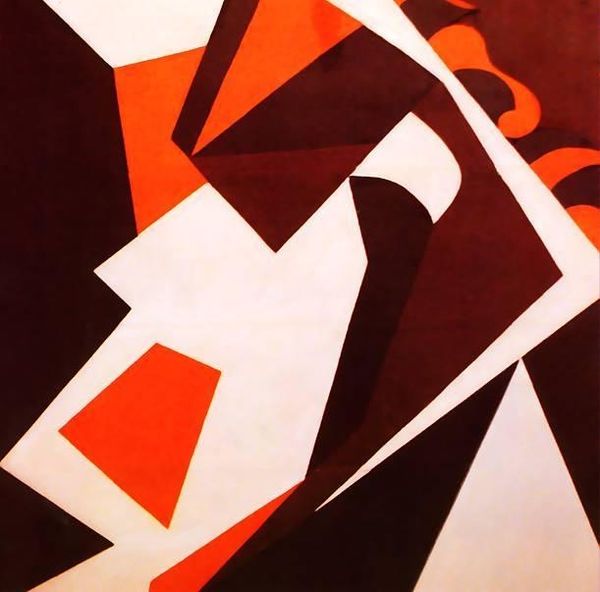
#
abstract-expressionism
# print
#
geometric
#
abstraction
#
line
#
modernism
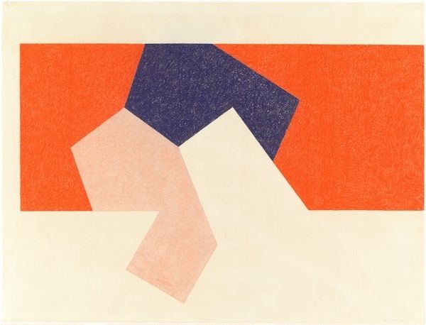
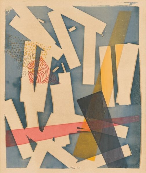
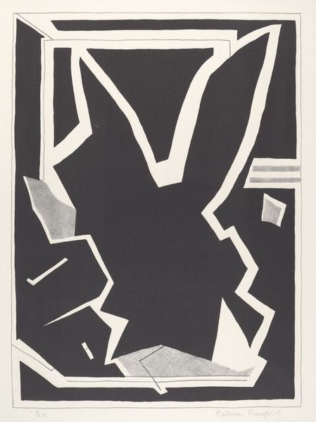
Dimensions: overall: 38 x 57 cm (14 15/16 x 22 7/16 in.)
Copyright: National Gallery of Art: CC0 1.0
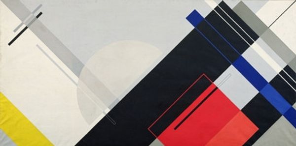
Curator: Immediately, what strikes me about this print, "Windows" by Ralston Crawford from 1957, is the confident angularity. The interplay of geometric forms in red, beige, white and black creates such an intriguing surface tension. Editor: It does. There’s a sort of industrial bleakness about it too, maybe a construction site seen from above, all steel girders and poured concrete catching the light. I wonder about the means through which Crawford realized this work? Curator: That's interesting, because, for me, I see something hopeful. The composition feels very considered, balanced between dynamism and stillness. There is almost an elegance in his simplification. Maybe he's pointing us to finding structure and beauty in the mundane of postwar American life. I'm just sort of musing here... Editor: Of course! That mundanity interests me, specifically regarding the processes through which mass manufacture shaped everyday materials of the era and also our collective aesthetic preferences, often prioritizing smooth, sleek surfaces over the complexities of something more artisanal. To what extent was abstraction here, achieved using what appears to be basic printing, itself becoming this agent in mass production and aestheticization of our relationship with industrialization? Curator: I see your point about Crawford potentially participating in this industrialization aesthetic, because if you examine it further, you notice how the print feels very clean and controlled, lacking the heavy textures and chaotic splatters of some of his contemporaries in the abstract expressionist movement. But then again, consider also that perhaps in his effort towards visual abstraction, he wanted a process that enabled a purer conveyance of the spirit – like an industrial tool capable of manifesting creative purity. I see him in the footsteps of someone like Mondrian. Editor: That is a nice twist on it. Although my personal inclination steers towards reading deeper into those links between his artistic processes and the cultural impact tied to industry—how art became more intertwined with daily existence during that epoch, both responding to, and actively influencing the modes through which the American public comprehended themes linked directly and indirectly to their social realities, for better or worse. Curator: True, these geometric shapes feel so much more direct in their social dialogue thanks to his chosen medium of mass-produced printmaking. A choice to speak to the culture as opposed to apart from it, perhaps? It definitely does invite considering. Editor: Right, and by analyzing how the materials shaped the final outcome, maybe we gain deeper insights not only into Crawford's choices but the socio-cultural landscape in the aftermath of the war. Curator: It does make the shapes jump off the paper, no doubt. Food for thought for sure! Editor: Absolutely, a little grist for the mill.
Comments
No comments
Be the first to comment and join the conversation on the ultimate creative platform.
More like this