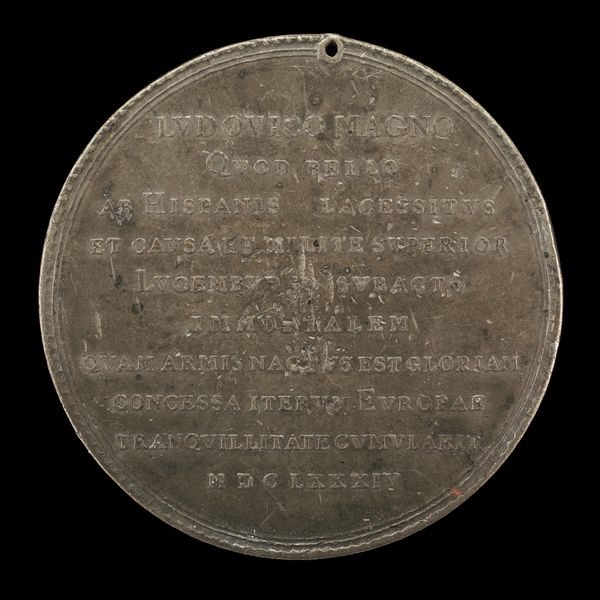
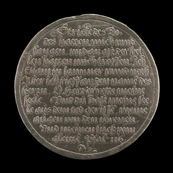
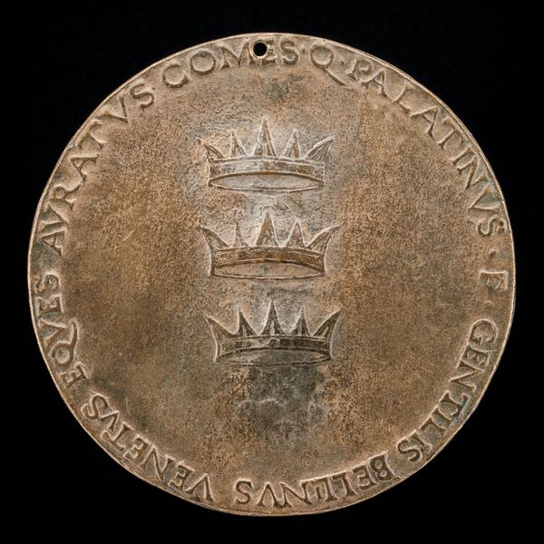
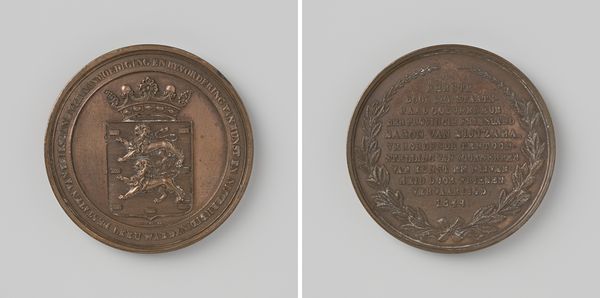
![Inscription [reverse] by B.C.V. Calker](/_next/image?url=https%3A%2F%2Fd2w8kbdekdi1gv.cloudfront.net%2FeyJidWNrZXQiOiAiYXJ0ZXJhLWltYWdlcy1idWNrZXQiLCAia2V5IjogImFydHdvcmtzLzcyNGU0YmVlLTk1NjUtNDYxOS1iZjNmLTk1ZDBiYWFmZmNlOC83MjRlNGJlZS05NTY1LTQ2MTktYmYzZi05NWQwYmFhZmZjZThfZnVsbC5qcGciLCAiZWRpdHMiOiB7InJlc2l6ZSI6IHsid2lkdGgiOiAxOTIwLCAiaGVpZ2h0IjogMTkyMCwgImZpdCI6ICJpbnNpZGUifX19&w=3840&q=75)
silver, relief, sculpture, engraving
#
silver
#
sculpture
#
relief
#
sculpture
#
engraving
#
historical font
Dimensions: overall (diameter): 4.39 cm (1 3/4 in.) gross weight: 23.28 gr (0.051 lb.) axis: 12:00
Copyright: National Gallery of Art: CC0 1.0
Editor: Here we have "Inscription [reverse]", a silver relief engraving by B.C.V. Calker, created in 1782. It has such a cool, formal quality with all that lettering! How should we approach this piece? Curator: Note the careful arrangement of the text, Editor. The artist uses varied line lengths to create a subtly shaped mass within the circle. How does that structured layout influence your understanding? Editor: I suppose it does lend itself to the formal tone. So the arrangement is a key feature… and the artist made that choice very deliberately? Curator: Precisely! Observe the density of the text and the considered use of negative space around the edges. What about the relationship between the text and the coat-of-arms at the top? Editor: That creates a nice visual hierarchy, separating the symbolic element from the factual inscription. It also seems like the crown floats a bit… Curator: Indeed. Notice how the engraver uses line and texture to create the illusion of depth, even in this relatively shallow relief. The precision contributes to its symbolic weight, wouldn’t you agree? Editor: It does. Thinking about the line work makes me appreciate the craft more than just reading the text. It’s more than just words; it’s a carefully constructed object. I never really thought about that! Curator: Focusing on these structural aspects allows us to look past immediate subject matter and to really examine its presence. A coin's form reflects the intentions of the work, Editor! Editor: I learned to appreciate the piece's texture and formal qualities rather than just its literal meaning. Thanks!
Comments
No comments
Be the first to comment and join the conversation on the ultimate creative platform.
More like this