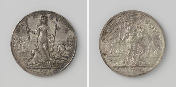
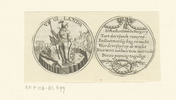
Penning met portretten van Willem III, prins van Oranje, en Lodewijk XIV, koning van Frankrijk 1688 - 1749
0:00
0:00
anonymous
Rijksmuseum
#
pencil drawn
#
toned paper
#
light pencil work
#
pencil sketch
#
old engraving style
#
personal sketchbook
#
pen-ink sketch
#
sketchbook drawing
#
pencil work
#
sketchbook art
Copyright: Rijks Museum: Open Domain
Editor: This is "Penning met portretten van Willem III, prins van Oranje, en Lodewijk XIV, koning van Frankrijk," created sometime between 1688 and 1749 by an anonymous artist. It's at the Rijksmuseum. The medium looks like pen and ink on toned paper. The twin portrait medallions have this stark, oppositional feel; almost like emblems of competing ideologies. What strikes you first about this piece? Curator: Initially, my focus is drawn to the formal arrangement of the composition. Notice how the circular format dictates the enclosed space, creating two distinct, self-contained worlds. We see the deliberate use of line – the delicate hatching creating volume and texture. Do you observe the stark contrast in the application of light and shadow within each medallion? Editor: Yes, the left one feels lighter, more open, whereas the right one is darker and more constrained. The line work in the depiction of Louis XIV is also much busier. Curator: Precisely. This visual dichotomy underscores the thematic contrast: Willem, rendered with clean, confident lines, embodies liberation. Consider how his figure dominates his space, holding symbols of power. Conversely, Louis is depicted as burdened, the lines around him contributing to a sense of oppression. The composition invites a reading of contrasting principles through visual means. Editor: It's interesting how the artist uses formal elements to suggest those character traits. It moves beyond just portraiture. What do you make of the objects included? Curator: Each element—the globe under Willem's foot, the burning city beside Louis—serves a symbolic function within its respective compositional sphere. They augment the central theme, which can be deduced by attending to those stylistic features and their arrangements, inviting the viewer to interpret the relationship between power and governance through the arrangement and execution of each vignette. Editor: So by focusing on line, light, and form, we can actually start to decode a visual argument made by the artist, even without knowing much historical context? I found this very enlightening. Curator: Precisely! The artwork speaks through its intrinsic visual language. Understanding that is its own reward.
Comments
No comments
Be the first to comment and join the conversation on the ultimate creative platform.
More like this