#
neo-pop
Copyright: Modern Artists: Artvee
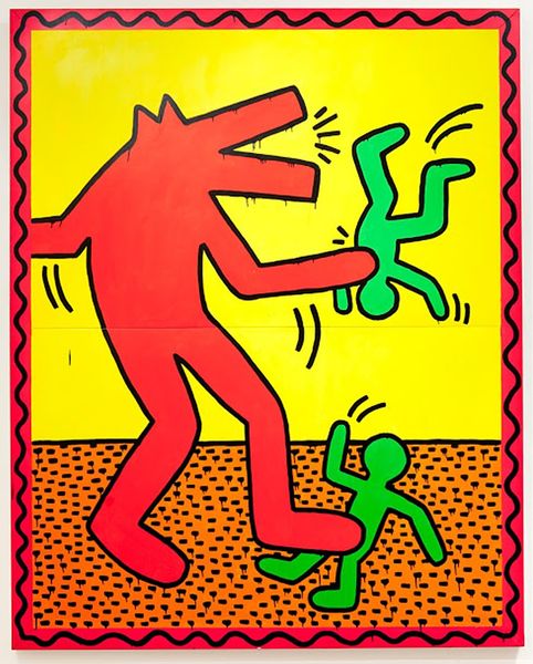
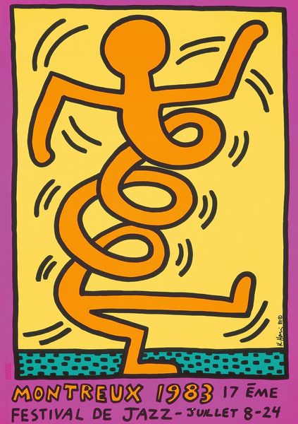
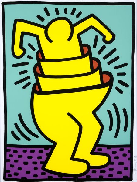
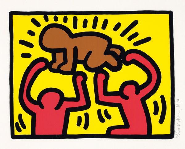
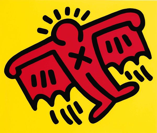
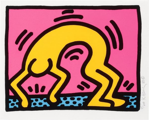
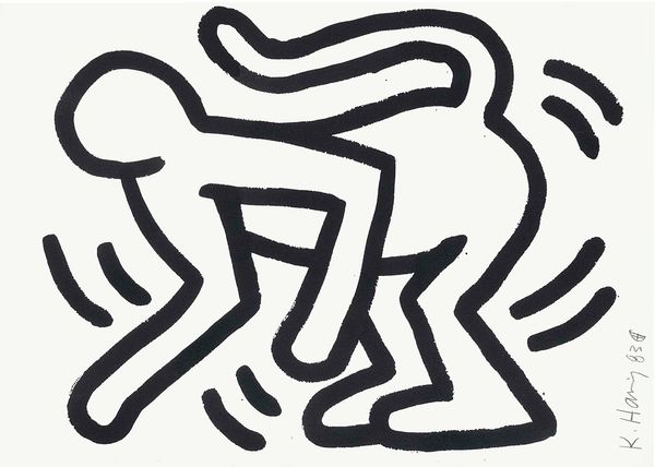
Keith Haring made Growing #1, sometime in the eighties, with screen printing. It’s all about simple shapes, right? The figures, stacked on top of each other, outlined in a bold graphic style. For Haring it was about getting the idea across, communicating directly and immediately with his audience. The colours are flat and bright – a pure yellow background setting off the fire engine red of the figures. There’s something very bodily about this, the sense of bodies squashed together. You can see the influence of street art and graffiti art in the way the shapes are simplified, all sharp angles. Look at those small dashes around the figure at the top – an echo of a sunburst and an aura of energy. Haring’s work always makes me think about the art of Jean-Michel Basquiat. Both artists shared a similar energy. They also prove that art can be fun and serious at the same time.
