#
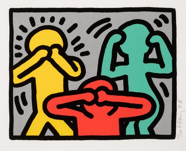
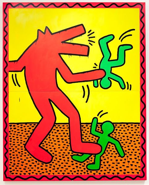
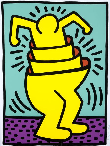
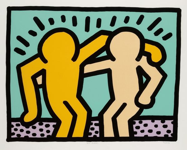
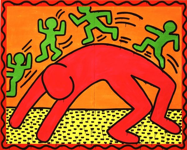
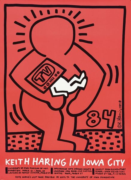
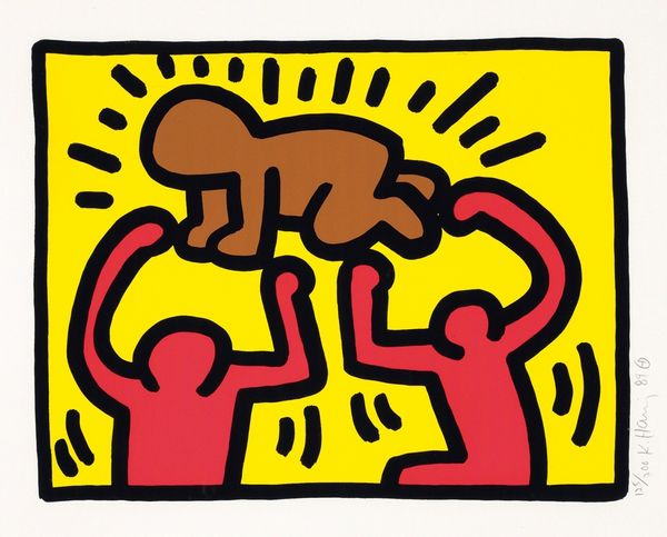
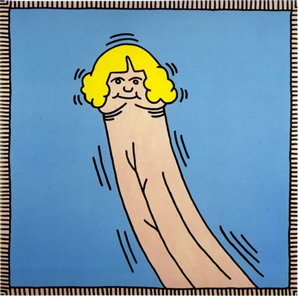
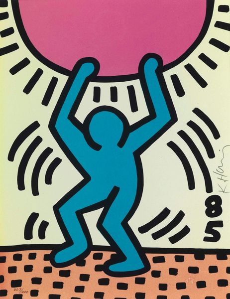
neo-pop
Copyright: Keith Haring,Fair Use
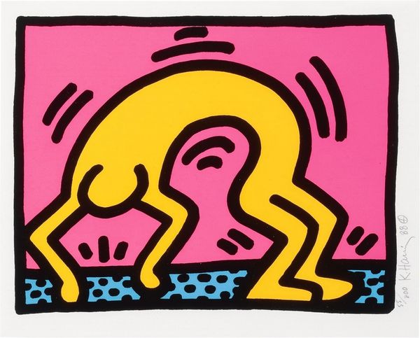
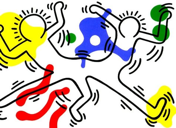
Keith Haring made this print, Pop Shop III, with screen printing using flat blocks of color. There are no gradients here. It’s all about that bold outline. Look at the way the yellow figure is rendered, bent double, almost merging with the machine. Haring's lines have this amazing quality. They’re so simple, so immediate, yet they manage to convey this whole sense of movement and energy. You can almost feel the rhythm of the city in them. It’s like he’s captured the essence of a moment with just a few strokes. What strikes me most is the dialogue, or maybe conflict, between the human and the technological. Is the figure worshipping the machine or being crushed by it? Haring's work reminds me a bit of Léger, both artists using this pared-down, almost robotic aesthetic. It is up to us to decide which interpretation is correct, maybe both, maybe neither!
Comments
No comments
Be the first to comment and join the conversation on the ultimate creative platform.
More like this