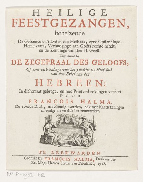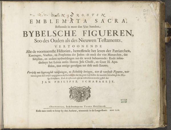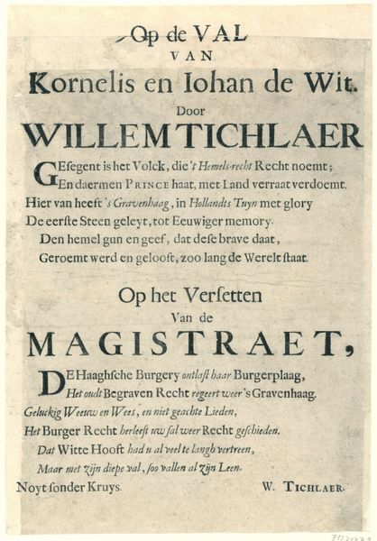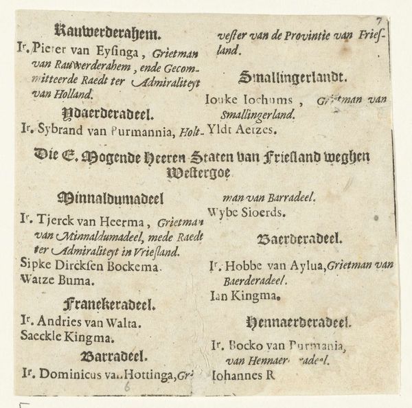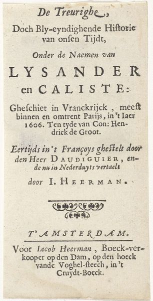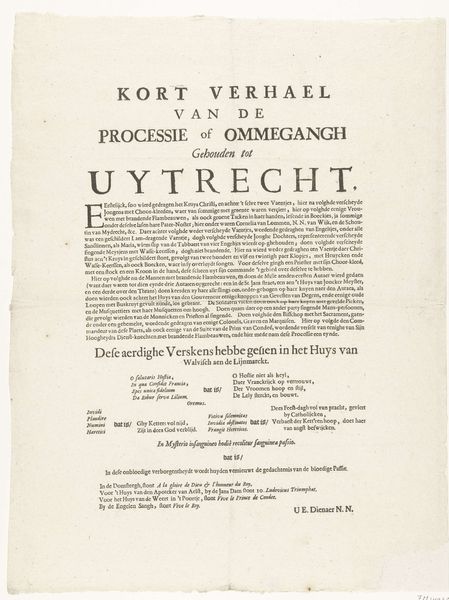
Titelpagina voor: Eduard Meiners, Kort ontwerp van de lere der waarheit of de Oostvriesche catechismus, 1740 1740
0:00
0:00
anonymous
Rijksmuseum
graphic-art, print, typography
#
graphic-art
#
aged paper
#
hand-lettering
#
baroque
# print
#
hand drawn type
#
typography
#
hand-drawn typeface
#
fading type
#
stylized text
#
thick font
#
handwritten font
#
historical font
#
columned text
Dimensions: height 196 mm, width 153 mm
Copyright: Rijks Museum: Open Domain
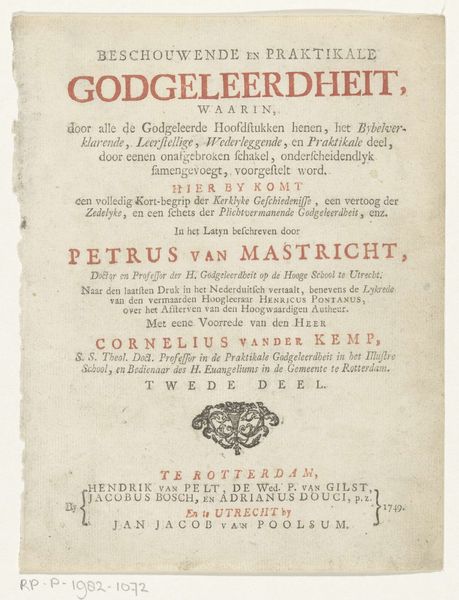
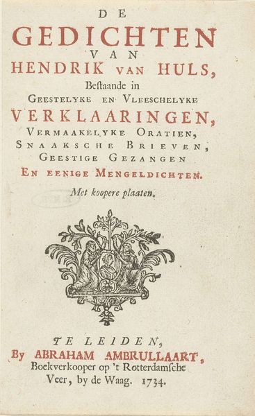
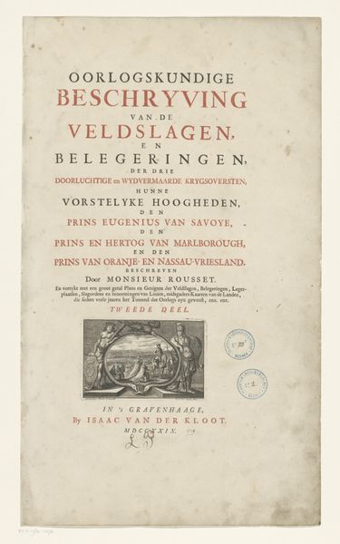
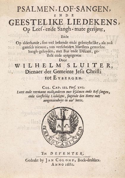
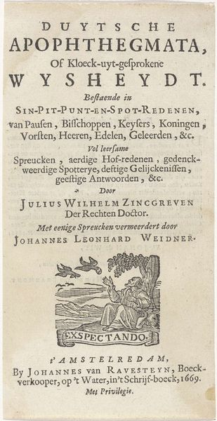
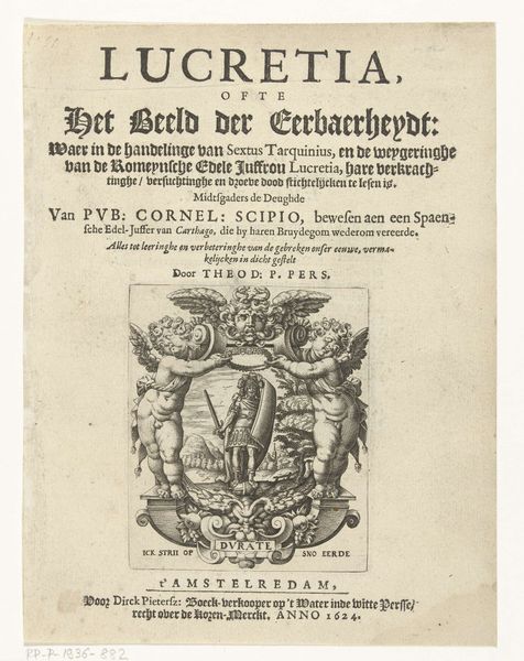
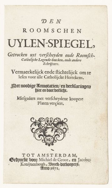
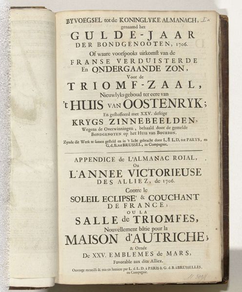
Curator: Here we have a title page from 1740, "Kort Ontwerp van de Lere der Waarheit of de Oostvriesche Catechismus" - "Short Design of the Teaching of Truth or the East Frisian Catechism." Editor: My eye is immediately drawn to the textures. There’s the obvious age of the paper, its discoloration...but then within the print itself, such intentional layering. Bold titles, delicate descriptions, it creates such a complex visual rhythm. Curator: Absolutely. Its existence provides insight into the religious and cultural landscape of 18th-century East Friesland. Consider its role as a tool for disseminating religious doctrine within a specific community, reflective of local printing practices and distribution networks. Editor: Note how the weight of the letters, the bold sans-serifs contrast the lower text sections. The hand-drawn type emphasizes verticality and seems to embody the serious and elevated themes suggested within the text itself. The design almost performs the act of solemn instruction. Curator: And look at the printer's device. The presence of Luito Blank, book printer and seller in Emden tells us something about the provincial book trade at the time. These kinds of prints were fundamental in spreading reformation ideals across the region. Editor: The fading ink also tells a story of use and time passing. See how the delicate, smaller fonts beneath the striking title have degraded so that each imperfection now forms a key aspect of our viewing experience? The materiality of the text reflects and anticipates its themes of spirituality and morality. Curator: Yes, it allows a glimpse into the world of religious instruction, publishing practices, and societal values prevalent at the time. These visual cues provide narratives and reinforce existing socio-cultural systems. Editor: For me, this isn't just text; it’s a compelling piece of abstract art using fonts as brushstrokes. There's such personality rendered on what appears to be aged paper with beautiful inconsistencies in lettering, almost reminiscent of musical notation. Curator: Indeed. Approaching historical printed matter allows us to reflect upon how knowledge and belief were constructed and disseminated within past social formations. Editor: Well, I’ve definitely found myself drawn into considering how even simple print can function as both informative text and a uniquely stylized aesthetic object.
Comments
No comments
Be the first to comment and join the conversation on the ultimate creative platform.
