drawing, ink, pen
#
drawing
#
hand-lettering
#
old engraving style
#
hand drawn type
#
personal sketchbook
#
ink
#
hand-drawn typeface
#
ink drawing experimentation
#
pen-ink sketch
#
pen work
#
sketchbook drawing
#
pen
#
sketchbook art
#
calligraphy
Copyright: Rijks Museum: Open Domain
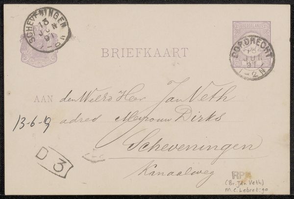
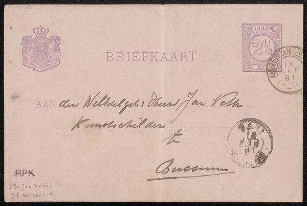
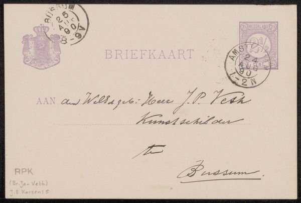
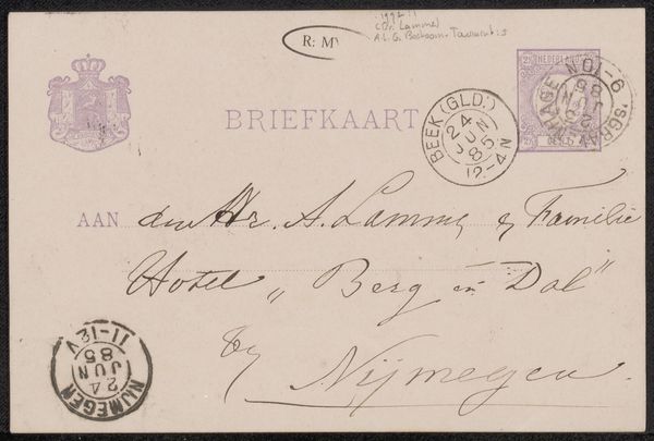
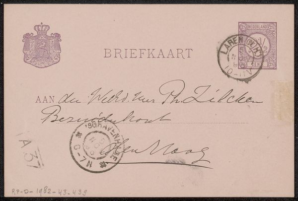
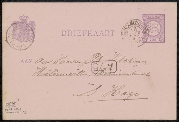
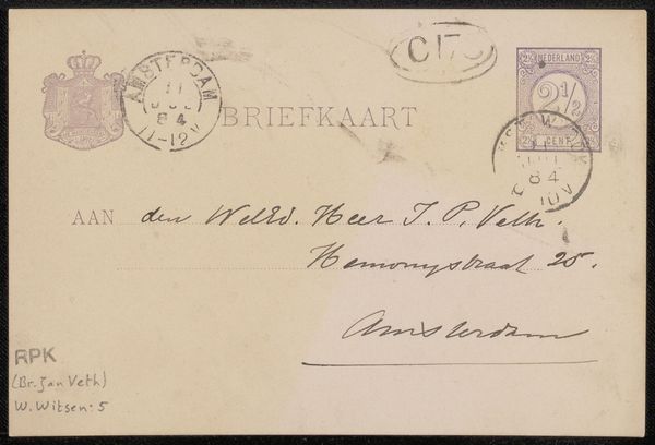
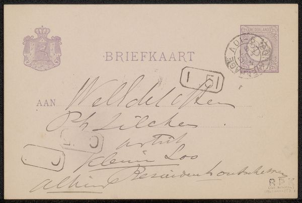
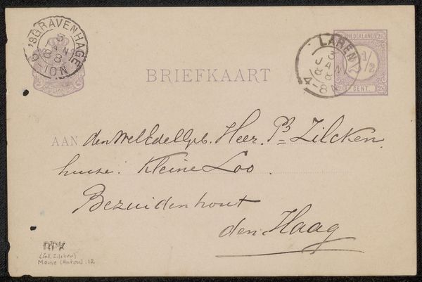
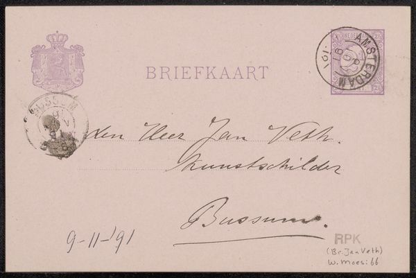
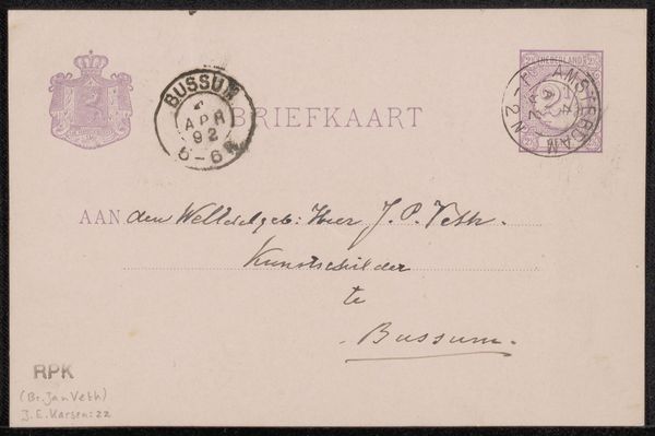
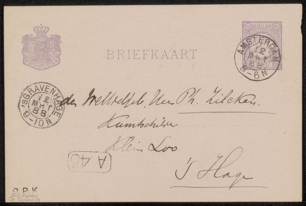
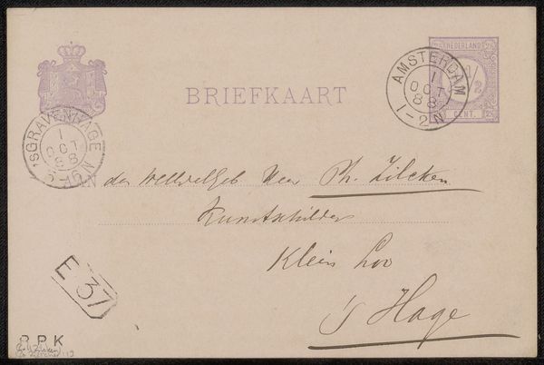
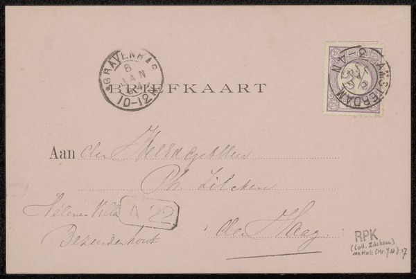
Curator: Here we have "Briefkaart aan Philip Zilcken," a pen and ink drawing that dates from around 1890-1891, created by Tony Lodewijk George Offermans. Editor: The immediate impression is quite delicate and functional. It's intriguing how the beauty lies in its purpose; it clearly was meant for practical communication. Curator: Indeed, the historical and social context of correspondence during that time really informs the understanding of this artwork. It exists at the intersection of personal communication and formal postal systems. Consider the labor involved – both in creating the paper and in the act of handwriting this missive. Editor: Absolutely. And the materiality – the paper itself, the ink – all products of specific industrial processes. The quality of the paper, the type of ink, they speak to resources available at that moment in history, dictating access to communications based on class and material conditions. What strikes you first, though? Curator: For me, it's the handwriting as a cultural artifact. It's a beautiful script reflecting the writer's education and social standing, a reflection of cultivated expression through standardized form, and hints at power structures that prioritized a certain visual literacy. It’s really an early form of graphic design, communicating ideas. Editor: I agree, seeing the stamp and postmark elevates it from personal artifact to evidence of a wider material network; systems of transport, postal workers’ labour and governmental bodies all enabled this interaction between people. What do you believe this tells us? Curator: It tells us that accessing networks of communication held political weight and this shows, in the fine materials of this small object, a world of cultural identity is constructed through the everyday technologies available at the time. It hints towards the labor behind such communications too, doesn't it? Editor: Without a doubt. The contrast between the mass-produced components—paper, ink, the postal system itself—and the handcrafted aspect of the calligraphy creates an interesting tension. The individual’s personal mark within a larger societal machine. I come away thinking this image represents what can occur if you allow artistic creativity into the common tools of communications; art need not necessarily remain on the walls!
Comments
No comments
Be the first to comment and join the conversation on the ultimate creative platform.
More like this