drawing, graphic-art, print, paper, ink, pen
#
drawing
#
graphic-art
# print
#
pen sketch
#
hand drawn type
#
paper
#
personal sketchbook
#
ink
#
hand-drawn typeface
#
ink drawing experimentation
#
pen-ink sketch
#
pen work
#
sketchbook drawing
#
pen
#
storyboard and sketchbook work
#
sketchbook art
#
calligraphy
Copyright: Rijks Museum: Open Domain
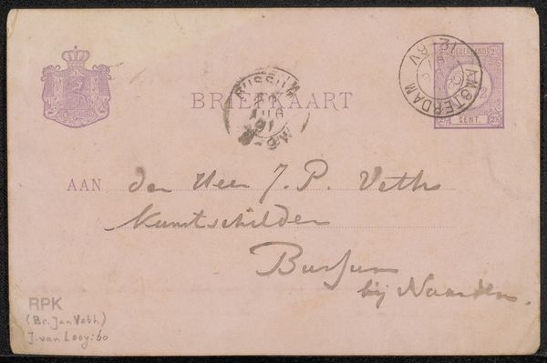
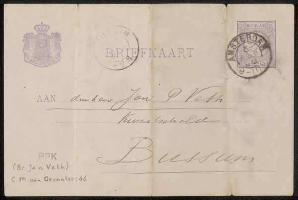
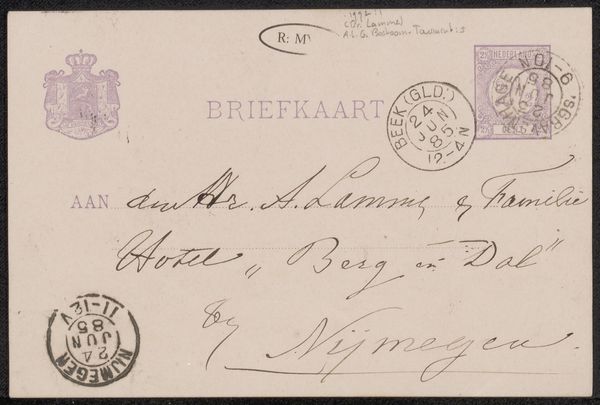
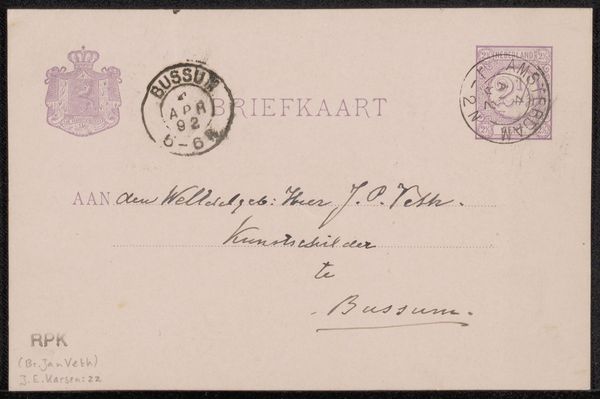
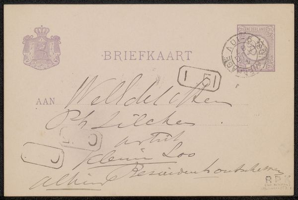
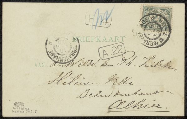
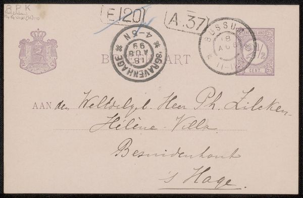
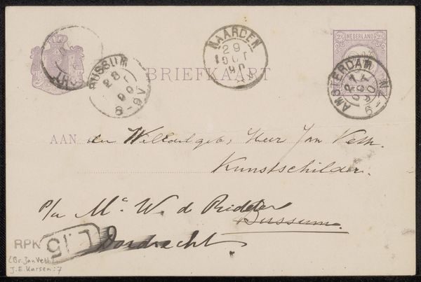
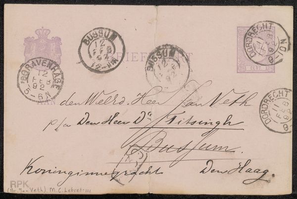
Curator: There's something deeply moving about seeing art history raw, isn't there? This unassuming item is "Briefkaart aan Jan Veth," thought to be created sometime between 1890 and 1899 by Chap van Deventer. It’s ink on paper. Editor: My first impression is one of faded intimacy. The casual, almost ephemeral nature of a postcard coupled with the formality of addressing someone… It feels like peering into a private world. The handwriting is beautiful but hurried. Curator: Precisely! Van Deventer’s graphic art here transcends mere correspondence. The postcard itself, destined for artist Jan Veth, becomes a canvas for expressive calligraphy and pen-ink experimentation. Note the stamp and seals: official markers turned into visual texture. The postal system wasn't just a delivery service, but an institution interwoven into daily life, right? Editor: Absolutely. And seeing Veth identified as "Kunstschilder" or artist, adds a layer of professional respect into what could be a simple, informal communication. But what I find striking is the blurring between functional design and artistic intent. Are these expressive flourishes or just quick penmanship? I love that ambiguity. It reminds me of artists using everyday materials to disrupt the preciousness around 'art.' Curator: The fact it has survived suggests it was appreciated by its receiver and subsequently preserved. Van Deventer clearly plays with the visual weight of language, turning mundane address into a delicate composition with his selection of various handwritten fonts, the text nearly dances on the card. Each character tells a story of cultural institutions, postal history, personal connection and artistry combined. It makes one think: Was this "just" a quick missive or was it intended, consciously or not, as a portable piece of art? Editor: The penwork is striking and quite skilled—a practiced hand experimenting with strokes and embellishments that feel very modern even now. There is something about receiving such correspondence by hand—it carries a much different meaning than electronic or printed material. Curator: Exactly. And to ponder that this tangible piece carries a slice of the fin-de-siecle aesthetic while reflecting on art's very grounding, functional beginnings through pen and ink sketches; it resonates powerfully. Editor: Yes, an unexpectedly rich slice of history disguised as everyday communication, hinting that, ultimately, even a humble postcard can become a revealing artifact.
Comments
No comments
Be the first to comment and join the conversation on the ultimate creative platform.
More like this