About this artwork
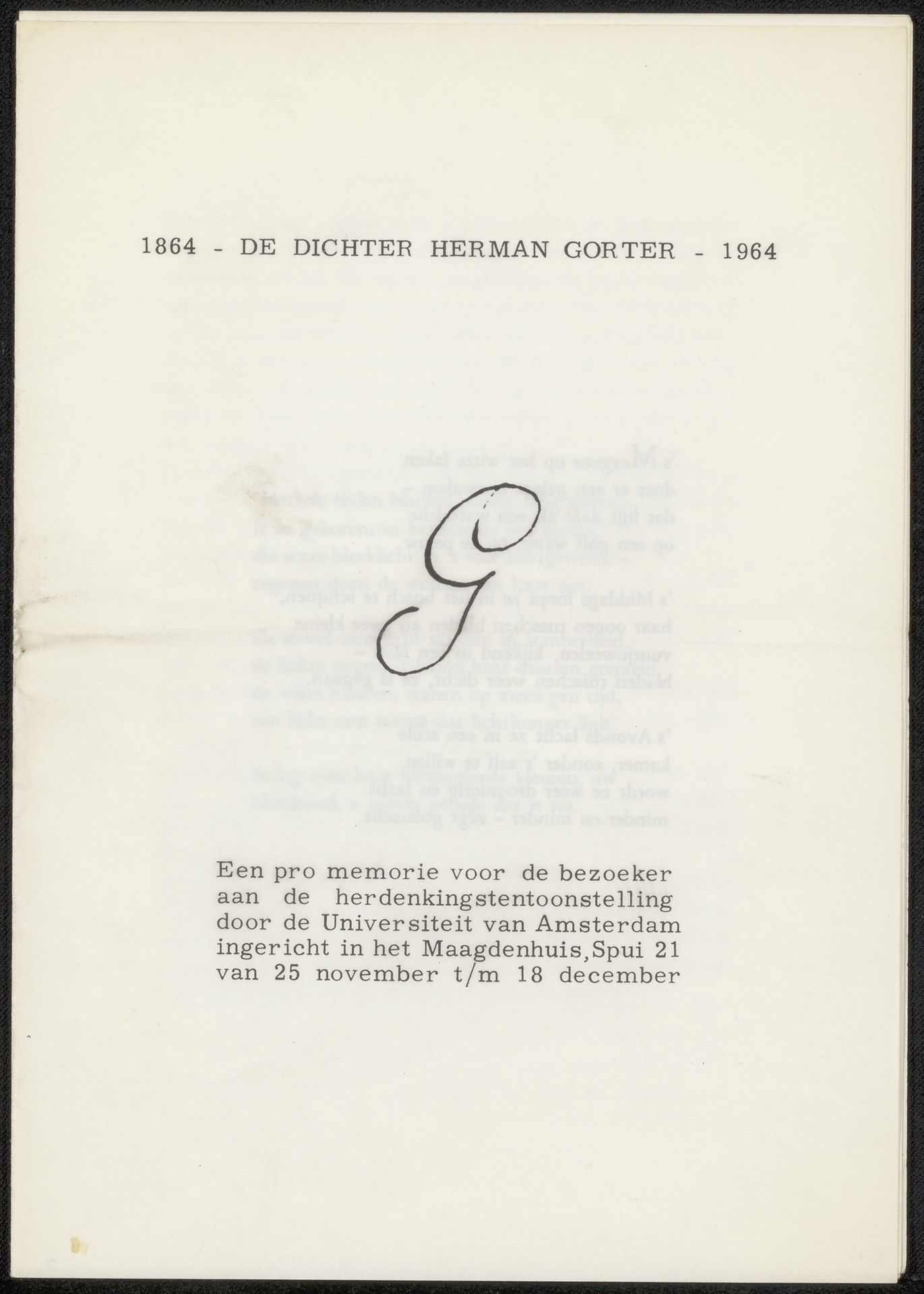
This is a flyer, made in 1964 in memory of Herman Gorter, perhaps with ink on paper. I love the simplicity of the design, how the mark making feels like a process, like something discovered. The large, calligraphic 'G' dominates the composition, its curving lines creating a sense of movement and flow. The ink looks almost translucent in its application, its effect is light, as though the letter is floating. The rest of the text is printed, neat and functional, anchoring the handwritten letter like a caption. The paper itself is a pale, creamy colour, adding to the overall feeling of warmth and intimacy. There is something so pure about it's presence, it is a quiet yet powerful expression of remembrance. Thinking about this piece, I am reminded of Cy Twombly, who also used text and handwriting in his paintings. Both artists embrace ambiguity, inviting us to bring our own associations and interpretations to the work.
Artwork details
- Medium
- drawing, graphic-art, textile, paper, ink
- Location
- Rijksmuseum
- Copyright
- Rijks Museum: Open Domain
Tags
Comments
Share your thoughts
About this artwork
This is a flyer, made in 1964 in memory of Herman Gorter, perhaps with ink on paper. I love the simplicity of the design, how the mark making feels like a process, like something discovered. The large, calligraphic 'G' dominates the composition, its curving lines creating a sense of movement and flow. The ink looks almost translucent in its application, its effect is light, as though the letter is floating. The rest of the text is printed, neat and functional, anchoring the handwritten letter like a caption. The paper itself is a pale, creamy colour, adding to the overall feeling of warmth and intimacy. There is something so pure about it's presence, it is a quiet yet powerful expression of remembrance. Thinking about this piece, I am reminded of Cy Twombly, who also used text and handwriting in his paintings. Both artists embrace ambiguity, inviting us to bring our own associations and interpretations to the work.
Comments
Share your thoughts