drawing, print, textile, paper, typography
#
drawing
# print
#
textile
#
paper
#
typography
#
letter
Copyright: Rijks Museum: Open Domain
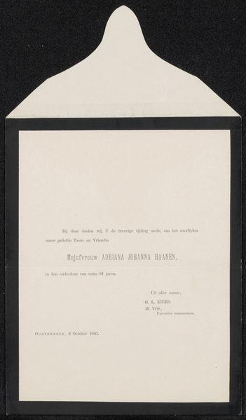
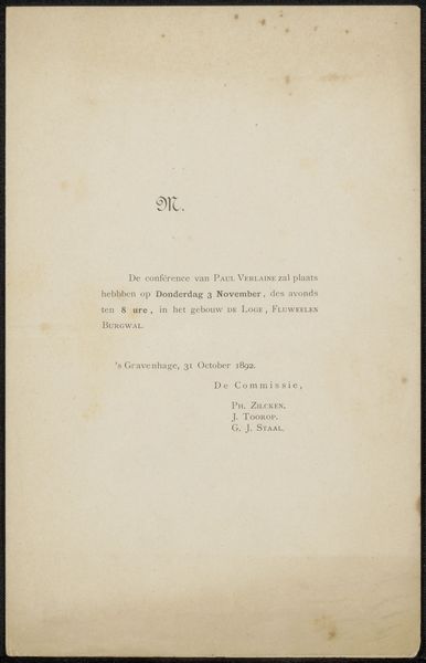
This unassuming notice, likely created in 1880, presents us with more than just a somber announcement; it is a study in structure and societal codes. The stark contrast between the black frame and the pale paper immediately draws the eye. The text, meticulously typeset, is arranged in a hierarchical order: the formal announcement, the name of the deceased, his titles, and then the bereaved. The typography and the layout combine to create a visual representation of societal order and respect. The choice of font, likely a traditional serif, speaks to an era valuing formality and decorum. But what happens when we consider the absent information? There is no elaboration on the life lived, no personal anecdotes – just the bare facts and titles. This absence itself speaks volumes, highlighting a society where one's position often overshadowed individual expression. Consider how this formal presentation both reflects and reinforces power structures, inviting us to question the values that dictate such representations of loss.
Comments
No comments
Be the first to comment and join the conversation on the ultimate creative platform.
More like this