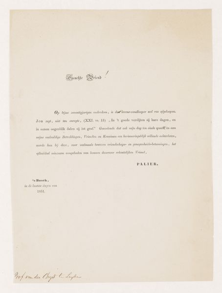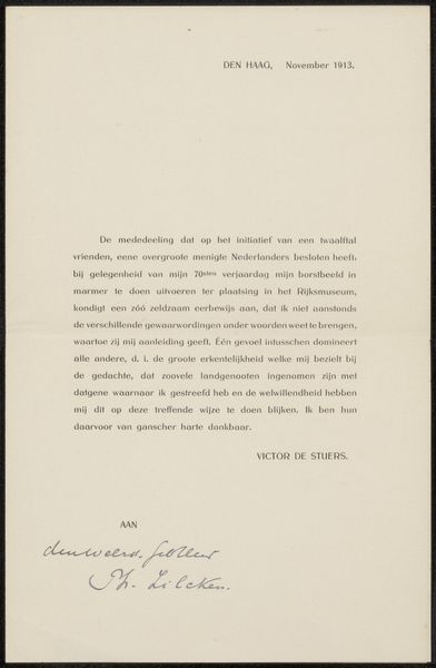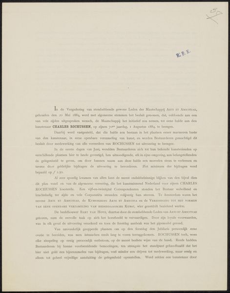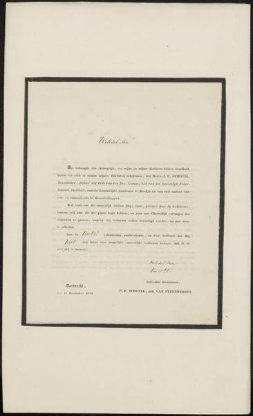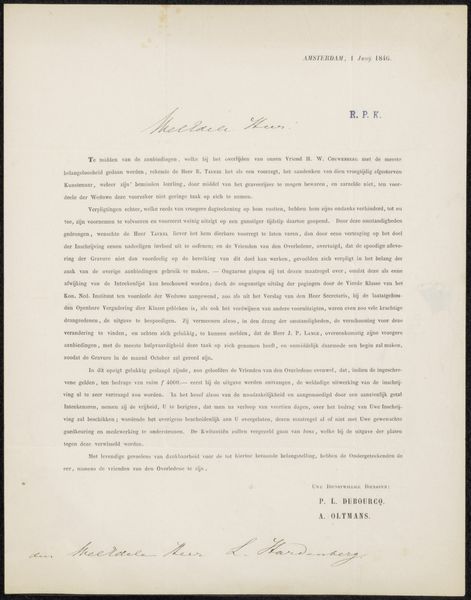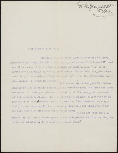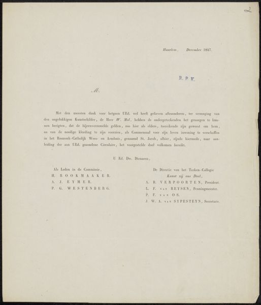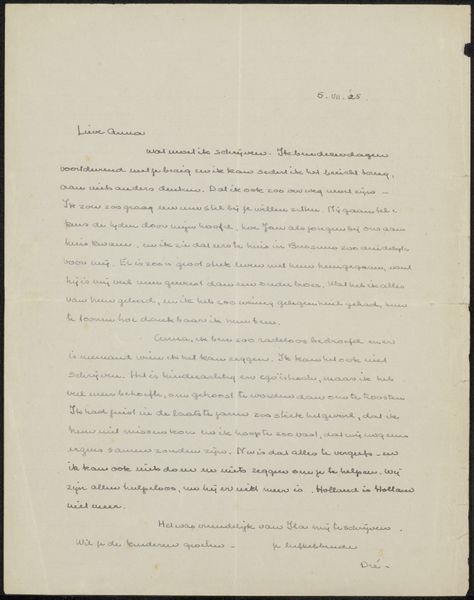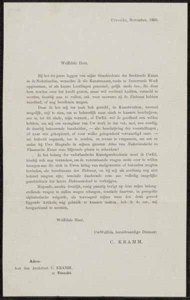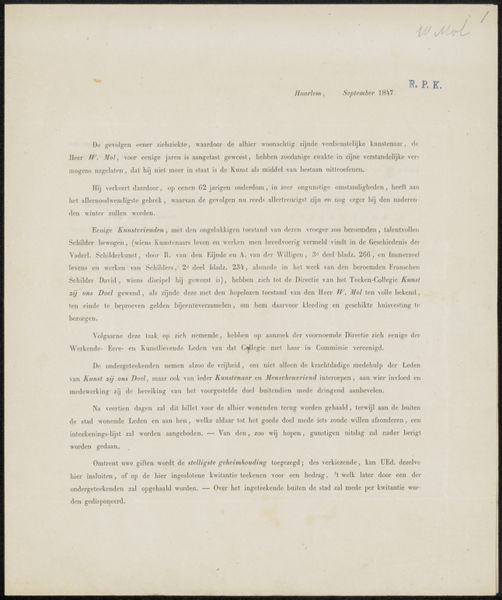
Brief aan de gewone leden en buitenleden van Arti et Amicitiae Possibly 1853 - 1859
0:00
0:00
artietamicitiae
Rijksmuseum
graphic-art, print, paper, typography
#
graphic-art
# print
#
paper
#
typography
Copyright: Rijks Museum: Open Domain
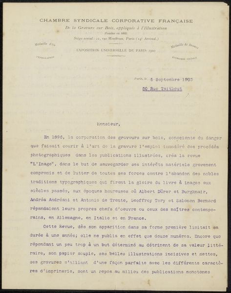
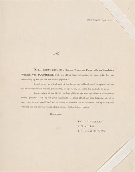
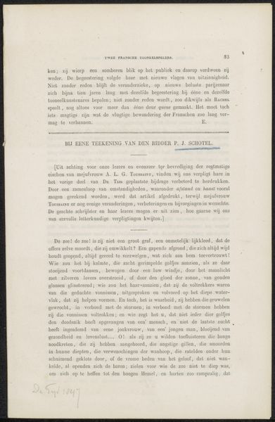
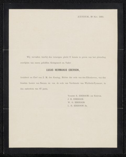
This is "Brief aan de gewone leden en buitenleden van Arti et Amicitiae", created in 1852 by Arti et Amicitiae. It's a printed letter, defined by the contrast between the dark ink and the pale paper. The text, arranged in neat blocks, creates a visual rhythm across the page. The composition emphasizes a structured hierarchy. Notice how the title is centrally placed, acting as a focal point, while the body of the letter is justified, giving it a formal, almost bureaucratic appearance. This use of form suggests an attempt to impose order and clarity through visual design. The letter's function as a means of communication destabilizes our conventional idea of art. It questions the boundaries between artistic expression and everyday communication. The formal arrangement of the text can be seen as a sign of authority and institutional control, reflecting the power structures inherent in language and communication. The structured layout and careful typography serve not just a functional purpose but also convey a specific message about order, authority, and institutional identity. It's a reminder that even the most functional objects can be analyzed for their aesthetic and communicative properties.
Comments
No comments
Be the first to comment and join the conversation on the ultimate creative platform.
