Copyright: Rijks Museum: Open Domain
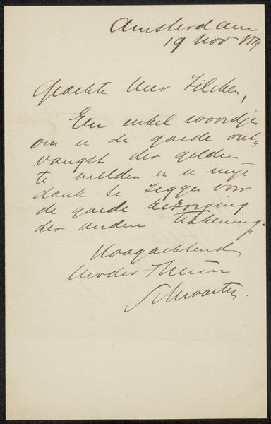
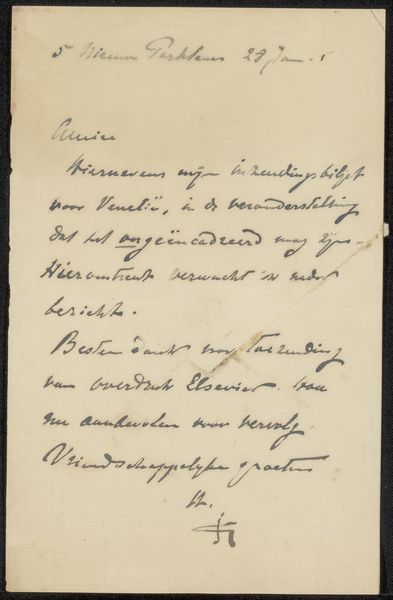
Editor: Here we have "Brief aan Philip Zilcken," potentially from 1901 to 1909, created by Jan Voerman. It's a handwritten letter in ink on paper. There's something incredibly intimate about seeing someone's personal correspondence like this. How would you approach an analysis of its intrinsic artistic value? Curator: Note how Voerman orchestrates visual hierarchy through varying the density and weight of his script. Ascenders and descenders are given space to breathe, allowing legibility. The signature is set apart by flourishing lines that provide a subtle aesthetic emphasis, a characteristic signature, wouldn’t you agree? The materiality contributes as much, though. Editor: So you're saying it’s the rhythm and variation in the lettering that carries visual weight, and the signature punctuates it? Does the somewhat uneven texture of the paper factor into the romantic feel, or would the artwork stand regardless? Curator: Precisely. Consider the negative space surrounding the text itself—it defines and accentuates the graphic qualities, creating visual balance despite the non-standard arrangement. The visible ageing and possible imperfection on paper and ink lends historical gravity and human vulnerability. Voerman seems uninterested to write like one of calligraphers from previous periods, like Jan van den Velde for example. In fact, his choice could serve an anti-academic statement against classical writing, since the Romantics saw individualism in this form as inherently sincere. Editor: Interesting. I never thought of handwriting that way before. Thank you! Curator: My pleasure. It’s this dance between textual content and visual form that reveals Voerman’s true mastery and intention. It is like staring into soul!
Comments
No comments
Be the first to comment and join the conversation on the ultimate creative platform.
More like this