Copyright: Rijks Museum: Open Domain
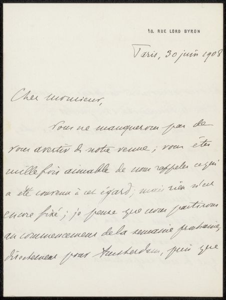
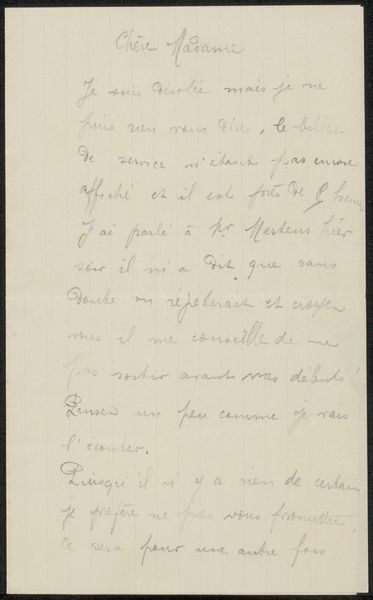
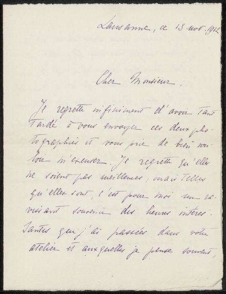
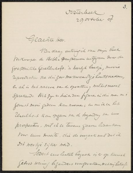
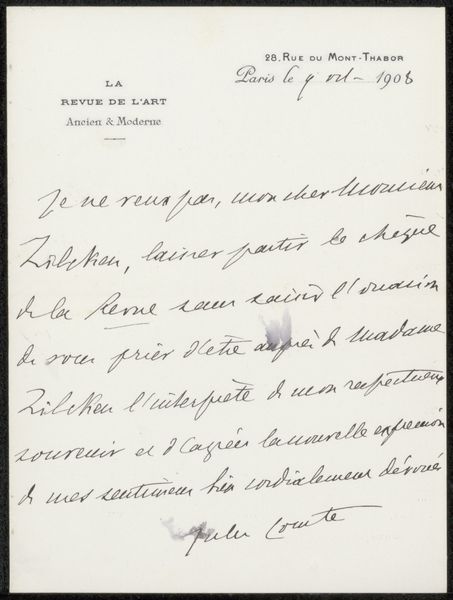
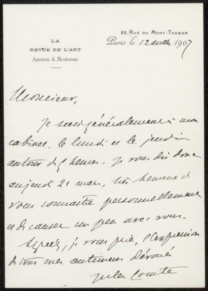
Curator: Here we have Jules Comte’s “Brief aan Philip Zilcken,” possibly from 1908. It's ink on paper, an intimate glimpse into the artist’s world. Editor: Intimate is right. The cursive script creates a sense of closeness, a whispered secret. It feels melancholic somehow, like a message filled with missed connections. Curator: Absolutely. Consider the Romanticism inherent in that cursive; Comte captures an almost feverish energy. The visual weight of the script gives the letter itself a unique power, more akin to art than simple communication. It’s a reflection of Romanticism’s emphasis on individual expression, which directly informed the style of calligraphy apparent in the note. Editor: So, it’s a functional object that transcends its function through aesthetics? Where do we place this in its time? Zilcken was, of course, a renowned artist himself and the editor of *Kunst en Letteren*. It's likely this missive influenced the editorial line or, at least, Zilcken's personal perspective. Were letters like this common networking tools within artistic circles at the time? Curator: Most certainly. And look at the top left, the watermark for Amstel Hotel adds a layer of socio-economic context. Perhaps implying Comte was lodging there and connecting the letter to notions of travel and mobility, all the rage for well-to-do artistic circles at the time. Editor: Yes, it highlights how social spaces, like that specific hotel, could indirectly shape artistic output, dictating the material conditions within which Comte crafted this communication. Curator: The language adds more emotional subtext. I read phrases like "helas! obligé" as an indicator that Comte possibly has conflicting demands to consider and wishes to reconcile through corresponding with Zilcken. What this says about social etiquette for artists at this time might yield interesting social insights into their relationships. Editor: It gives the "hurry-up-and-wait" vibe of the professional arts circles—all charm and hidden impatience. Looking closer, notice how some strokes are bolder, filled in more, while others trail off… The evidence suggests this letter had real importance. Curator: It captures the immediacy of human emotion through the unique visual of calligraphy—it serves not just as conveyance of message, but preservation of feeling as well. The artist makes a lasting impression! Editor: Indeed! It humanizes a slice of history and offers subtle hints about the lives that have come and gone. It is definitely something to behold.
Comments
No comments
Be the first to comment and join the conversation on the ultimate creative platform.
More like this