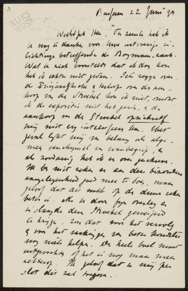
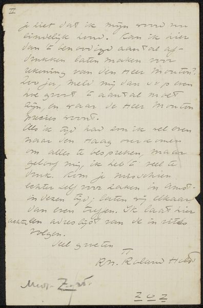
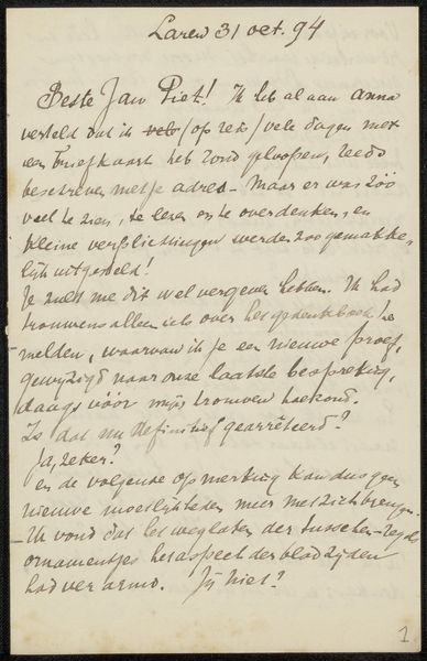
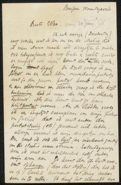
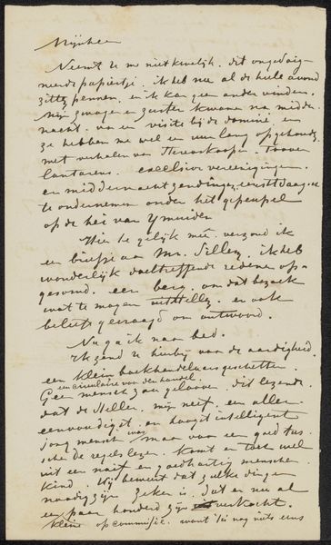
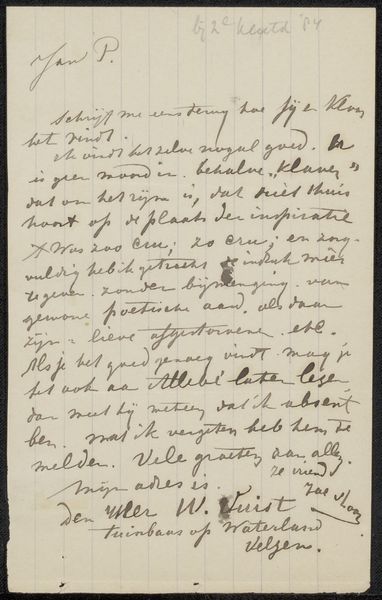
drawing, paper, ink, pen
#
drawing
#
german-expressionism
#
paper
#
ink
#
expressionism
#
pen
Copyright: Rijks Museum: Open Domain
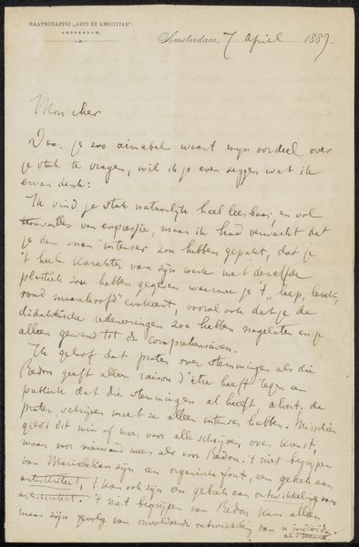
This is a letter, "Brief aan Cornelis Gerardus 't Hooft," by Max Liebermann, and look at the way he makes marks with the pen! The ink is a warm grey, it has a real handmade feel. You can almost see him thinking as he writes, deciding where the words should go on the page, not crammed in, or too spaced out. The texture of the paper seems smooth, but I bet if you could touch it, you’d feel the fibers, a slight resistance, it's the kind of thing that can really change how a mark is made. Notice how some lines are darker than others, it’s like Liebermann is pushing and pulling, emphasizing certain thoughts. The way he’s looping and connecting letters is super physical too. It reminds me a bit of Cy Twombly’s handwriting, that similar balance of intention and accident. It’s like a conversation, an ongoing exchange of ideas and feelings across time. And ultimately, like any good artwork, it leaves room for interpretation, for us to bring our own experiences to it.
Comments
No comments
Be the first to comment and join the conversation on the ultimate creative platform.
More like this