Copyright: Modern Artists: Artvee
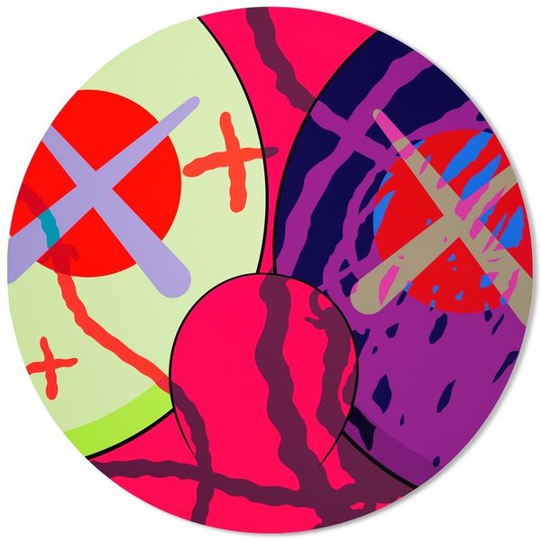
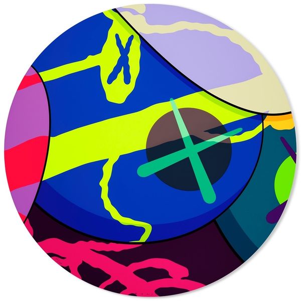
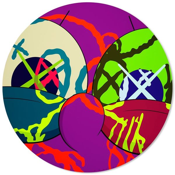
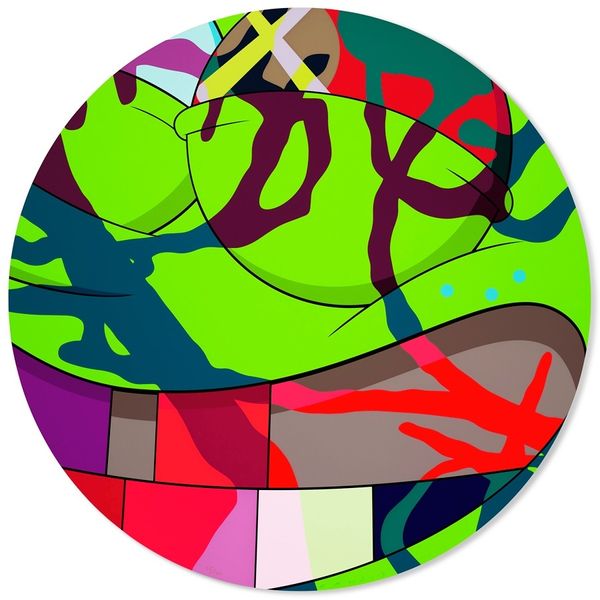
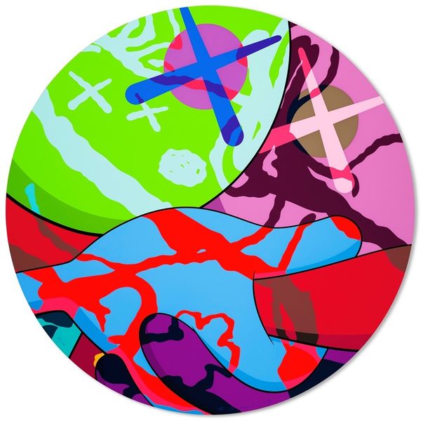
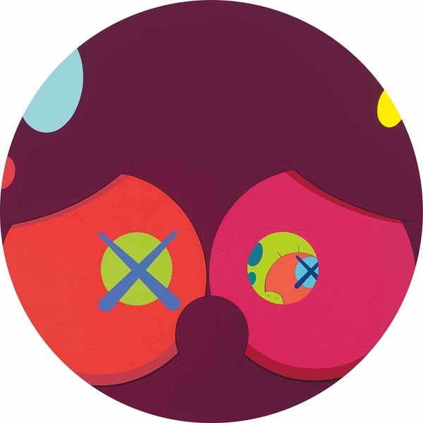
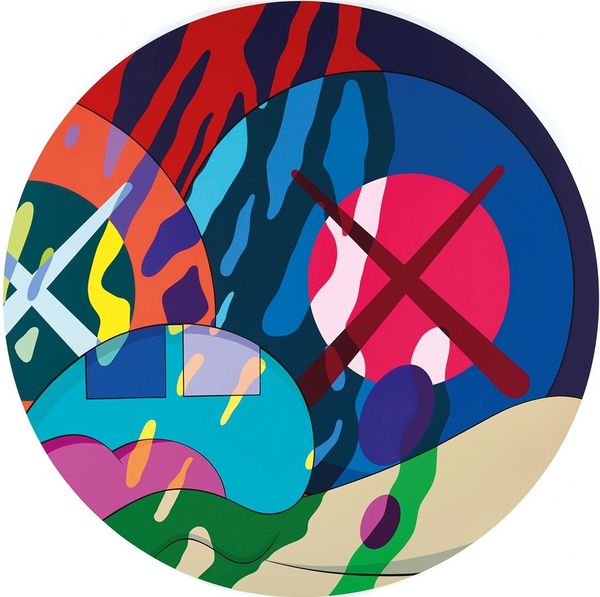
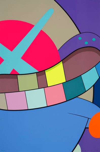
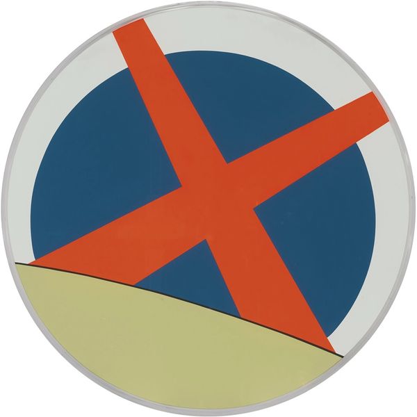
Editor: Here we have KAWS's "The News #9" from 2017, made with acrylic paint. I'm struck by the boldness of the colors and the simplified shapes. What do you see in this piece from a formalist point of view? Curator: The most immediately apparent aspect is the striking use of color. The juxtaposition of the bright, almost acidic pink, against the cooler blues creates a strong visual tension. Observe how the composition employs a limited palette, yet achieves a remarkable degree of visual complexity. Note the deployment of geometric forms throughout. Editor: So you’re saying that the limited color palette is intentional, pushing against simplicity despite it being quite bold and bright? Curator: Precisely. KAWS utilizes the inherent properties of these colours and geometric shapes to establish a dialogue. The flatness, a hallmark of pop art, serves to accentuate the objecthood of the painting itself. Are you noting any implied textures? Editor: I see what you mean. It’s interesting how such a flat surface can suggest depth. The layering and the stark contrast help. The criss-cross on the bottom is suggestive. I didn’t immediately consider the importance of its flatness! Curator: Indeed. This push and pull between the flat surface and the illusion of depth is key to understanding its formal complexities. It challenges our perception and reminds us of the artifice inherent in representation itself. We can learn much about how our gaze interprets form! Editor: That's a totally fresh perspective, really highlighting the surface itself rather than searching for some symbolic narrative. It’s been really helpful to consider just the interplay of colors and shapes in the work.
Comments
No comments
Be the first to comment and join the conversation on the ultimate creative platform.