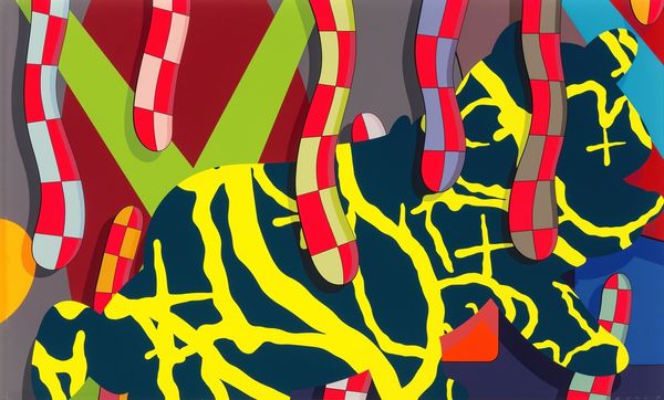
Copyright: Modern Artists: Artvee
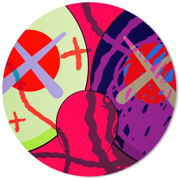
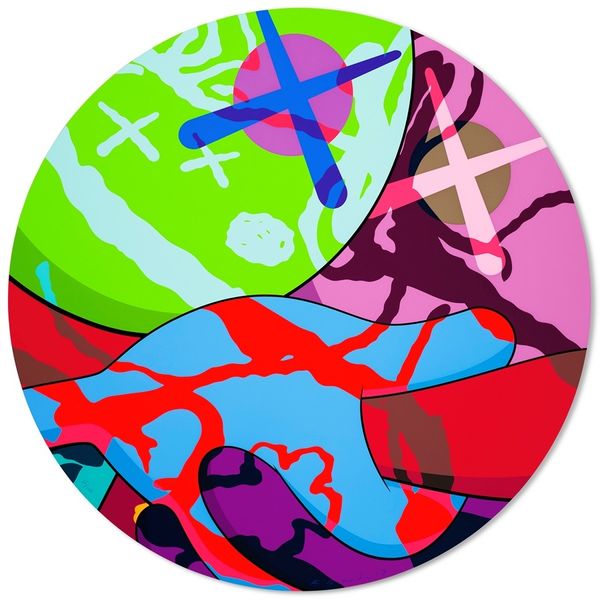
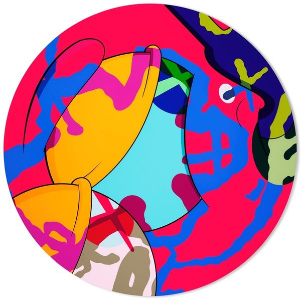
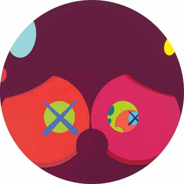
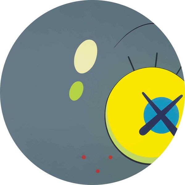
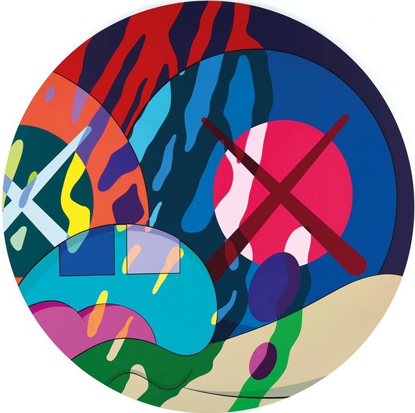
Editor: We’re looking at “The News #6” by Kaws, created in 2017 using acrylic paint. It's circular, and the bright colours pop right out. There’s an intensity in the overlapping forms. What do you see when you look at this piece? Curator: Initially, the formal qualities strike me: the vibrant chromatic palette contained within the circular format. Notice how Kaws masterfully orchestrates the interplay between the amorphous neon green shape and the stark, geometric red crosses. This generates a visual tension, does it not? Editor: It does. I'm also curious about the grey background and how it functions as negative space. The bright colours stand out so much more. Curator: Precisely. Observe also how the overlapping of the red crosses over the black oval disrupts any sense of perspectival depth. The interplay of these compositional elements is not accidental. Each contributes to the overall semiotic field. The circle serves as a framing device, isolating this visual discourse. Do you agree? Editor: Yes, it feels very intentional. The frame both contains and enhances the other shapes. I hadn't really noticed how it affects the meaning of the work. Curator: Consider, too, the materiality of the acrylic paint itself. The smooth, unmodulated surfaces speak to a certain detached quality, typical of much contemporary abstract painting. Editor: That makes sense. I see it now as more than just some shapes and colours. Thanks for pointing out the visual connections in the work. Curator: Indeed, by attending to these formal qualities, we begin to apprehend the deeper strata of meaning embedded within the composition. A useful approach to art analysis.
Comments
No comments
Be the first to comment and join the conversation on the ultimate creative platform.