Copyright: Modern Artists: Artvee
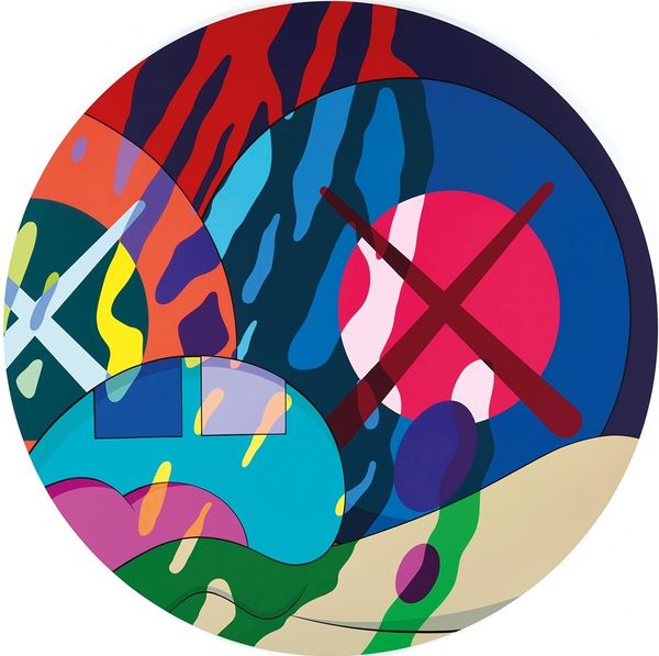
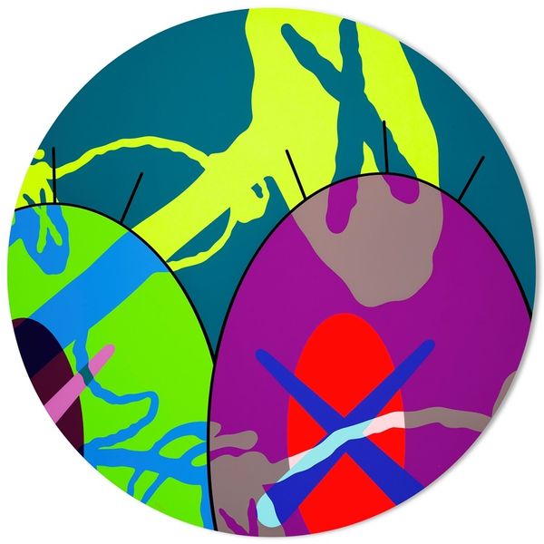
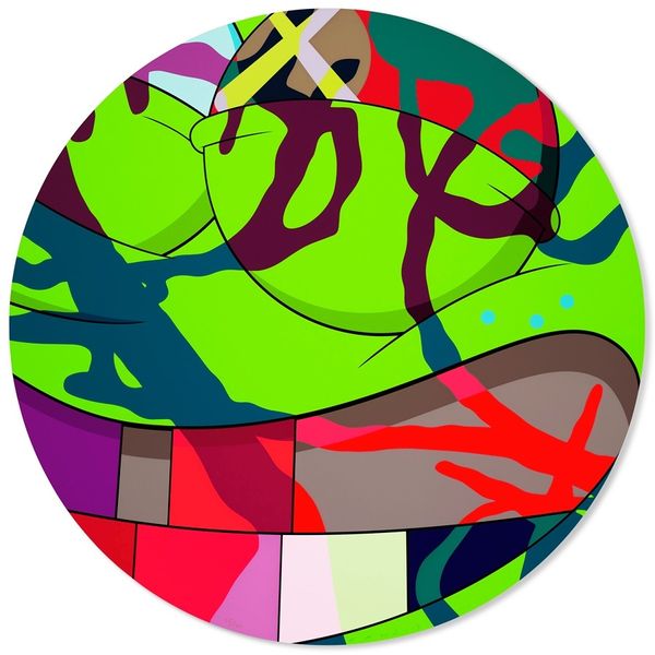
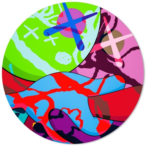
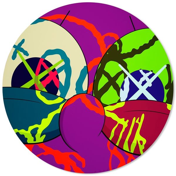
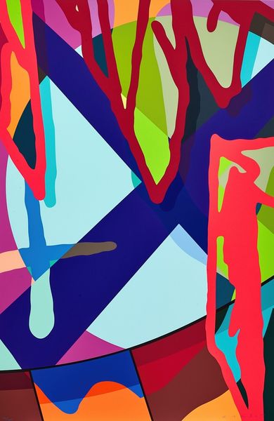
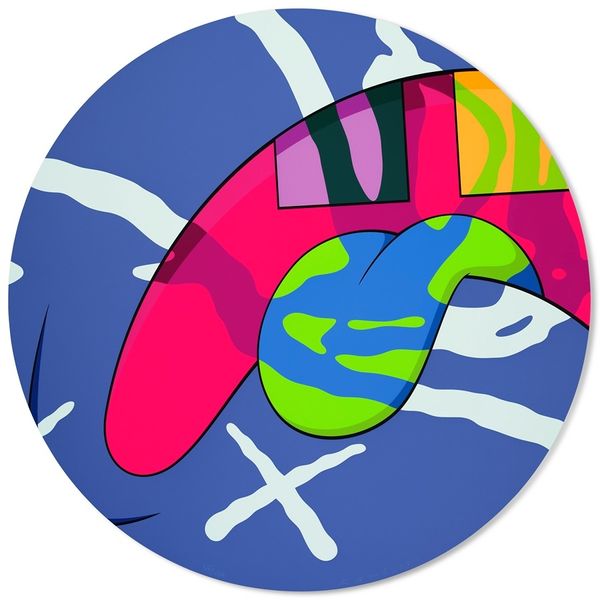
Editor: We're looking at KAWS' "The News #10" from 2017, done with mixed media including acrylic paint. It's a vibrant circle of colliding cartoon-like shapes; I'm struck by the energy of its bold, contrasting colours. How would you interpret this explosion of colour and form? Curator: KAWS emerged in a context where pop art had been thoroughly institutionalized, but its strategies—appropriation, bold graphics, a kind of knowing cynicism—remained potent. So I see this less as an explosion and more as a highly controlled commentary on image saturation. Notice the title, "The News." Does that offer a clue? Editor: Hmm, image saturation... are you saying it reflects how overwhelmed we are by news and media? Like, all these chaotic shapes represent different stories vying for our attention? Curator: Precisely! KAWS often samples existing imagery, abstracting and re-presenting it. So consider the ways he utilizes the visual vocabulary of cartoons, not just for aesthetic appeal, but as a readymade language, one we're already fluent in through constant media exposure. What does it mean when 'high art' adopts this vernacular? Is it democratizing, or diluting? Editor: That makes me think about how art galleries and museums shape what's considered 'important' art. And by exhibiting KAWS, are they commenting on pop culture's role in society? Curator: Exactly! And further, KAWS' work is almost inherently public. It's designed for Instagram, for billboards, for massive sculptures in public squares. What is the function of art in public in our contemporary moment? Editor: I never thought about the artwork as a socio-political statement, but it brings so much to think about for the way the news are shown through such vibrant, bold presentation. Curator: And hopefully, we’re all just a bit more attuned to the messages embedded within seemingly simple images.
Comments
No comments
Be the first to comment and join the conversation on the ultimate creative platform.
More like this