drawing, painting, paper, watercolor
#
drawing
#
water colours
#
painting
#
paper
#
watercolor
#
earthenware
#
decorative-art
#
decorative art
#
realism
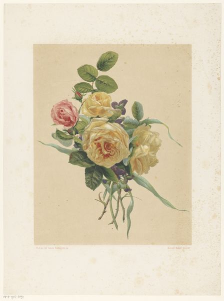
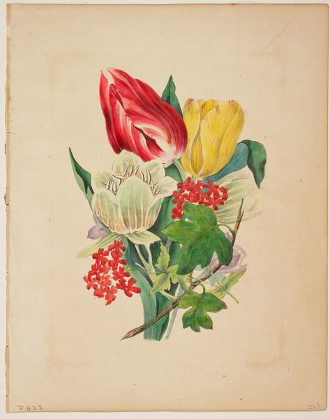
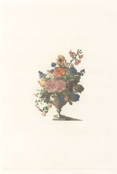
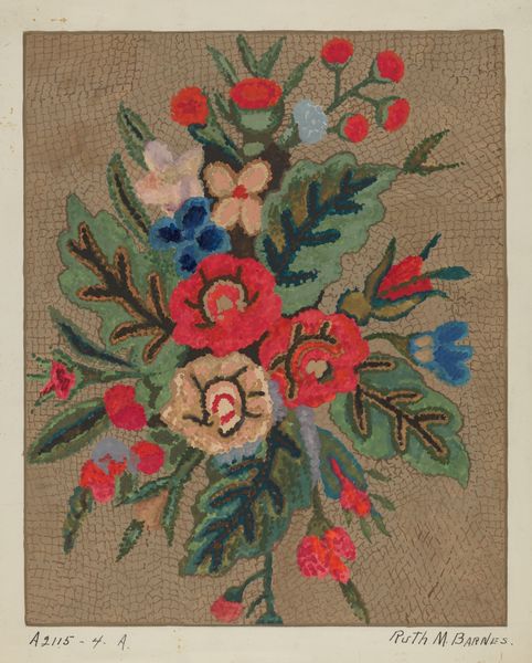
Dimensions: overall: 55.4 x 46 cm (21 13/16 x 18 1/8 in.) Original IAD Object: 14" high; 17" wide
Copyright: National Gallery of Art: CC0 1.0
Curator: We're looking at Bessie Vandre's "Still Life," a watercolor and ink drawing on paper from 1941. It features an abundant bouquet of roses. Editor: It feels intensely nostalgic, almost Victorian. The colors are muted, but rich at the same time. The composition is quite dense, almost overflowing. Curator: I’m intrigued by the paper choice here, especially given the date. Its slight roughness and warm tone significantly impact the final appearance. Consider how mass-produced papers were becoming increasingly available around that time and yet a conscious decision has been made for one that hints back to an older handcraft tradition. Editor: Yes, the paper does seem to be doing some heavy lifting in terms of mood! For me, roses immediately carry potent symbolic weight. Love, loss, beauty, fragility—all those heavy hitters are packed into this one image. The darker crimson roses tucked amongst the lighter blooms add a complex dimension to the emotional register here, almost a hidden disquiet. Curator: I think that "disquiet" also stems from Vandre's method of application, creating tonal gradations, giving dimension, volume, but not overly masking that material process. Look at how those visible layered marks speak to process and not some ethereal idealized vision, grounding it materially in her actions as the artist, in that specific era. There's this dialogue with how we physically make an image that resonates too, beyond a symbolic narrative, you know? Editor: Absolutely. And while we talk of process, those stark white blooms dominating the bouquet call to mind purity and maybe innocence lost, juxtaposed against the decay implied by the wilting stems… Vandre masterfully directs our emotional journey through her precise arrangement. I feel like it speaks volumes, even about what was left unsaid or unseen during times of conflict, with WWII brewing so strongly at this date. Curator: Indeed. Viewing "Still Life," what becomes clear is the intimate relationship between materiality and meaning and how Vandre’s method highlights this bond and that to me is where a deeper and more pertinent truth surfaces about labor and creation and artistic context in that moment. Editor: So, "Still Life" is more than a pleasant flower arrangement then! We've unlocked an art piece dense with emotional symbolism rooted firmly in technique and artistic context. Thanks for opening my eyes to a much richer perspective.
Comments
No comments
Be the first to comment and join the conversation on the ultimate creative platform.
More like this