print, typography
#
dutch-golden-age
# print
#
typography
Dimensions: height 359 mm, width 222 mm
Copyright: Rijks Museum: Open Domain
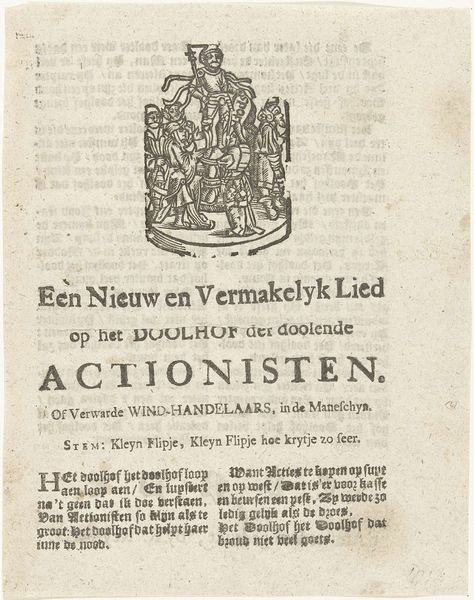
This broadside, printed by Jacobus Scheltus in 1672, documents the sentence against Cornelis de Witt. Immediately, you're struck by the stark contrast of the black text against the off-white paper and the rigid vertical lines of the gothic typeface. This structured arrangement conveys a sense of order and authority. However, this order is undermined by the swirling, almost chaotic, emblem at the top, which depicts heraldic symbols. This juxtaposition introduces a tension, a visual equivalent of the upheaval and power struggles of the period. The emblem acts as a signifier of the ruling class, yet its placement above the legal text also suggests its vulnerability. Ultimately, the broadside is a fascinating example of how form can be used to express and subtly destabilize established meanings, reflecting the complexities of Dutch society at that time. It invites us to consider the relationship between power, representation, and the printed word.
Comments
No comments
Be the first to comment and join the conversation on the ultimate creative platform.
More like this