Dimensions: height 490 mm, width 375 mm
Copyright: Rijks Museum: Open Domain
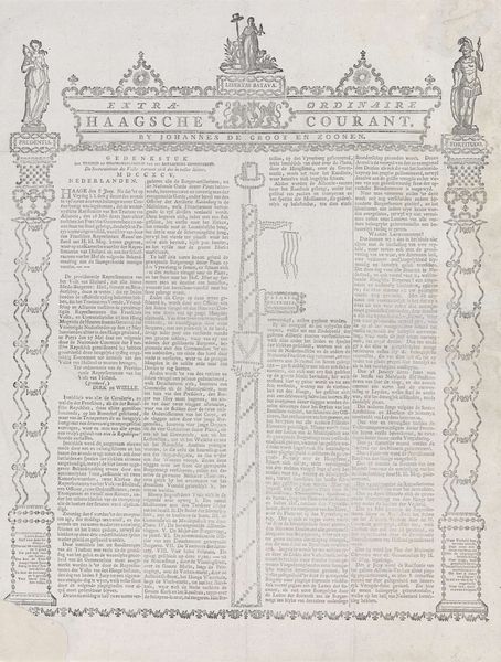
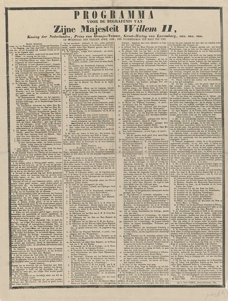
Editor: So, this is "'s Gravenhaegse Extra Courant van 4 maart 1774," possibly from that very year, by Pierre Gosse Junior, it looks like an engraving on paper. It reminds me of old lace, and I'm curious about all of the decorative framing surrounding the dense typography in the middle. What can you tell me about how we read this work as more than just informational text? Curator: Indeed, it resembles lace, doesn’t it? As an iconographer, I see how the seemingly ornamental border operates on many levels. Note how the edges, rather than simply framing the news, borrow from classical motifs – a visual language of power and order during that era. What do you think this decorative choice communicates about the printed word itself? Editor: Maybe that the printed word holds power, credibility and importance, like classicism? Also, is that the royal coat of arms or something similar at the very top? Curator: Precisely! And what does that imply? Think about the relationship between authority, information, and the dissemination of news. The coat of arms ties this specific publication to a particular kind of governance and cultural capital, especially as print media was rapidly growing in importance in public life. How might that framing influence how readers perceived the news it contained? Editor: I suppose it creates a sense of official endorsement, maybe lending more weight to the information inside. And seeing this publication as an artifact gives it a new presence in my mind. The past feels much closer. Thank you! Curator: My pleasure! Recognizing how these symbolic visual choices reinforce the socio-political context provides an amazing view into history.
Comments
No comments
Be the first to comment and join the conversation on the ultimate creative platform.
More like this