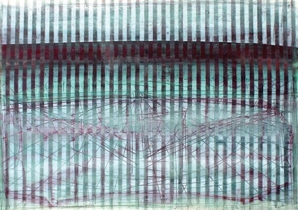
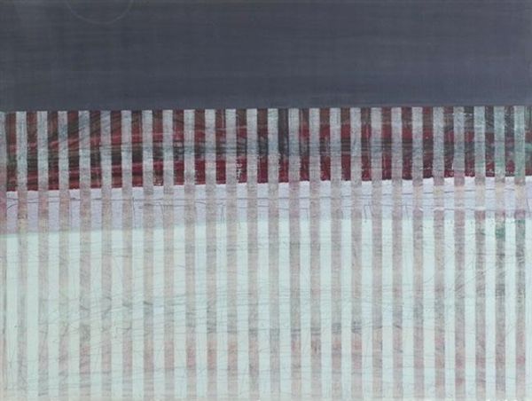
drawing, graphite
#
drawing
#
amateur sketch
#
rippled sketch texture
#
light pencil work
#
thin stroke sketch
#
rough brush stroke
#
incomplete sketchy
#
hand drawn type
#
abstract
#
chalky texture
#
geometric
#
rough sketch
#
line
#
graphite
#
modernism
#
initial sketch
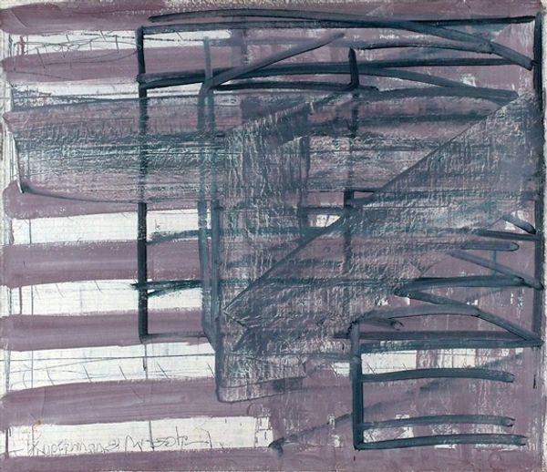
Copyright: Moshe Kupferman,Fair Use
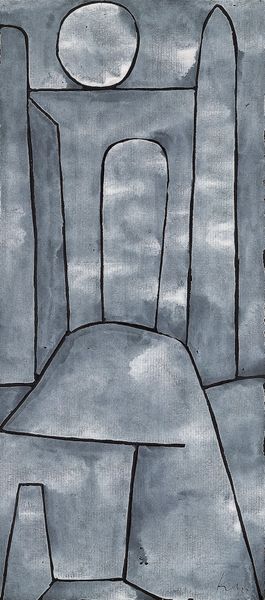
Curator: This graphite drawing is an Untitled piece by Moshe Kupferman, created in 1970. There is a distinct juxtaposition, a rather strong one might I add, between the geometrical patterns and the almost randomly placed light strokes. What do you think about the artist's use of these seemingly contradictory features? Editor: The thing that hits me immediately is its… economy. It feels very sparse, very direct in its application of graphite. The repeated lines look almost like machine-made marks, challenging the immediacy we usually associate with drawing. It’s quite… somber, wouldn’t you say? Curator: Indeed. Notice how the recurring vertical lines structure the space and how the faintest suggestion of depth is created through the overlaid, softly rendered geometric forms. They seem to float and echo, suggesting perhaps an allusion to something ephemeral, or something not readily tangible. Editor: That resonates with me. Looking at the darker solid block to the right, it creates an oppressive, industrial presence when contrasted with the loose lines on the left, drawing our eye towards the process of how these lines are actually created rather than just focusing on their compositional effect. Are we seeing an influence from his labor during that time in the materials that were available to him and a specific mark making response to it? Curator: That could certainly be one valid interpretation, especially when seen in light of his other works from this period which employ a similar visual vocabulary. His focus on line and form certainly hints at an investigation of the very essence of modernist abstraction. The composition here really shows the rigor in his visual research and the deconstruction of those core geometric shapes. Editor: It’s hard to look past that feeling of industrial labour with the sheer repetitive strokes, though. I would venture the production of work itself would speak of constraints of the material and conditions Kupferman had during that specific time in 1970. Curator: Ultimately, what's engaging is Kupferman's skillful articulation of tension between these geometric elements. Its visuality and placement prompts introspection. Editor: It really makes you appreciate that balance between form and how those structures become part of his language with what’s to hand. I’m going to remember how this made me look at these things with fresh eyes.
Comments
No comments
Be the first to comment and join the conversation on the ultimate creative platform.
More like this