drawing, paper, ink, pen
#
drawing
#
imaginative character sketch
#
quirky illustration
#
quirky sketch
#
pen sketch
#
cartoon sketch
#
figuration
#
paper
#
personal sketchbook
#
ink
#
idea generation sketch
#
ink drawing experimentation
#
pen-ink sketch
#
sketchbook drawing
#
pen
#
genre-painting
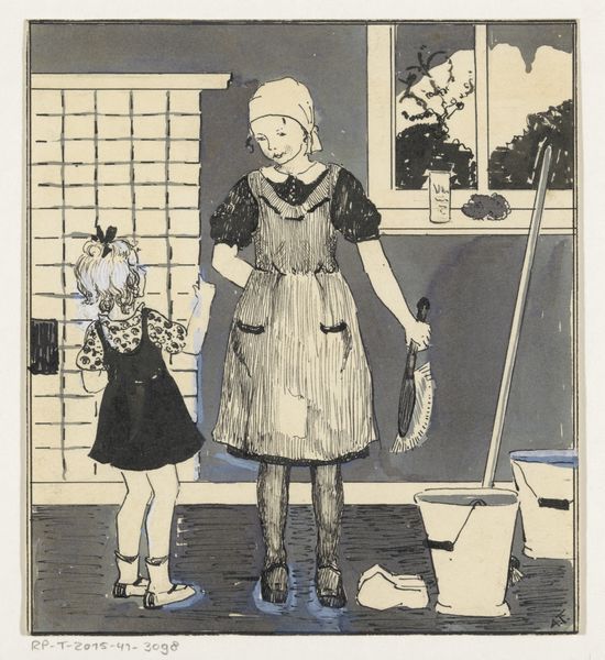
Dimensions: height 269 mm, width 207 mm
Copyright: Rijks Museum: Open Domain
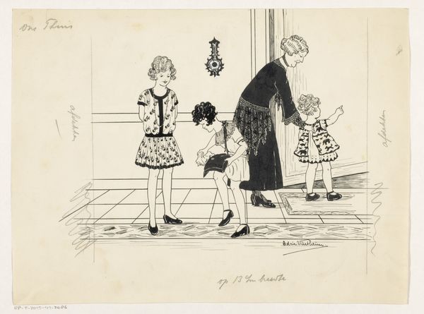
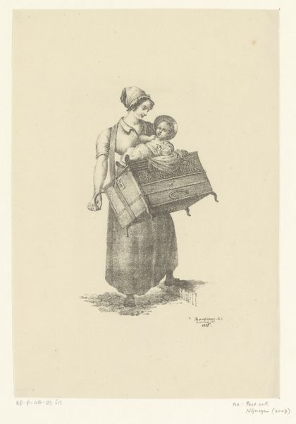
Curator: Here we have C. van Roojen's pen and ink drawing on paper titled "Tweelingzussen bij de juf," likely created between 1920 and 1970. What strikes you first? Editor: The immediate impression is the starkness and simplicity, a monochromatic world rendered through seemingly effortless lines. I’m curious about the paper stock; it doesn't appear to be a high-quality rag paper. It has the quality of a daily sketch. Curator: Indeed, it has the feeling of a study, capturing a fleeting domestic scene with precise line work. The artist used line weight strategically; thicker lines define forms and create a sense of depth where solid shadows have been inked in. Note how the forms are spatially organized. What can we say about its organization? Editor: Right. The application is intriguing given the work probably evolved into more elaborate work and likely was preparatory. There is a strong illustrative focus and the technique evokes similar economical uses of material that, say, someone like Matisse, might use. Here the process feels deeply tied to its practical outcome, with less emphasis placed on posterity or permanence. Curator: Consider how the choice of ink as a medium further reinforces a sense of immediacy and directness. In comparison to pencil, for example, this work, perhaps out of sheer chance, implies a certain decisiveness and confidence that invites speculation from viewers. Editor: And that relates directly to the cultural significance and social environment, since these classroom practices in Western cultures also were emphasizing exactitudes in math lessons; you notice how the board provides context with quick mathematical problems that demand one solution to each equation. One might even extrapolate from there how Van Roojen likely grew up at an intersection of stringent disciplinary expectations in an industrializing age. Curator: That social backdrop resonates strongly given the material used, I must concede. Let's just notice one more element: observe how the subtle variations and tonal range are utilized; note especially that effect it provides regarding the texture and tonality of the skirt or dark garments worn by the twins. It is simply ingenious and quite subtle. Editor: Yes, definitely the relationship between labor and materiality is fascinating here, from the physical act of sketching to its status as potentially an afterthought rather than a focal creation. So often such steps toward realizing “finished” pieces of fine art are not deemed precious. Curator: On my end, I hope we shed light on the elegance, or indeed, beauty of line as it engages the negative spaces, which, combined with compositional techniques, allows the twins and the teacher to express a great depth of emotion. Editor: Agreed, recognizing the often disregarded value of work is equally fulfilling for both of us in this endeavor, and helps contextualize its historical value on display for you to experience today.
Comments
No comments
Be the first to comment and join the conversation on the ultimate creative platform.
More like this