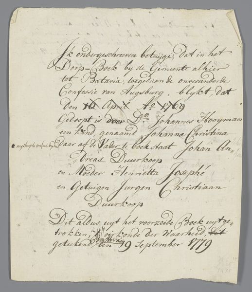
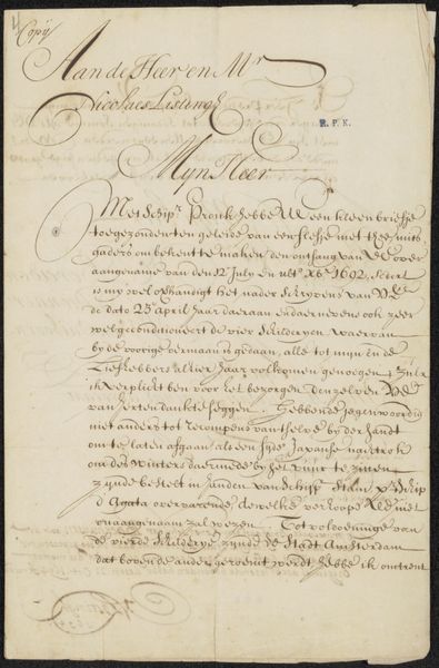
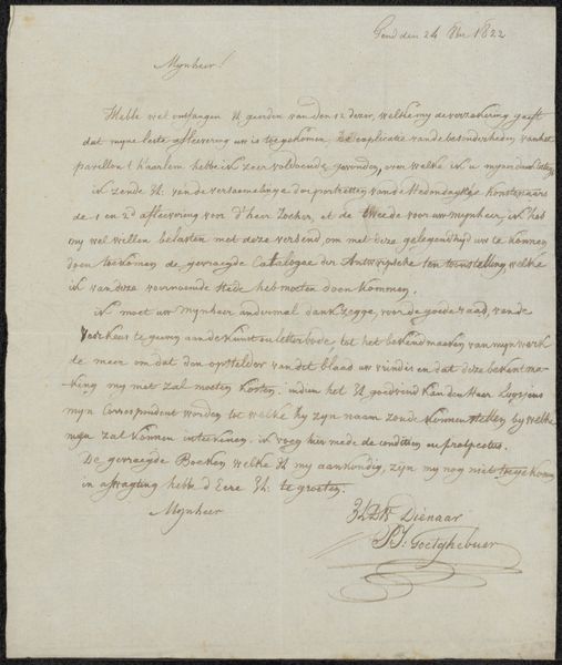
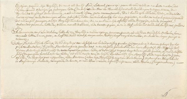
Aantekening betreffende Peter Paul Rubens, Jacques Jordaens en andere schilders Possibly 1679
0:00
0:00
drawing, paper, ink
#
drawing
#
aged paper
#
toned paper
#
dutch-golden-age
#
paper
#
ink
#
watercolour illustration
#
history-painting
#
calligraphy
Copyright: Rijks Museum: Open Domain
Curator: This piece, titled "Aantekening betreffende Peter Paul Rubens, Jacques Jordaens en andere schilders," is a drawing possibly from 1679 by Matthias Scheits, executed in ink on paper. The toned paper and dense calligraphy give it a unique textural feel. What draws your eye in this complex composition? Editor: I find the density of the text striking. It feels almost impenetrable, a closed system of meaning. The paper itself looks aged, contributing to a sense of history and perhaps mystery. What do you see in its formal elements? Curator: The density you observe is critical. The arrangement isn’t haphazard but deliberate. Scheits creates a visual hierarchy through varying letter size and the calligraphic flourishes that punctuate the script. Notice how certain names or phrases seem visually emphasized, suggesting points of entry into the textual mass. This relates to principles of rhetoric and composition wherein certain words would receive certain emphasis. Do you think it successfully communicates the author’s message? Editor: That’s fascinating. I hadn't considered the deliberate composition. But to be honest, deciphering any specific "message" is quite a challenge. It feels like a visual puzzle more than a clear historical record. Does that impact its effectiveness as a piece of art? Curator: The success lies in its intricate design and interplay between legibility and abstraction. We respond to its rhythmic arrangement of lines, the contrasting light and dark areas, and the way the calligraphy occupies and articulates the page. It’s precisely this tension that grants it its aesthetic interest beyond any easily retrievable historical information. Editor: So, even without fully understanding the text, we can still appreciate its visual qualities. It’s a refreshing take! Thanks for that insight. Curator: Indeed! The text's visual texture is the artwork; historical interpretation is supplementary, not obligatory.
Comments
No comments
Be the first to comment and join the conversation on the ultimate creative platform.
More like this