drawing, paper, ink
#
drawing
#
paper
#
ink
#
romanticism
Copyright: Rijks Museum: Open Domain
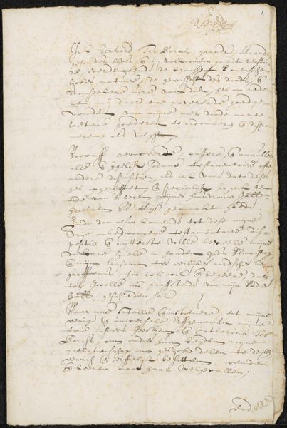
Curator: Charles Howard Hodges’ "Brief aan professor Göller," potentially from 1831-1833, is rendered in ink on paper, currently held in the Rijksmuseum. What strikes you about this drawing? Editor: Well, firstly it doesn’t quite feel like a ‘drawing’, the overall texture almost creates a soft hazy wash. It reads as romantic; however, the medium—ink—gives it a firm, almost detached tonality. What's your interpretation? Curator: Let's consider the semiotics of the composition. Notice how the dense script fills almost every available space. What effect does this density have on the viewer? Is legibility the main purpose here? Editor: It doesn't seem that readable, to be honest. The texture of layered ink competes for my eye. It creates a visual depth, almost as if looking through sediment. Curator: Precisely. Think about the formal qualities of the marks themselves: their varying weight, direction, and overlap. What kind of structure emerges when these are carefully scrutinized? Are they haphazard, or is there an underlying intentionality in their arrangement? Editor: It feels more spontaneous. However, now you point it out, the way the top line cuts off suggests some prior constraint. Curator: How do these elements then challenge our preconceived notions about Romanticism as a style of art? It pushes boundaries with conventional legibility by incorporating elements of both intentional composition with impulsive arrangements. Editor: So, by understanding the material and composition, we learn Hodges is playing with our understanding of Romanticism. I'll definitely be spending longer decoding this one!
Comments
No comments
Be the first to comment and join the conversation on the ultimate creative platform.
More like this