drawing, paper, ink
#
portrait
#
drawing
#
script typography
#
hand-lettering
#
hand drawn type
#
hand lettering
#
paper
#
ink
#
hand-drawn typeface
#
thick font
#
typography style
#
handwritten font
#
coloring book page
#
miniature
#
calligraphy
#
small lettering
Copyright: Rijks Museum: Open Domain
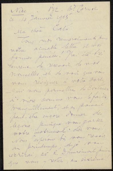
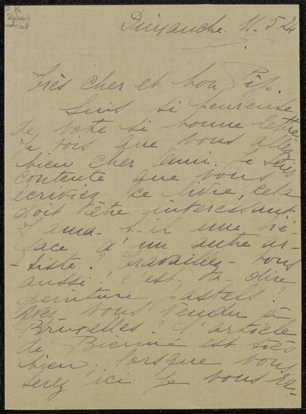
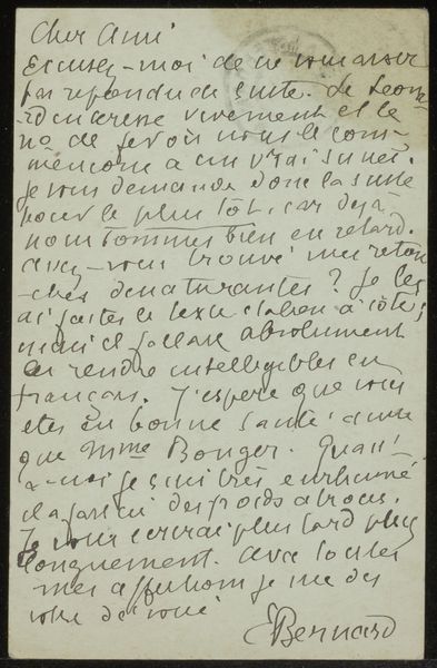
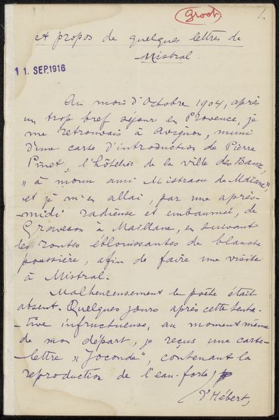
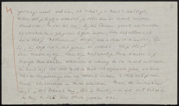
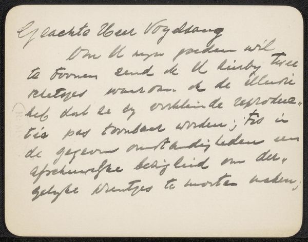
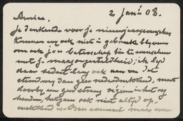
This is a calling card made by Maurice Maeterlinck, probably with ink on paper. It's all about the gesture here, the movement of the hand, the way the words flow and almost bleed into one another. There's something so intimate about handwriting, isn't there? You can almost feel the writer's presence, their thoughts taking shape on the page. The ink is this soft gray, which gives it a ghostly feel, like a whisper from another time. And the way the letters dance and lean, some darker, some lighter, it's like a little performance. The lowercase 'j' in the opening line loops in on itself, as if to emphasise this sense of playful, personal enquiry. For me, this card is reminiscent of Cy Twombly's scribbled paintings, or maybe a correspondence with the CoBrA group in its spontaneity. Art is like an ongoing conversation, a constant exchange of ideas across time. In the end, it's not about having all the answers, but about embracing the questions, the ambiguity, and the endless possibilities.
Comments
No comments
Be the first to comment and join the conversation on the ultimate creative platform.
More like this