drawing, print
#
drawing
#
aged paper
#
toned paper
#
hand-lettering
# print
#
book
#
hand drawn type
#
hand-drawn typeface
#
thick font
#
golden font
#
watercolor
#
historical font
#
columned text
Dimensions: 7 7/8 x 6 1/8 in. (20 x 15.5 cm)
Copyright: Public Domain
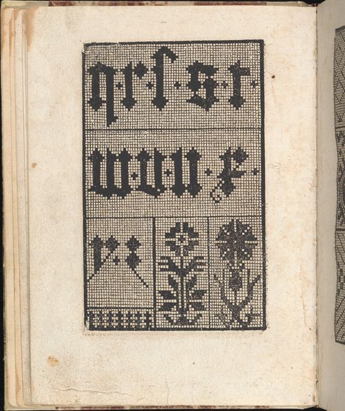
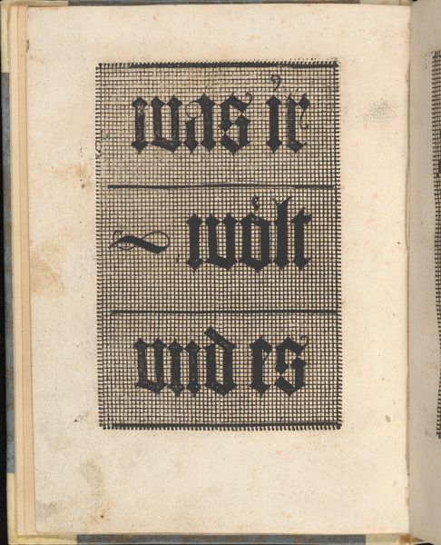
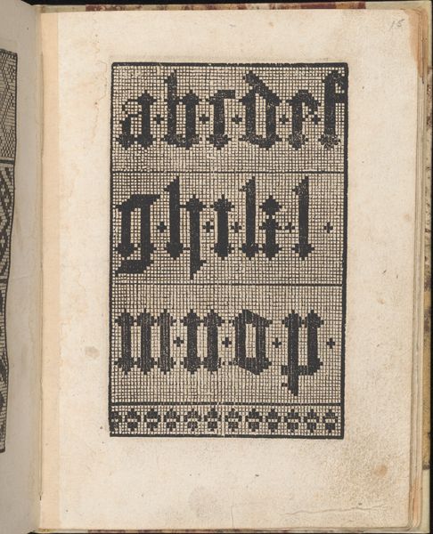
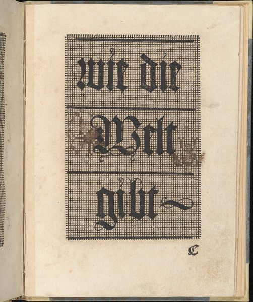
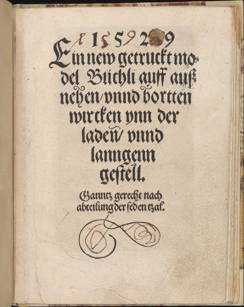
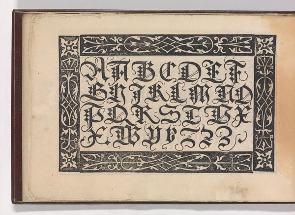
This is the title page of "Ein ney Furmbüchlein," a book crafted by Johann Schönsperger the Younger, sometime around the early 16th century. The lettering style, known as Fraktur, echoes the architectural forms of the Gothic period, evoking a sense of medieval grandeur and authority. The bold, blackletter typeface, with its dense and angular forms, creates a visual texture. This can be seen in other works, such as Albrecht Dürer's woodcuts, where the same lettering evokes a sense of Northern Renaissance solemnity. This style of lettering harkens back to illuminated manuscripts, where each letter was a work of art, reflecting the cultural memory of scribal traditions. Yet, even as Fraktur communicates authority, it also embodies a transformation. The printed word democratized knowledge, shifting the creation of texts from the hands of a few to the hands of many. Like the serpent biting its own tail, Fraktur participates in a cyclical transformation; preserving the past while ushering in the future.
Comments
No comments
Be the first to comment and join the conversation on the ultimate creative platform.
More like this