Copyright: Robert Mangold,Fair Use
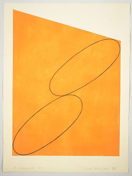
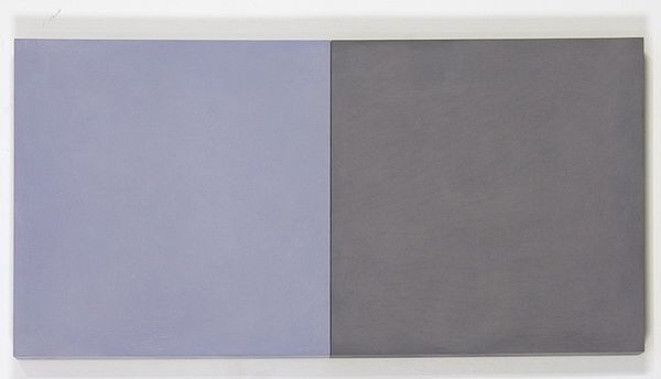
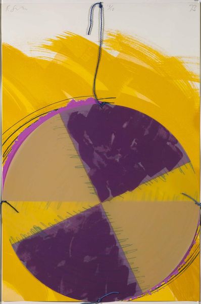
Editor: Here we have Robert Mangold's "Plane-Figure Series D (Double Panel)" from 1993, rendered in acrylic on paper. The two panels, one purple, one yellow, immediately struck me as quite bold, almost playful despite their minimalist style. What do you see in this piece? Curator: The power in Mangold's work often lies beneath the surface. The stark juxtaposition of colors—think royalty meeting sunshine—and the fragmented ovoid shapes carry a surprising weight. How do these simple shapes interact with your own understanding of wholeness and division? Editor: That's a great question! I hadn't thought about it in terms of wholeness. The division feels very deliberate, like a statement. But what kind of statement? Curator: Perhaps a statement about duality? Yellow often signifies intellect, clarity, while purple is linked with spirituality, mystery. They're presented as equal halves, united only by the ghost of that shared oval. Does this division diminish or amplify the emotional impact for you? Editor: It makes it stronger. Seeing that implied shape, trying to mentally complete it... it creates tension. I start thinking about how opposing forces can actually define each other. Curator: Exactly! And remember, these colors aren't random. Yellow and purple exist as direct complements on the color wheel; pure contrast designed to catch the eye. In your view, is this tension calming or energizing? Editor: Definitely energizing. The piece makes you think. I appreciate how the colors pull you in, and then the geometry gives you something to analyze. Curator: A beautiful summation. It’s fascinating to see how the cultural weight we ascribe to color interacts with such pared-down forms. Editor: Absolutely. It has given me a fresh way to appreciate minimalist art, recognizing the complexity hidden beneath apparent simplicity.
Comments
No comments
Be the first to comment and join the conversation on the ultimate creative platform.
More like this