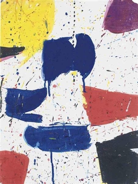
Copyright: James Brooks,Fair Use
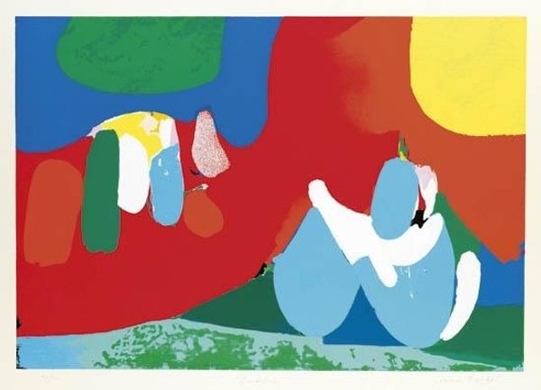
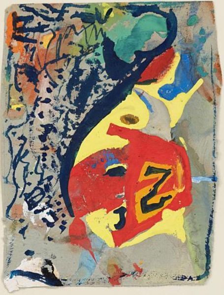
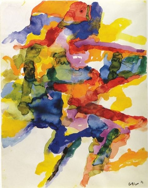
James Brooks made this print, Concord, with lithograph. The colour palette is so bold, like a painterly traffic jam! This artwork feels like the result of a fast, intuitive process, a kind of visual free-writing. I love the way the colours push against each other. Check out the textures created by these overlaps; look at the bottom left corner, the red bleeding into the yellow. The colours aren't mixed so much as layered, one after the other, and you can imagine him trying to resolve an image by continuously playing with the placement of the marks. The scraping in the cream space towards the top right of the work is like a small eruption of energy. Brooks' playful use of colour reminds me a little of Joan Mitchell, but where Mitchell’s canvases often feel expansive and wild, Brooks keeps everything tightly composed. In the end, it's a reminder that art is a conversation, not a monologue.
Comments
No comments
Be the first to comment and join the conversation on the ultimate creative platform.
More like this