painting, acrylic-paint
#
abstract-expressionism
#
abstract painting
#
painting
#
colour-field-painting
#
acrylic-paint
#
acrylic on canvas
#
abstraction
#
allover-painting
#
modernism
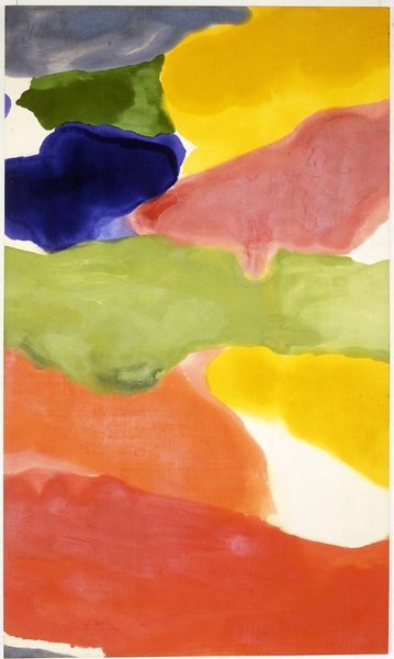
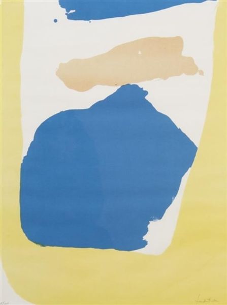
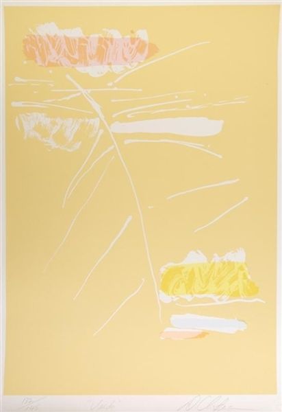
Copyright: Helen Frankenthaler,Fair Use
Helen Frankenthaler made this color lithograph, called Wind Directions, with a printmaking process that emphasizes the fluid qualities of ink. The forms are not sharply delineated, but soft-edged, suggesting movement and air. Frankenthaler achieved this effect by applying the lithographic inks in a painterly way to the printing stone. Instead of carefully controlled, hard-edged shapes, she allowed the ink to flow and blend, similar to her soak-stain paintings. The resulting prints have a feeling of spontaneity. The lithography process, which relies on the resistance between oil and water, allowed Frankenthaler to retain the gestural quality of her brushstrokes, translating them into a reproducible format. By embracing these techniques, Frankenthaler blurred the boundaries between painting and printmaking, elevating the status of printmaking from a purely commercial endeavor to a fine art form. It's a reminder that understanding an artwork means appreciating the labor and choices of the artist.
Comments
No comments
Be the first to comment and join the conversation on the ultimate creative platform.
More like this