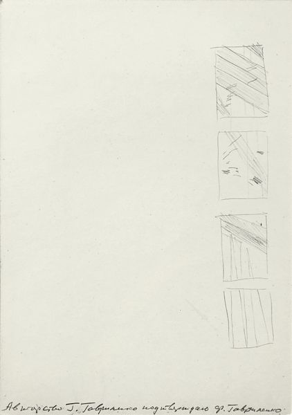
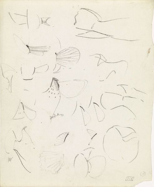
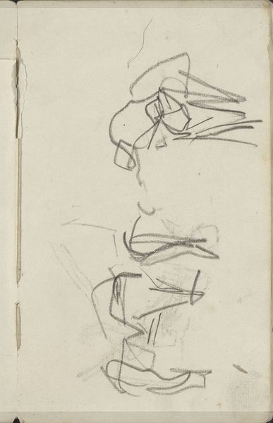
drawing, graphic-art, paper, typography, pencil
#
drawing
#
graphic-art
#
hand written
#
art-nouveau
#
script typography
#
hand-lettering
#
lettering
#
hand drawn type
#
hand lettering
#
paper
#
form
#
typography
#
hand-drawn typeface
#
fading type
#
geometric
#
pencil
#
typography style
#
small lettering
Copyright: Rijks Museum: Open Domain
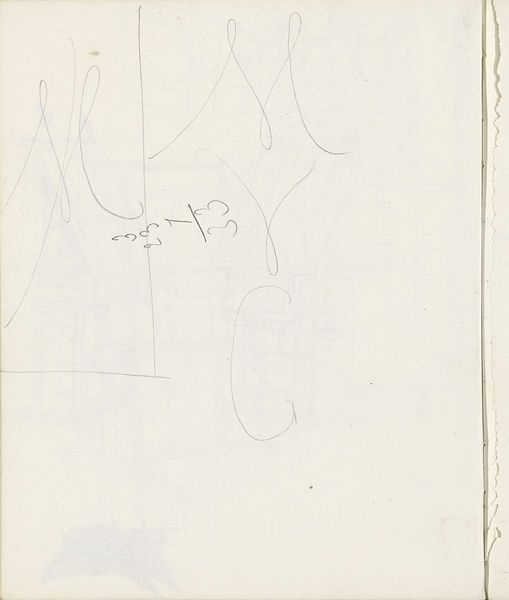
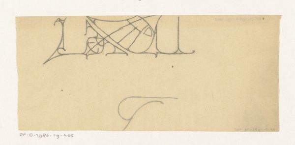
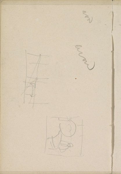
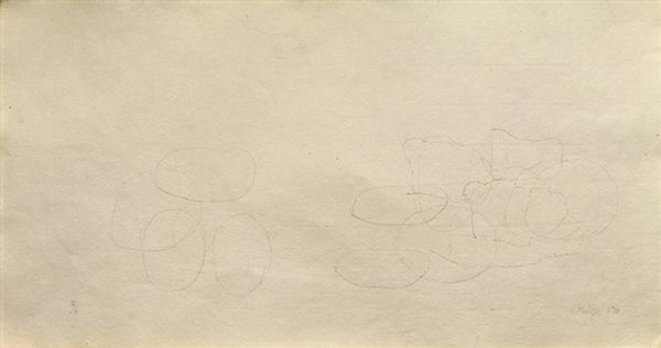
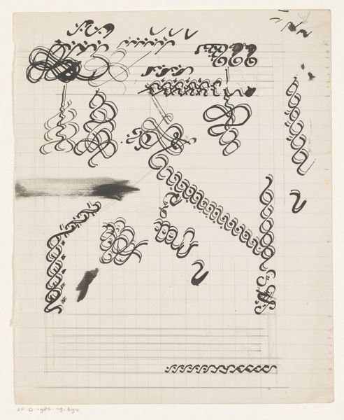
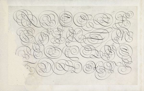
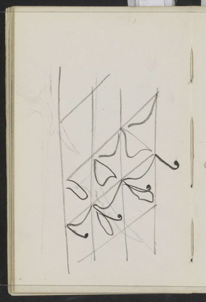
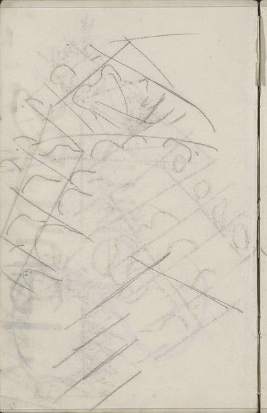
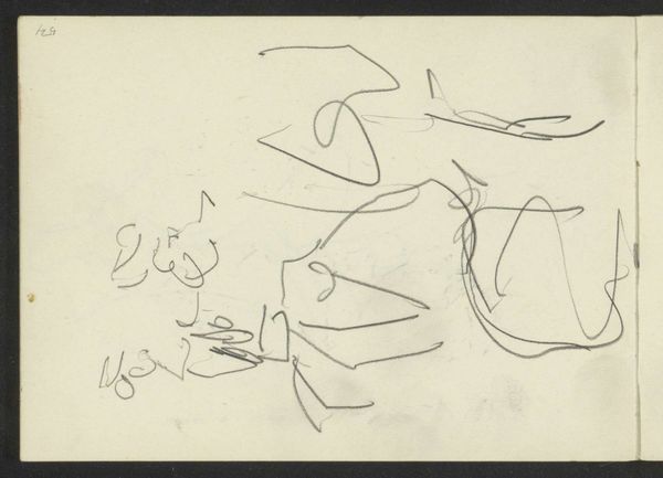
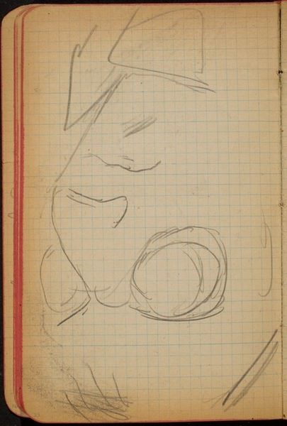
Curator: I find something almost dreamlike in these tentative sketches. Editor: Tentative is the word. These graphite drawings, made around 1900 by Carel Adolph Lion Cachet, showcase design studies for the letters 'A' and 'D'. They’re held here at the Rijksmuseum. It seems like he’s working through a multitude of possibilities, trying to get at the essence of those letters. Curator: Precisely. See how some of them are cradled in what looks like heraldic shields or diamond shapes? It feels like an attempt to imbue the letters with nobility, permanence, perhaps even a coded family history. Editor: I see that. Cachet was involved in advertising, book design, and even textile design. These experiments weren't just academic; they had a commercial purpose. I wonder what these letters were eventually used for? Was it a logo, a monogram? Curator: What strikes me is that each variation subtly changes the letters' emotional resonance. A sharp, angular 'A' conveys a different feeling than one embraced by a soft curve. The psychological weight of the alphabet, and how we instinctively respond, is profound. The associations must have been carefully thought through by Cachet. Editor: It's interesting you mention feeling, as Art Nouveau, with which Cachet is associated, aimed to elicit sensory responses through organic forms and elegant lines. His letterforms reflect this principle, even in these early drafts, intended for print or other reproduced media, as opposed to illuminated manuscripts. Curator: Indeed, these are not merely letters but containers of cultural meaning. It's fascinating to consider the persistence of such symbols, passed down through generations. Each interpretation offers us an image into its use and significance to its original intended audience. Editor: Thinking about their history, it becomes very apparent to me, however abstract it feels, these letters and Cachet are bound to their time period and reveal as much as they communicate through design alone. It is an almost hidden way to capture something about this place in time. Curator: A sentiment I wholeheartedly concur with, it really reflects, even at first sight, just how beautiful letters could be if one allows themselves to see its beauty. Editor: And by contemplating that beauty and what that might convey, a new, deeper level of appreciation blooms within the eye.
Comments
No comments
Be the first to comment and join the conversation on the ultimate creative platform.
More like this