drawing, paper, pen
#
drawing
#
hand written
#
art-nouveau
#
hand-lettering
#
hand drawn type
#
hand lettering
#
paper
#
personal sketchbook
#
hand-drawn typeface
#
fading type
#
geometric
#
line
#
sketchbook drawing
#
pen
#
sketchbook art
#
small lettering
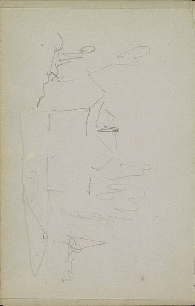
Copyright: Rijks Museum: Open Domain
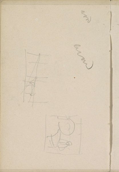
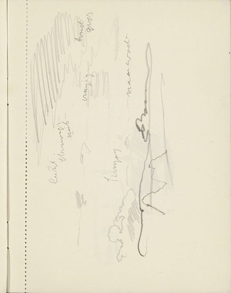
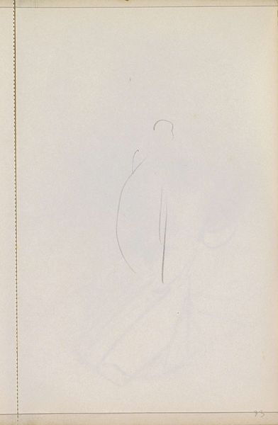
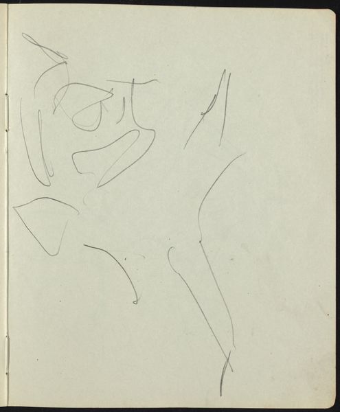
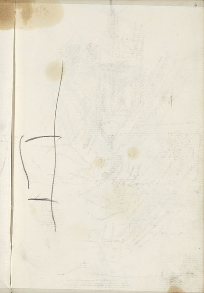
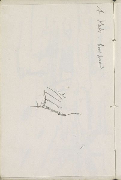
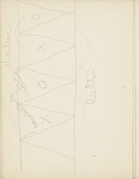
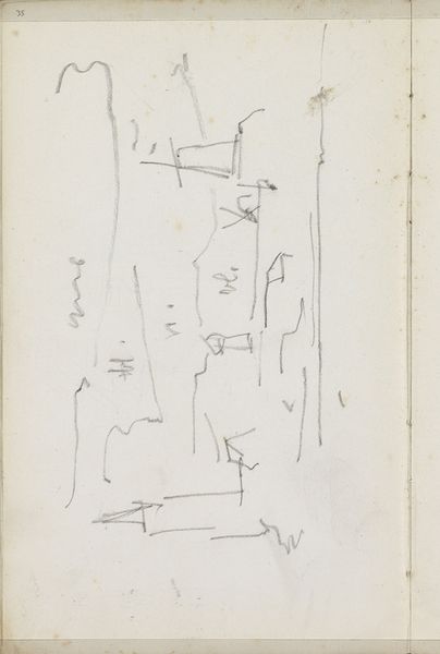
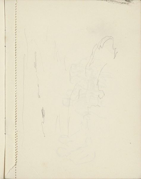
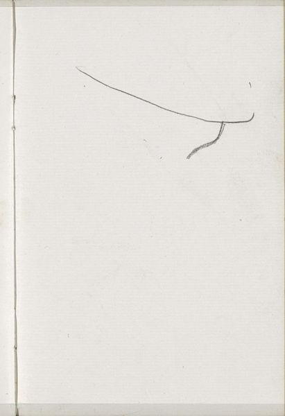
Editor: This is "Studies, waaronder een letter 'C'," by Carel Adolph Lion Cachet, around 1900. It’s a drawing made with pen on paper, housed here at the Rijksmuseum. It feels like a peek into an artist's notebook, capturing a moment of creative exploration. I'm curious, what do you see when you look at the piece? Curator: Immediately, my attention is drawn to the delicate lines that define the forms. Note the contrast between the confident, flowing curves of the larger letterforms and the almost tentative quality of the smaller numerals. Observe how Cachet uses line weight to create visual hierarchy and imply depth on the flat plane. Do you notice how the composition is balanced, almost as if abstract shapes float across the page? Editor: I see what you mean! It’s less about the letters themselves and more about how they occupy the space. The 'C' seems almost incidental compared to the other shapes. Curator: Precisely. We can consider these studies as exercises in form and composition, prioritizing line, shape, and spatial relationships over legibility. What impact has the medium -- pen and paper -- upon the study itself? How might the sketch transform with digital mediums or a printed letter form? Editor: The starkness and immediacy of the pen give it a raw, almost unfinished quality. It definitely encourages you to focus on the essential elements. Without the subtleties possible with color, the beauty and dynamism of the individual lines take precedence. Curator: Exactly. It's this commitment to essential forms that highlights the careful choreography of Cachet's lines, underscoring the foundational structure of visual language. Editor: That’s a great perspective. I'll definitely look at drawings differently from now on, paying closer attention to line and form. Curator: And I shall enjoy seeing if the visual deconstruction transforms one letter to another and how different line thicknesses might further shape an overall geometric impression.
Comments
No comments
Be the first to comment and join the conversation on the ultimate creative platform.
More like this