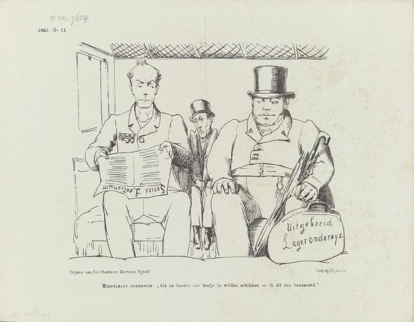
drawing, pen
#
drawing
#
dutch-golden-age
#
caricature
#
cartoon sketch
#
figuration
#
pen
#
cartoon style
#
cartoon carciture
#
modernism
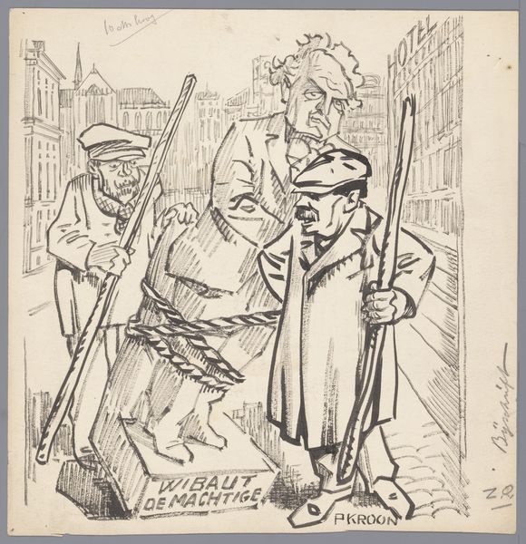
Dimensions: height 226 mm, width 232 mm
Copyright: Rijks Museum: Open Domain
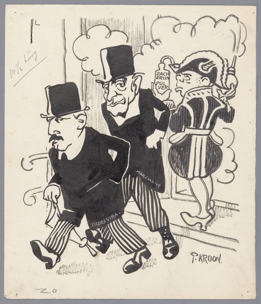
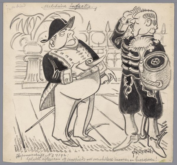
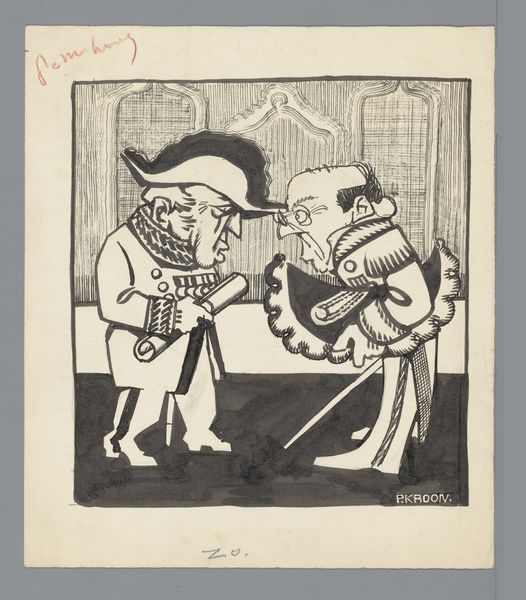
Editor: This drawing, "Haagse toneelgezelschappen," dating between 1910 and 1935, uses pen and ink to depict a group of caricatured figures. The mood seems satirical, perhaps even a little cynical. What do you see in this piece? Curator: Immediately, I'm drawn to the symbolic weight carried by each figure and the objects surrounding them. Consider the "STAD" and "HUIS" labels, seemingly referring to different theatre houses: one is grand and public while the other more intimate or domestic. Then there are those labelled hats... "HOFSTADTOON," "GROOTE SCHOUWBURG"... Are these representative of particular acting troupes and the roles that actors play? Editor: That's an interesting reading! I hadn't focused on those specific labels as representing houses and troupes so explicitly, more on just how they are positioned. Curator: Exactly! Placement is everything. Notice how one character holds both hats together, and how that character is bent at the hip offering his open hand towards a well dressed figure... there is cultural memory embedded here... is this person asking for money and from whom and for whom... it triggers cultural memory and allows a deeper reading of continuity from then until now. Editor: The one in the dress clearly marked from Stad theatre is the wealthiest, it seems to hint? I also wonder what the jar is carried in the back of the caricature group says; it seems very small to discern. Curator: The label "PRINSESSE SCHOUWBURG" can possibly hint at royal funding or association. Each element within this caricature carries layers of socio-cultural meaning, allowing us glimpses into early 20th century Dutch theatre culture and what kind of commentary the author seems to imply with it. It seems there is tension here to interpret. Does the modern "cartoon style" further enhance this or undermine our interpretation of tension and critique? Editor: That makes a lot of sense. I hadn't considered how deeply symbolic each aspect could be. It’s fascinating to think about how visual shorthand like this still functions today in political cartoons and satire.
Comments
No comments
Be the first to comment and join the conversation on the ultimate creative platform.
More like this