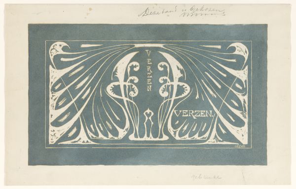
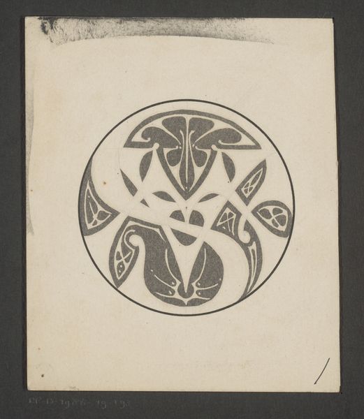
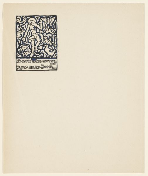
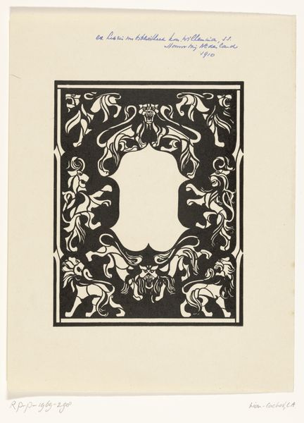
Bandontwerp voor de voorzijde van: Hélène Lapidoth-Swarth, Stille dalen, 1898 1898
0:00
0:00
drawing, graphic-art, paper, typography, ink
#
drawing
#
graphic-art
#
art-nouveau
#
blue ink drawing
#
paper
#
typography
#
ink
Dimensions: height 218 mm, width 136 mm
Copyright: Rijks Museum: Open Domain
Curator: This is a bandontwerp, a cover design, created in 1898 by Reinier Willem Petrus de Vries. It was intended for the front of a book of poetry titled “Stille Dalen”, or Silent Valleys, by Hélène Lapidoth-Swarth. Editor: There's something profoundly still and almost meditative about it, like a calligraphic chant. The stark lines and the stylized fleur-de-lis speak of ritual and of pared-down essence, which really fits with the book’s subject. Curator: It's interesting you say ritual; that’s precisely what I see! Knowing it was intended as a book cover makes me consider the industrial processes in bookmaking and graphic design as a sort of "mass ritual" of imbuing text into printed matter and bringing knowledge into the public sphere. We have black ink on paper to thank. Editor: Mmm, so good point about those rituals! But let's focus on those sinuous curves for a minute. It is Art Nouveau through and through! Every element, from the typography to the floral emblem, dances together—everything leans into flow and interconnectedness. Do you not think so? Curator: Oh, absolutely! However, for me, this artwork isn't just a beautiful aesthetic object. Instead, the ink, the paper, the very act of production represent labor: from the trees pulped to make paper, to the printing press and workers who printed thousands of these covers, labor often invisible or ignored when we look at fine art objects. And look at how the author's name is foregrounded alongside the title. Who profits here, and whose names are immortalized in these silent valleys? Editor: Well, I always get happily swept away in the visual poetry first. Now I can feel all those workers vibrating just below the surface... the paper's no longer quite so still! It definitely shifts my perception; now the design feels less a whisper and more a resonant chord. Curator: Precisely! And these layered meanings are just some of what make studying this book design such a fascinating venture!
Comments
No comments
Be the first to comment and join the conversation on the ultimate creative platform.
More like this