print, paper, typography, engraving
#
aged paper
# print
#
old engraving style
#
paper
#
text
#
11_renaissance
#
typography
#
northern-renaissance
#
engraving
Dimensions: height 169 mm, width 81 mm
Copyright: Rijks Museum: Open Domain
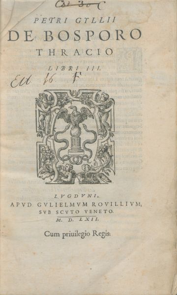
Curator: This printed page, "Drukkersmerk van Plantijn," created in 1613, intrigues me with its careful arrangement. What's your initial take on its visual impact? Editor: Austere and commanding. The stark contrast and regimented typography create an almost forbidding effect. It evokes a sense of solemn authority, even coldness. Curator: Interesting observation. The symmetrical layout directs the eye downwards, each line contributing to the overall block-like structure. The variations in font size create a clear hierarchy, emphasizing key phrases and names. Editor: I immediately see the image encircled by foliage: it is compelling. Doesn't that circular emblem representing Plantijn's printing house, a compass held by a hand emerging from clouds, strike you as paradoxical? Heavenly guidance and earthly craftsmanship intertwined. A visual symbol of knowledge emerging from divine will, almost. Curator: Precisely. That emblem serves as a focal point, disrupting the text’s rigid grid. Its circularity introduces a visual counterpoint to the rectilinear text, playing with form and space. It presents the tension inherent between organic and structured form. Editor: I see further meaning in it, beyond pure aesthetic contrast. The compass references accuracy and precision, important values of the time. Also, I note that Plantijn chose a very recognizable symbol in the context of Antwerp humanism, an effort of cultural promotion of the time through imagery. Curator: Indeed. And one should observe the density of information packed into this single sheet. Every element appears deliberately placed, contributing to the print's function as a powerful announcement of the publisher. Note also how the lettering conveys an attention to craft typical of the Northern Renaissance. Editor: So it's less about immediate beauty and more about the symbolic language employed, intended for its contemporary audience, filled with meanings that have inevitably faded over time? This emblem shows us there's always a story beyond the immediately visible. Curator: Exactly. It demonstrates that effective visual communication stems from the harmonious balance of structure, legibility, and symbolically charged iconography. Editor: I see now how diving beneath that seemingly stern facade, there is a rich narrative to unpack, as well as compositional sophistication at play. Curator: Agreed, revealing hidden meanings within even the simplest form.
Comments
No comments
Be the first to comment and join the conversation on the ultimate creative platform.
More like this