Copyright: Public Domain: Artvee
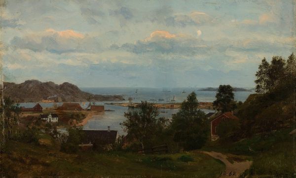
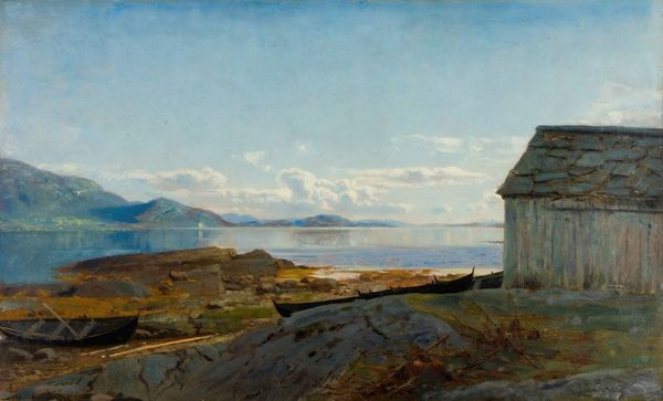
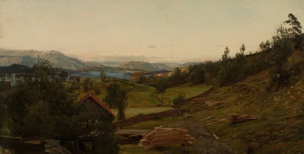
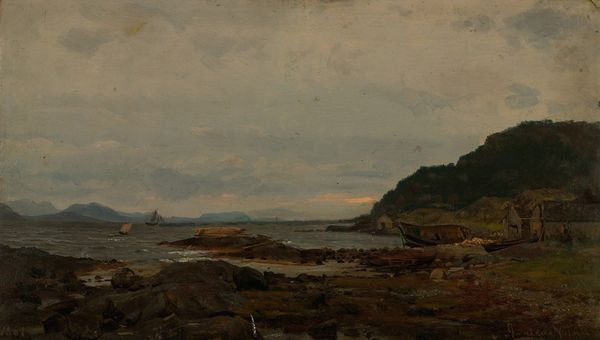
Editor: Here we have Amaldus Nielsen’s "Fra Gjertsbjerg, Mandal," painted in 1863, using oil paint, apparently done "en plein air". It’s quite striking – a panorama of a town nestled near the sea. It has a serene, almost nostalgic quality to it. What stands out to you? Curator: Notice how the town is almost embraced by the landscape? Consider the symbolism of shelter, protection, and the interconnectedness of community. It evokes a sense of belonging. Do you feel that the artist captured a specific mood, beyond serenity? Editor: I do - it is a kind of quiet melancholy... I wonder if the colours influence that, with the subdued earth tones and greys? How do the colours interact to create deeper meaning? Curator: The colours absolutely contribute to the emotional depth. But observe the horizon. The lighter tones symbolize hope or the future. Juxtapose this against the darker greens and browns representing the land and daily life. It can create tension - a longing for escape, perhaps? What resonates with you most, personally? Editor: I’m drawn to the enduring quality of the scene. It feels familiar, like a place remembered from a story. It feels somehow significant - as though it may contain some deeper universal truths about humanity. Curator: Exactly! Consider how even seemingly simple landscapes like this can act as mirrors, reflecting our own inner landscapes. Through them we revisit historical archetypes again and again. They're portals into shared memories. Editor: This has been insightful. I now look at it with totally new eyes.
Comments
No comments
Be the first to comment and join the conversation on the ultimate creative platform.
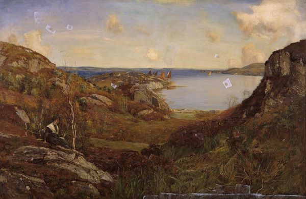
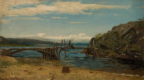
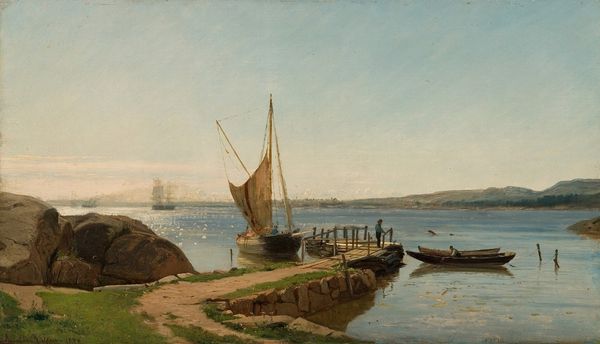
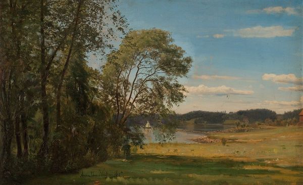
More like this