About this artwork
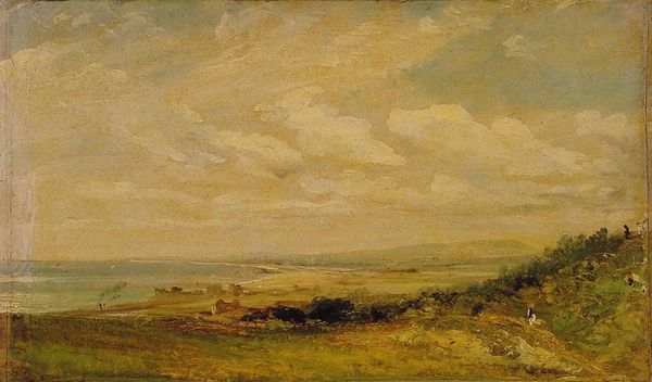
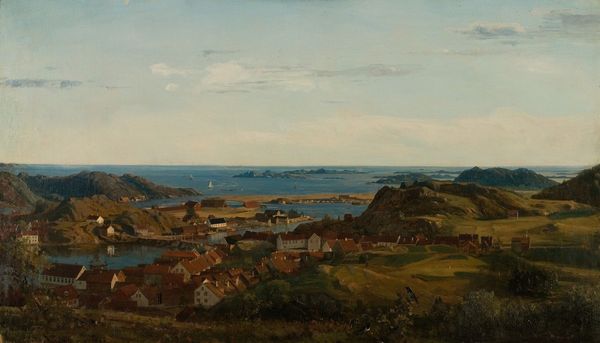
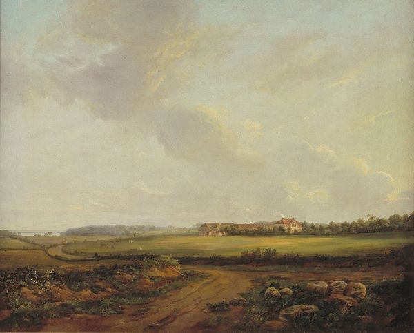
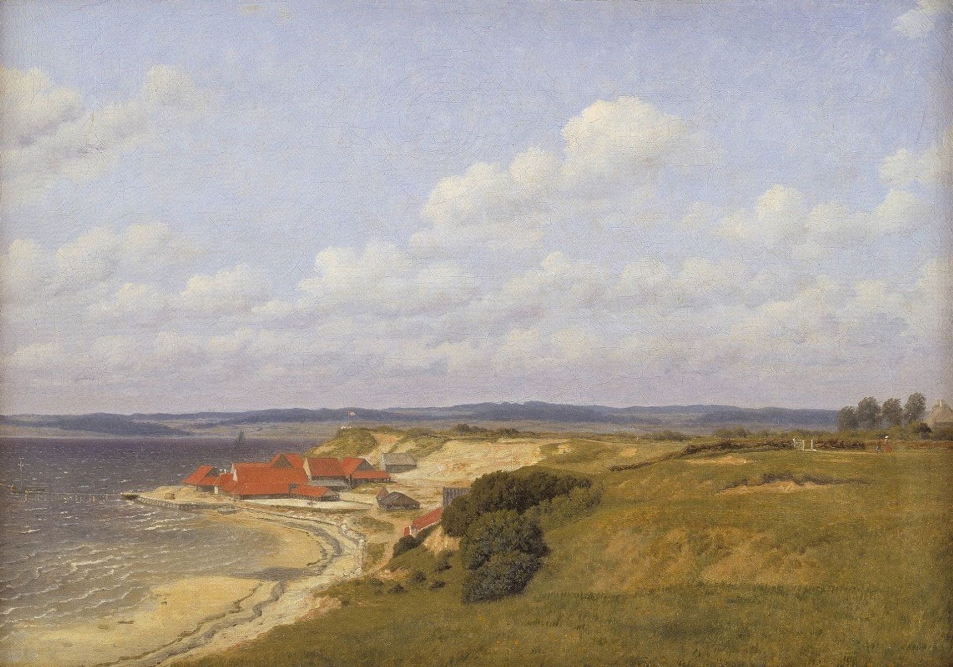
Editor: This is "Renbjærg Tileworks by Flensburg Fiord," an oil painting created around 1830 by Christoffer Wilhelm Eckersberg. It has a very calm and still quality, a sense of quiet observation. What strikes you most about it? Curator: Formally, I'm immediately drawn to the compositional balance. Notice how the horizontal line of the distant shore bisects the canvas, creating two distinct zones. The upper zone, dominated by the sky, presents a diffuse expanse of cloud formations. Below, the geometry of the buildings with their distinct red roofs sharply contrast against the organic curves of the coastline and the rolling hills. Editor: The color palette feels muted, almost washed out. Was that common for the time? Curator: More important than historical fashion, consider how that choice actually serves the composition. The restrained palette, largely absent of intense chroma, promotes the formal structures of the painting, and allows one to fully take in the organization of elements in space. Ask yourself what effect vivid, bright colors might have? Editor: That makes sense. The quiet colors definitely let you focus on the shapes and forms. I hadn't thought of it that way before. The brushwork seems pretty smooth too. Curator: Precisely. Note also how Eckersberg employs aerial perspective, blurring the distant shore and fading the colors to create a convincing illusion of depth, further unifying these carefully placed forms within a visual field. Editor: It's interesting to see how much a focused analysis on just the formal elements can reveal. Curator: Yes. Attending to these visual cues provides the means of access for deeper appreciation of the image as image. It moves beyond merely illustrating something.
Artwork details
- Medium
- painting, oil-paint
- Copyright
- Public Domain: Artvee
Tags
painting
oil-paint
landscape
oil painting
romanticism
realism
Comments
No comments
About this artwork
Editor: This is "Renbjærg Tileworks by Flensburg Fiord," an oil painting created around 1830 by Christoffer Wilhelm Eckersberg. It has a very calm and still quality, a sense of quiet observation. What strikes you most about it? Curator: Formally, I'm immediately drawn to the compositional balance. Notice how the horizontal line of the distant shore bisects the canvas, creating two distinct zones. The upper zone, dominated by the sky, presents a diffuse expanse of cloud formations. Below, the geometry of the buildings with their distinct red roofs sharply contrast against the organic curves of the coastline and the rolling hills. Editor: The color palette feels muted, almost washed out. Was that common for the time? Curator: More important than historical fashion, consider how that choice actually serves the composition. The restrained palette, largely absent of intense chroma, promotes the formal structures of the painting, and allows one to fully take in the organization of elements in space. Ask yourself what effect vivid, bright colors might have? Editor: That makes sense. The quiet colors definitely let you focus on the shapes and forms. I hadn't thought of it that way before. The brushwork seems pretty smooth too. Curator: Precisely. Note also how Eckersberg employs aerial perspective, blurring the distant shore and fading the colors to create a convincing illusion of depth, further unifying these carefully placed forms within a visual field. Editor: It's interesting to see how much a focused analysis on just the formal elements can reveal. Curator: Yes. Attending to these visual cues provides the means of access for deeper appreciation of the image as image. It moves beyond merely illustrating something.
Comments
No comments