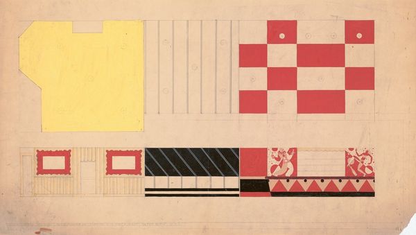
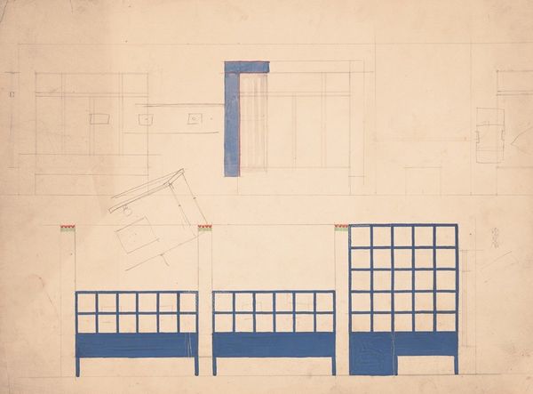
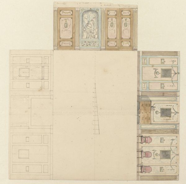
![Designs for Modern Hotel Suite, Du Pont Biltmore Hotel, Wilmington, Delaware.] Colour chart for Suite 210 by Winold Reiss](/_next/image?url=https%3A%2F%2Fd2w8kbdekdi1gv.cloudfront.net%2FeyJidWNrZXQiOiAiYXJ0ZXJhLWltYWdlcy1idWNrZXQiLCAia2V5IjogImFydHdvcmtzLzRmYmI1NTE3LWNkZTItNDQ5Mi05ZDJkLTdlM2QwOGFiNTg4ZC80ZmJiNTUxNy1jZGUyLTQ0OTItOWQyZC03ZTNkMDhhYjU4OGRfZnVsbC5qcGciLCAiZWRpdHMiOiB7InJlc2l6ZSI6IHsid2lkdGgiOiAxOTIwLCAiaGVpZ2h0IjogMTkyMCwgImZpdCI6ICJpbnNpZGUifX19&w=3840&q=75)
Designs for Modern Hotel Suite, Du Pont Biltmore Hotel, Wilmington, Delaware.] Colour chart for Suite 210 1928
0:00
0:00
drawing, paper, watercolor
#
art-deco
#
drawing
#
paper
#
watercolor
#
watercolor
Copyright: Public Domain: Artvee
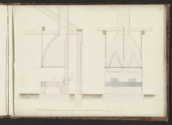
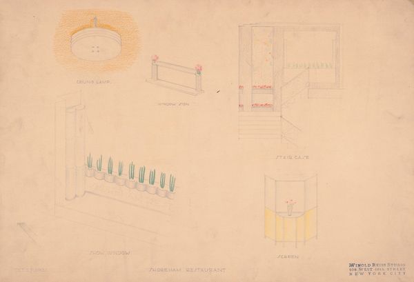
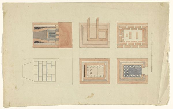
Winold Reiss dreamt up this design for a modern hotel suite with pencil and watercolour. It’s like looking at a plan for a painting, or maybe a painting as a plan. There's something so satisfying about the way he's laid out these blocks of color – pinks, yellows, and grays – each neatly contained within its zone. The pink is my favorite, brushed on with loose, watery strokes that let the paper breathe through. It's this tension between the schematic and the sensuous that really grabs me. I love the mix of precision and looseness in the design, the way the colors hint at the atmosphere of a room, not just its layout. Reiss, with his background in the German modernist movement, had an eye for clean lines and bold color, reminiscent of someone like Sonia Delaunay. But here, he’s also giving us something deeply personal, a glimpse into his process, and that's what makes it sing.
Comments
No comments
Be the first to comment and join the conversation on the ultimate creative platform.
More like this