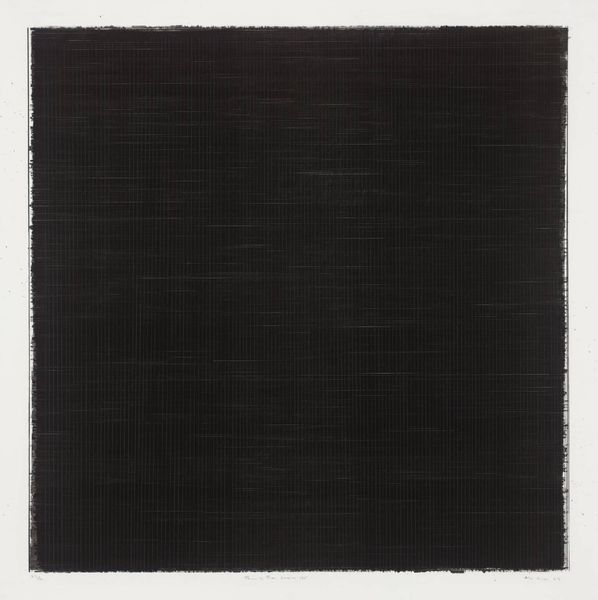
acrylic-paint
#
minimalism
#
op art
#
acrylic-paint
#
geometric
#
abstraction
#
line
#
pattern repetition
#
hard-edge-painting
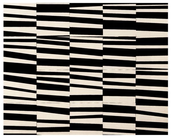
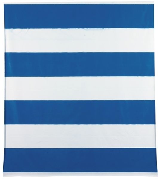
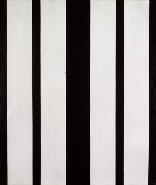
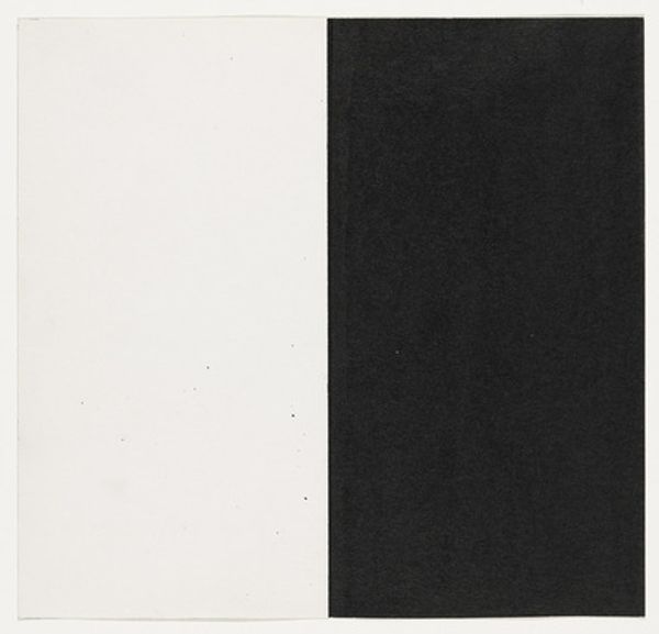
Copyright: Michel Parmentier,Fair Use
Curator: Immediately striking. Simple, yet visually arresting, a high contrast rhythm almost. Editor: That's a great starting point. We're looking at "17 juil" by Michel Parmentier, a piece created in 1984. Parmentier was very engaged with questions about art’s socio-political function. Curator: Black and white, classic. I'm drawn to what these colors can evoke: a sense of starkness, perhaps even something absolute. The stripes also read as a visual metaphor, could it be associated to uniforms and systems of power? Editor: I agree, the high contrast can definitely suggest clear dichotomies. Parmentier’s work frequently intervened against conventional artistic values. During the 1960s, he famously abandoned individual artistic creation. Considering that, this bold application of stripes could perhaps challenge traditional notions of originality, raising questions about artistic production, questioning consumerism and art as a commodity. Curator: You know, stripes have such a deep history. Think about their presence across so many contexts – fashion, flags, even prison uniforms. Do you read some connection of this abstraction with collective meanings, traditions? Editor: It’s tempting, but perhaps too direct a link. Consider his engagement with the BMPT group, their radical gesture of negation which, ironically, became iconic. Parmentier employed serial forms to deconstruct established norms within the art world, pushing to rethink our roles as individuals involved with a work. Curator: But that almost reinforces the visual association, right? Negation and iconoclasm – a kind of stripping bare – it is also about identity and refusal of it. Editor: It could be interpreted that way, seeing negation not as an end, but a step towards new understanding of ourselves and our expectations around artistic value. Curator: Thinking about the simplicity here, in conjunction with its hard-edge style, opens a door to many possibilities. It becomes like a sign—powerful through its reduction. Editor: A sign pointing toward… perhaps further questioning. Thank you. Curator: An invitation, perhaps, to dismantle certainties. Thank you too.
Comments
No comments
Be the first to comment and join the conversation on the ultimate creative platform.
More like this