drawing, graphic-art, paper, ink
#
drawing
#
graphic-art
#
paper
#
ink
#
geometric
#
line
#
calligraphy
Dimensions: height 205 mm, width 316 mm
Copyright: Rijks Museum: Open Domain
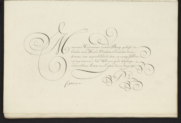
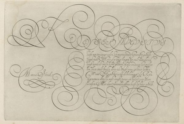
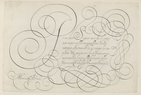
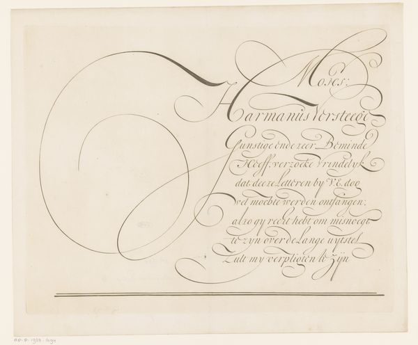
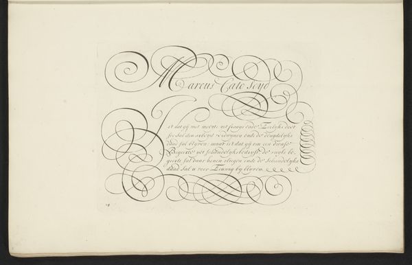
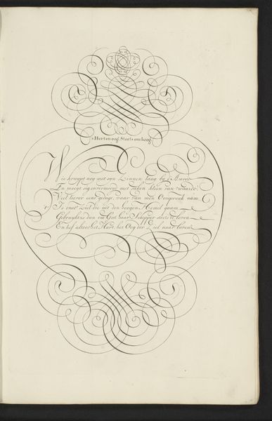
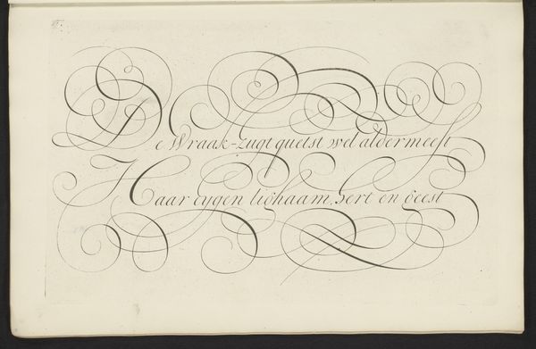
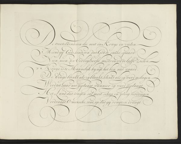
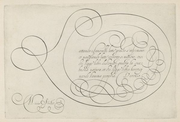
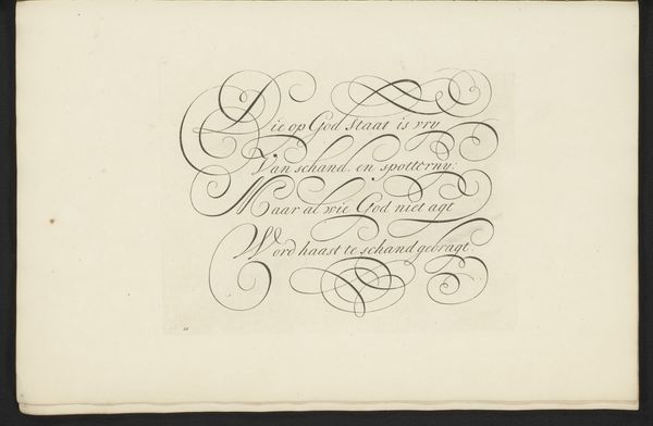
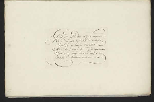
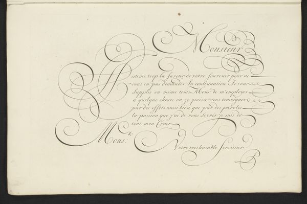
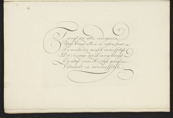
Bastiaan Boers made this calligraphic study, "Schrijfvoorbeeld: Montre moy donc (...)", around the turn of the 18th century, using ink on paper. Here, the contrast of the dark ink against the light paper creates a visual harmony between the graphic qualities of lettering and the conventions of drawing. Notice how the artist explores the expressive potential of line through its weight and direction, from the thin, hairline strokes to the more emphasized curves. These lines and shapes aren't just visual; they are deeply connected to the movements of the hand that guided the pen. What is particularly striking is the amount of skill, labor, and time involved in creating such elaborate penmanship. Although calligraphy like this is less common today, we can appreciate how it was once a highly valued skill, essential for record-keeping, correspondence, and the production of beautiful documents. It reminds us of a time when handwriting was not just a means of communication but a form of artistry.
Comments
No comments
Be the first to comment and join the conversation on the ultimate creative platform.
More like this