Copyright: Public Domain: Artvee
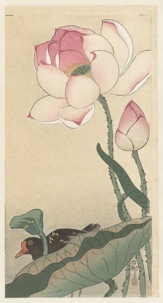
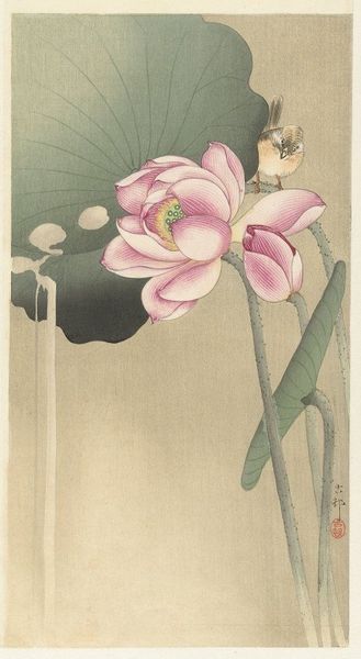
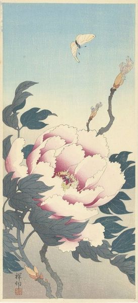
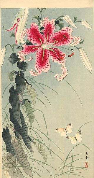
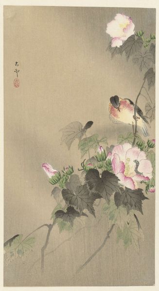
Editor: Here we have Ohara Koson's "Blooming Lotus Flowers," made sometime between 1920 and 1930, using watercolor techniques. I’m struck by the delicate yet bold strokes; they create such a sense of serene vitality. What do you see in this piece, considering its visual construction? Curator: Indeed. Focusing on form, note how Koson deploys asymmetry to achieve balance. The large leaf anchors the composition, while the blossoms create a rising, dynamic rhythm. Editor: So the asymmetry is deliberate? It feels so natural, not forced. Curator: Precisely. And consider the interplay of line. Observe the strong verticality of the stems, contrasting with the curvature of the petals and leaf. This juxtaposition animates the surface. What is the affect in terms of compositional organisation? Editor: I see it! It creates a push and pull, a tension that keeps the eye moving. The restricted palette is also striking. Curator: Yes, the limited color range—various muted tones and pale pinks, unified under a slightly aged tone– strengthens the image's cohesive structure. It reduces competing forms and directs the eye toward the carefully crafted lines. The eye doesn't focus as much on contrasts in hue and value and it instead is directed toward shapes. How effective do you find that choice? Editor: Very effective. It’s taught me that restricting colors is a really helpful move when aiming to produce serenity. Curator: Absolutely, paying close attention to how the artist’s manipulation of the pictorial space itself allows for a deep art historical understanding. Editor: That's a great lesson on understanding structure; it impacts our reading in subtle ways, I will remember that!
Comments
No comments
Be the first to comment and join the conversation on the ultimate creative platform.
