drawing, ink, pen
#
drawing
#
hand-lettering
#
hand drawn type
#
hand lettering
#
personal sketchbook
#
ink
#
hand-drawn typeface
#
ink drawing experimentation
#
ink colored
#
pen work
#
sketchbook drawing
#
pen
#
sketchbook art
#
calligraphy
Copyright: Rijks Museum: Open Domain
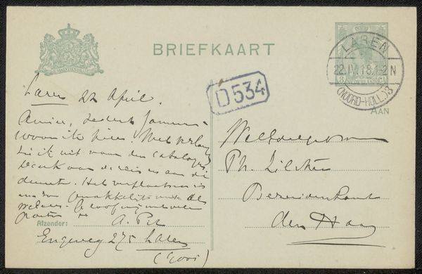
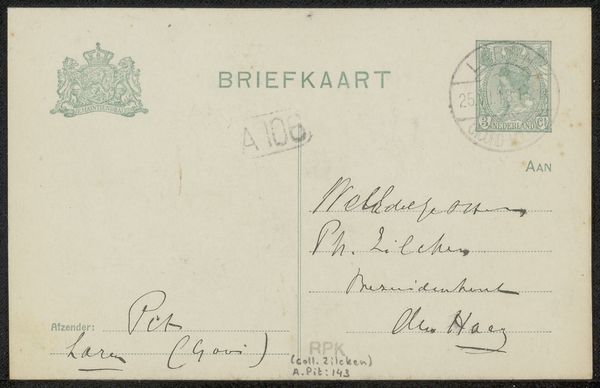
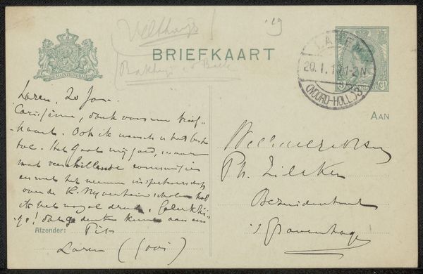
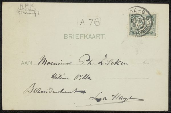
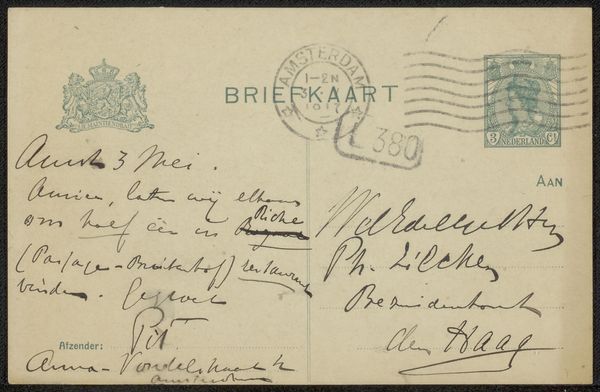
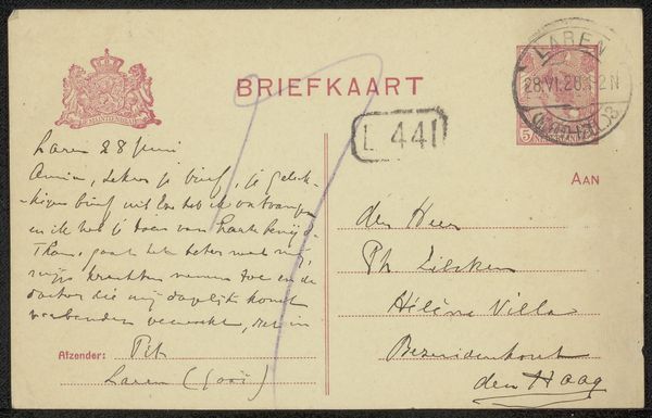
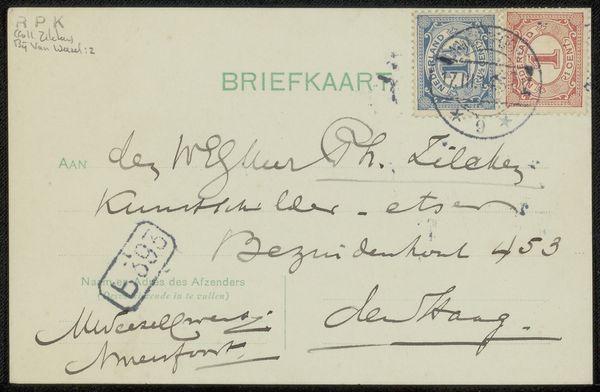
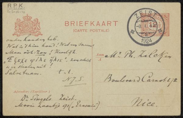
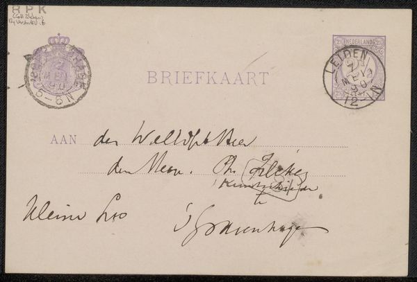
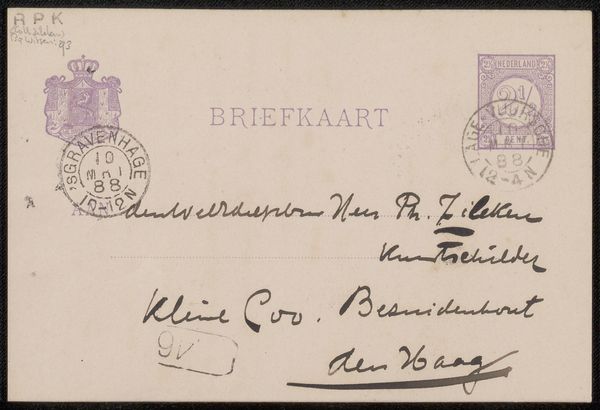
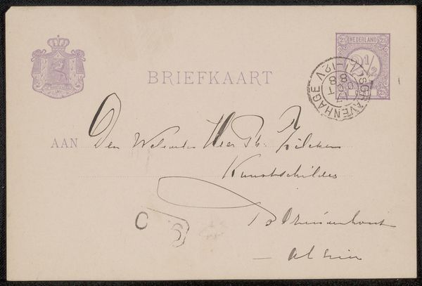
Curator: This postcard, a "Briefkaart aan Philip Zilcken," created before 1917 by Adriaan Pit, is composed of ink on paper. The delicate script, clearly crafted with a practiced hand, fills the available space. Editor: There’s a compelling intimacy here, even from a distance. The restricted palette emphasizes the gestural freedom of the lettering itself. The slant and pressure create a rhythm almost musical on the page. Curator: Yes, there's a definite personal touch. Note the official elements – the printed word "BRIEFKAART," the small coat of arms, even the stamp with the queen's profile – existing alongside Pit’s very human script. It is the cultural dance of function versus intimacy. The tension makes it compelling. Editor: And the way the handwritten script both adheres to and pushes against the printed lines—that’s where the energy lies. It plays with semiotics—the tension between the system and the individual hand. It has to navigate, correspond, comply; nonetheless, the free flow creates the sender’s identity. Curator: Consider, too, the function of postcards at the time. They served as quick missives, brief updates traveling through networks of individuals and institutions. Each handwritten word becomes imbued with intent. Editor: Absolutely. And as a formal composition, that concentrated energy feels deliberate, yet offhand. Almost as if this was dashed off in a moment, but with intent to show some degree of design consideration. A tension exists: both ephemeral and somehow timeless because of the craft. Curator: Seeing these hand-rendered marks allows us a tangible link to the past. The shapes of the letters—the rise and fall of each line—create a human story beyond the transcribed message. We interpret more than mere communication; we also encounter personality, perhaps a fragment of Pit's own life story. Editor: Precisely. And by studying the hand lettering here as form and content—the rhythm and balance and tonal scales of black and off-white–we come to discover deeper truths and experience this image more completely, almost beyond language. Curator: Ultimately, we recognize, through ink and paper, how historical gestures communicate long after the hand that made them has stilled. Editor: Yes, there's an intensity within those pen strokes that echoes into our present, offering a kind of vibrant resonance.
Comments
No comments
Be the first to comment and join the conversation on the ultimate creative platform.
