drawing, paper, ink, pen
#
drawing
#
old engraving style
#
hand drawn type
#
hand lettering
#
paper
#
personal sketchbook
#
ink
#
hand-drawn typeface
#
ink drawing experimentation
#
pen-ink sketch
#
pen work
#
sketchbook drawing
#
pen
#
post-impressionism
#
sketchbook art
Copyright: Rijks Museum: Open Domain
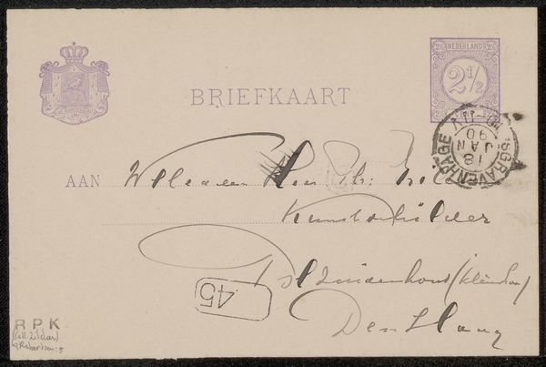
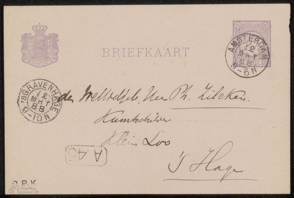
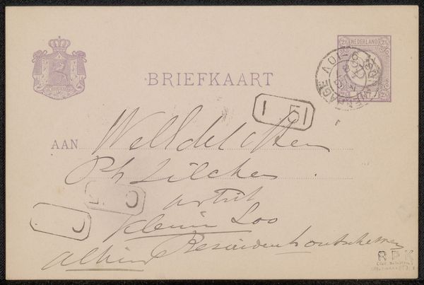
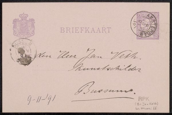
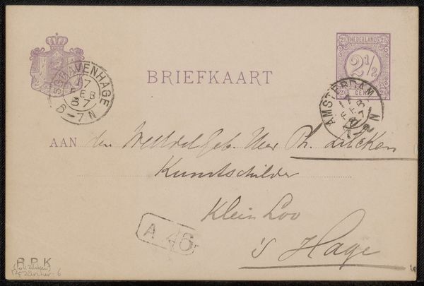
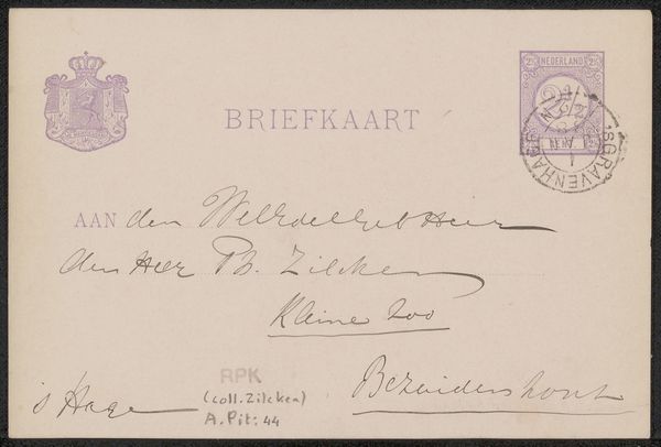
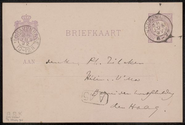
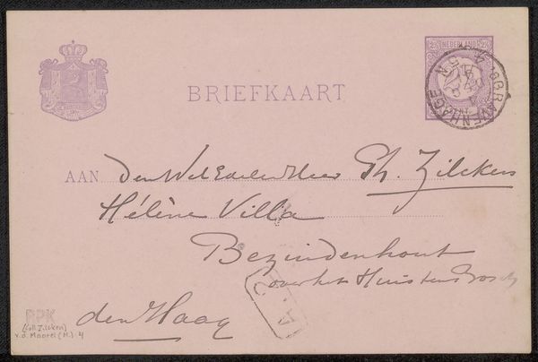
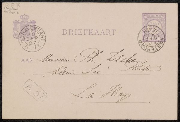
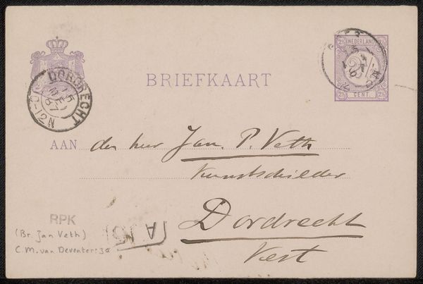
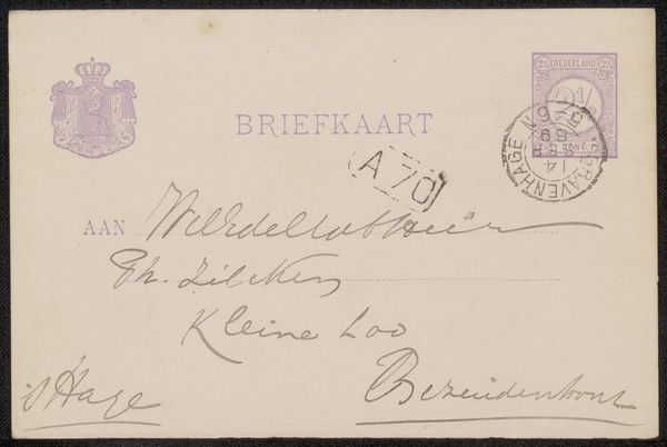
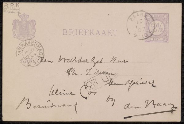
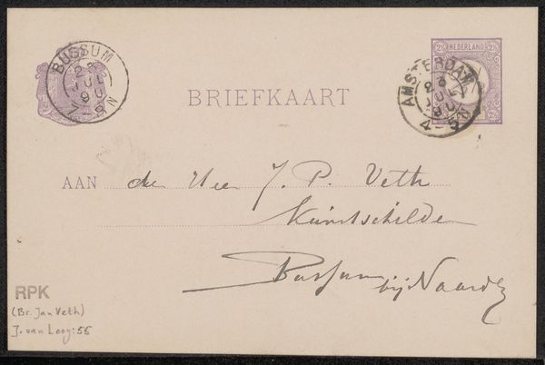
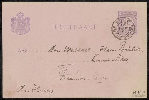
This is Suze Robertson’s "Briefkaart aan Philip Zilcken," an intriguing object blending the mundane with personal expression. The card, designed for correspondence, features a rigid rectangular shape, softened by the fluid, calligraphic handwriting that dominates its surface. The eye is immediately drawn to the interplay between the official and the intimate. Printed elements, such as the formal "BRIEFKAART" and the heraldic emblem, contrast sharply with the dynamic, almost impulsive script. This tension between the structured format of the card and the free-flowing lines of the handwriting destabilizes the traditional notion of a postcard as a mere transactional object. Instead, the postcard becomes a deeply personal artifact, a space where public and private realms intersect. Robertson's use of handwriting transforms the card into a semiotic field. The strokes and curves carry not only textual information, but also reveal something of the artist's hand, her energy, and her relationship with the recipient. We are left to contemplate the layers of meaning embedded in this simple form.
Comments
No comments
Be the first to comment and join the conversation on the ultimate creative platform.
More like this