graphic-art, print, textile, paper, typography, engraving
#
portrait
#
graphic-art
#
aged paper
#
hand-lettering
#
dutch-golden-age
# print
#
hand drawn type
#
hand lettering
#
textile
#
paper
#
11_renaissance
#
personal sketchbook
#
typography
#
fading type
#
stylized text
#
thick font
#
history-painting
#
handwritten font
#
engraving
#
small lettering
Dimensions: height 140 mm, width 190 mm
Copyright: Rijks Museum: Open Domain
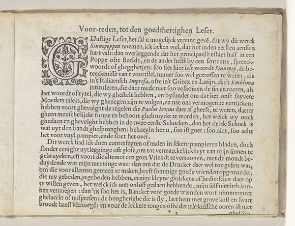
Curator: This intriguing piece, currently housed in the Rijksmuseum, is titled "Nederlandstalig voorwoord, pagina 2," which translates to "Dutch Preface, Page 2." It's an engraving, a printed work on paper crafted around 1641 by Crispijn van de Passe the Younger. The typography alone creates a visual experience, and that’s before considering the textual content. Editor: Immediately, I'm struck by the texture and the aged feel of the paper itself. There’s something inherently intimate about seeing handwritten, or rather, hand-lettered text. It’s also incredibly haunting. The thick font somehow underscores a sense of gravity. What's your take? Curator: The use of this bold font and the specific letterforms certainly draws our attention. It speaks to a period where typography was considered a significant art form in its own right. Lettering styles held meaning, acting almost as emblems. It's as if the very shape of the letters wants to convey the character of the text. The hand-lettering here adds a human quality often lost with movable type. Editor: Absolutely. This page offers more than just religious and moral declarations from its time. It’s very clearly focused on the shortcomings of women. Looking closely at some of the phrases here: "lichte Vrouwen"—"unchaste women", perhaps. There's an immediate connection to discussions about sin, gender, and redemption. Curator: True, such judgements might be considered as artifacts from the time it was composed. The symbolic structure uses these familiar narratives—the fall of David, Samson, and Absalom—as cautions, linking their downfall to female temptation. These stories weren't chosen randomly. Editor: Exactly! In my eyes it underlines the socio-political and cultural anxieties concerning female behaviour during the Dutch Golden Age. The last line "ren tot haer zielen zaligheyd" serves as a heavy conclusion. So much pressure from the Patriarchy. It shows that these visual motifs were crucial in upholding moral boundaries and enforcing social roles. Curator: I agree with your analysis of the role the artwork played in shaping societal behavior at that moment in history. Looking closely and taking some time really opens your eyes! Editor: It definitely invites an engaging intersection between historical context and how artworks functioned to reflect and shape norms of their day. That will stick with me!
Comments
No comments
Be the first to comment and join the conversation on the ultimate creative platform.
More like this