print, paper, typography
# print
#
paper
#
11_renaissance
#
typography
Dimensions: height 137 mm, width 188 mm, height 95 mm, width 60 mm
Copyright: Rijks Museum: Open Domain
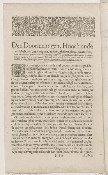
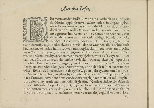
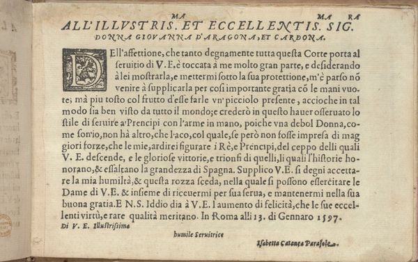
This is a preface to Roemer Visscher’s “Sinnepoppen”, likely printed in the early 17th century. Note the density of the text block and its visual weight on the page. This isn't just about legibility; it reflects a humanist interest in classical rhetoric, where the visual presentation of an argument was as crucial as its content. The ornate initial “G” is itself a statement. It's both decorative and functional, marking the beginning of the text while also signaling the author's erudition and artistic sensibility. The letter is intertwined with foliage. The typography may appear straightforward, but its careful arrangement subtly influences the reader. The close leading, justified alignment and dense letter spacing create a uniform texture, inviting careful reading and contemplation. Notice how Visscher uses the physical structure of the page, the interplay between text and ornament, to frame his ideas. It encourages the reader to approach the text not just as a repository of information, but as an aesthetic and intellectual object.
Comments
No comments
Be the first to comment and join the conversation on the ultimate creative platform.
More like this