drawing, coloured-pencil, paper, watercolor, typography
#
drawing
#
coloured-pencil
#
medieval
#
water colours
#
paper
#
watercolor
#
typography
#
coloured pencil
#
geometric
#
decorative-art
Dimensions: height 250 mm, width 197 mm
Copyright: Rijks Museum: Open Domain
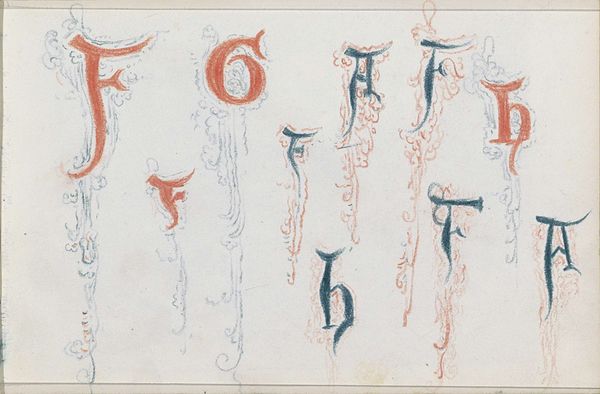
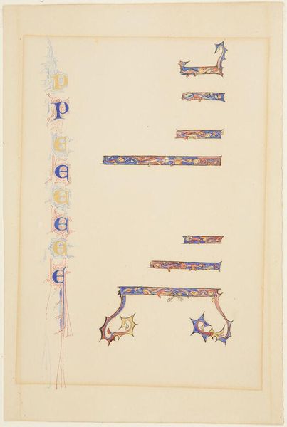
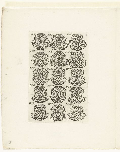
Curator: Here we have "The Letters M through Z in Gothic Style" by Henri Cameré, created sometime between 1864 and 1894 using watercolor and colored pencil on paper. Editor: My initial reaction is one of striking clarity. The letters, though stylized, maintain a clean, geometric precision. The use of the colored pencil provides clear-cut shapes. Curator: Indeed. The artist's precise rendering emphasizes the interplay of positive and negative space within each letterform. The consistent application of color – a vibrant blue against a warm red – creates a visual harmony across the composition. Editor: Absolutely, though I would note how deeply these choices speak to the Gothic Revival. Consider the cultural weight of illumination during the medieval period. Cameré is not just rendering letterforms, but summoning associations with sacred texts and heraldic tradition. Curator: A compelling point. We might analyze the structural similarities between these letterforms and the architectural features of Gothic cathedrals: the pointed arches echoed in the 'M' and 'Z,' the ribbed vaults suggested in the internal ornamentation. Editor: The use of red too can signal various layers of meanings. Beyond a decorative quality, it points towards passion, martyrdom, or the aristocracy within illuminated manuscripts. Each of these choices creates powerful subliminal narratives. Curator: I am more inclined to consider how this controlled palette, and geometric construction serves to underscore the essential features of legibility itself. Each form serves a clear structuralist role. Editor: Perhaps that tension between inherent structure and historically resonant meaning, offers its viewer an exciting perspective on typography itself! Curator: Well said. The controlled precision and limited color palette do emphasize an essence of communication for a modern viewing public. Editor: Indeed. A glimpse into a period where form, meaning, and material come together.
Comments
rijksmuseum over 2 years ago
⋮
In designing these letters, Cameré was influenced by the initials in late medieval manuscripts. They were popular motifs in jewellery to signify the names of children and loved ones. A bracelet by the French goldsmith Lucien Falize with nearly the same initials is in the Schmuckmuseum in Pforzheim, Germany.
Join the conversation
Join millions of artists and users on Artera today and experience the ultimate creative platform.
More like this