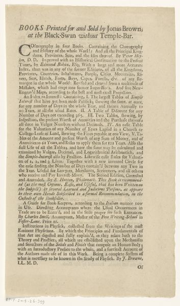
Verklaring van de penning door Gerrit van Moelingen sr. geslagen op de inhuldiging van Willem V, prins van Oranje-Nassau, als erfelijk stadhouder van de Nederlanden 1766
0:00
0:00
anonymous
Rijksmuseum
print, paper, typography, ink
#
dutch-golden-age
# print
#
paper
#
text
#
typography
#
ink
Dimensions: height 16.5 cm, width 20 cm
Copyright: Rijks Museum: Open Domain
Editor: Here we have a typography piece, titled "Verklaring van de penning door Gerrit van Moelingen sr. geslagen op de inhuldiging van Willem V, prins van Oranje-Nassau, als erfelijk stadhouder van de Nederlanden" from 1766. It’s all text, in Dutch. I'm curious about how people at the time viewed these kinds of pronouncements. What kind of message was it trying to convey? Curator: It’s fascinating to consider how potent typography could be. This print is filled with classical allegories and emblems – the anchor of Hope, the bible, the spear, the hat of Freedom – all visualized through dense, elaborate prose. Consider the emotional landscape. What is evoked by using particular words, the choice of font, and the very act of printing and distributing these declarations? Editor: It feels almost like coded language. The average person probably couldn’t unpack all those classical references easily, could they? Curator: Indeed. While ostensibly for the public, its symbolism appeals to a learned elite, those versed in classical imagery. This print then becomes an instrument for shaping public perception by appealing to collective cultural memory, evoking tradition, and subtly suggesting authority and divine support for William V’s rule. Editor: So, the actual information is only part of it. It's more about creating a feeling of legitimacy through imagery. Curator: Exactly. Each of these symbols triggers a web of associations. The layered effect creates a feeling of historical destiny, presenting the Prince’s rule as inevitable and divinely sanctioned. How might a contemporary audience react to such dense symbolism? Would it be embraced or seen as old-fashioned and elitist? Editor: It’s really different from how we get our news today! I hadn't considered how a document could be so loaded with historical meaning through typography and imagery. Curator: Reflecting on the interplay between text and symbol helps us see the deeper layers of meaning embedded in even the most seemingly straightforward documents.
Comments
No comments
Be the first to comment and join the conversation on the ultimate creative platform.
More like this